Ahead of kicking off its fourth season on Thursday, April 7, the Canadian Premier League and league-wide manufacturer Macron have been hard at work. All eight clubs are donning new home and away kits this season, with at least one third kit also thrown into the mix.
The league has also started using a new name and number font this season, inspired by the Canadian men’s national team that qualified for the 1986 FIFA World Cup, played in Mexico. The line through the numbers represented the 49th parallel, which makes up much of Canada’s border with the United States and runs through all 10 provinces.
Here’s what we know so far about what all eight teams will wear when they take the pitch this summer …

Defending league champions Pacific FC waited until their home opener on April 10 to unveil their new alternate kit, which was designed by a Coast Salish Indigenous artist. It depicts salmon and children’s faces, representing resilience and a bright future, respectively. The purple home kit features a sublimated design of Douglas fir branches.
Both kits feature the gold North Star Badge above the club crest on the chest. This new feature is reserved for the defending league champions.


Calgary-based Cavalry FC continues to emphasize the city’s relationship with the Lord Strathcona’s Horse (Royal Canadians), a Canadian army regiment dating back to 1901, with its 2022 kits. The home kit is red with a regimental sash containing a tonal geometric pattern. The chevron pattern on the green away kit references both the regiment and Calgary’s location in the foothills of the Rocky Mountains.

FC Edmonton’s traditional blue home kit is accented with gold and pink trim, representing the wheat fields of Alberta and the province’s official flower, the wild rose, respectively. The away kit is inspired by the ice castles constructed in Hawrelak Park each winter since 2015, while the orange-and-blue third kit — the only third kit in the league as of the start of the season — takes its colours from the city’s first pro soccer team, the Edmonton Drillers.

Winnpeg-based Valour FC made a drastic change in their home kits for 2022, going from a half-maroon, half-white design in 2021 to a black-and-maroon design this year. The white away kit has gold trim and an embossed pattern of wheat stalks.

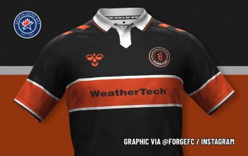
The pattern on the orange home kit for Forge FC, based in Hamilton, is inspired by “the sparks from the strike of a hammer.” The grey away kit pays tribute to the Canadian Warplane Heritage Museum in Hamilton with an embossed pattern resembling airplane panels and rivets, plus a roundel with a cinquefoil flower inside — the same flower found on the Hamilton city flag.
Forge FC will be the only CanPL club to wear the new Legacy Shield on their left sleeves this year. The gold league logo has a large ‘2’ inside, commemorating the club’s league championships in 2019 and 2020.


York United’s home kit is mostly white, with blue, green and gold stripes across the chest. Inside those stripes is the skyline of Toronto, the club’s home city. The away kit is inspired by the North York Rockets, and features embossed diamonds containing three alternating symbols: the “YU” monogram from the club’s current crest; a maple leaf; and a stylized trillium — the provincial flower of Ontario — from the club’s old logo when they were known as York9.

Atlético Ottawa continues to pay homage to its parent club, Atlético Madrid of Spain’s La Liga, with red and white stripes on its home kit. The tonal chevron pattern in the stripes represents the Rideau Canal locks. The away kit features an embossed pattern based on the O in Ottawa’s city flag; the blue and teal colours also come from the flag.

“Nova Scotia” is Latin for “New Scotland,” so it’s only fitting that a touch of Scotland finds it way into HFX Wanderers’ away kits. The “naval grey” shirt is trimmed with tartan on the collar and sleeve cuffs, and even the numbers on the back will feature the tartan pattern.

The home kit features an embossed pattern of ocean waves inspired by the club crest and lighter blue raglan sleeves.
All images courtesy Canadian Premier League


