The Cleveland Cavaliers are updating their logos for the 2022-23 season.
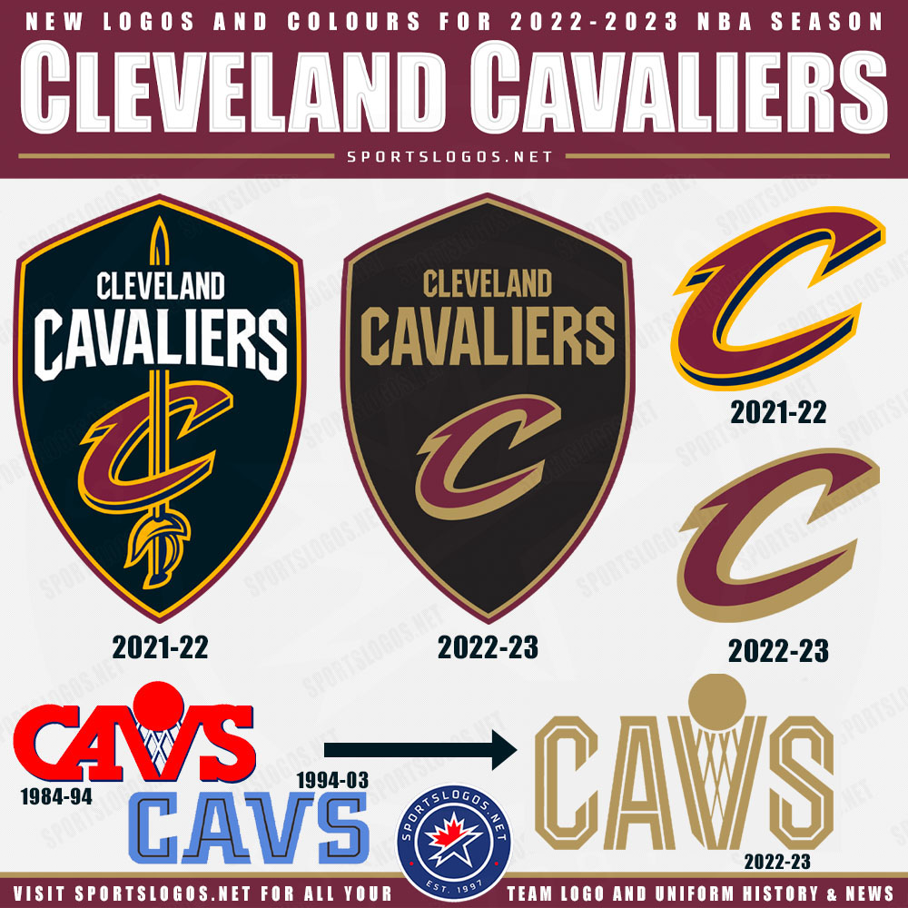
Proclaiming “GOLD IS BACK”, the Cavs this morning confirmed our story from late last night (which this post is an update of), navy blue is gone, mustard yellow is gone. Tweaks to their “Global Logo” shield, their scripted C “Partial” logo, and two entirely new retro-inspired wordmark designs featuring a combination of a couple of throwback Cavs designs.
Here’s what we’ve collected via various sources thus far, all collected from publically available official team websites:

Note, an earlier version of this graphic showed different colours in that “CAVS” wordmark — as we noted at the time, those colours were an estimate, what you see above is now accurate based on what the Cavs themselves have been posting.
LINK: Cleveland Cavaliers logo and uniform history
SHOP: New logo Cleveland Cavaliers t-shirts and more available now
For those who aren’t obsessed with the details of the logos of the Cleveland Cavaliers circa 2017/18 through 2022, the major changes we see from this collection include the elimination of navy blue, a swap out of yellow to bring back the gold they used back when LeBron first joined the team in 2003, and the elimination of the slight arch on the “CAVALIERS” wordmark.

A video accompanying the Cavs official announcement of the new look placed a heavy focus on the return to the shade of gold the team had used from 2003/04 through 2010 rather than the actual changes to the logos and even the new wordmark logo.
Here’s that video:
The Cavs have officially announced their new logos set via this video they just posted to their social media channels. They’ve chosen to focus on the switch from the old “mustardy” gold to the more metallic gold.
— Chris Creamer (@sportslogosnet) June 2, 2022
Our story on the new look from last night: https://t.co/MBARuknT18 pic.twitter.com/jU31w50qFt
CLEVELAND CAVALIERS LOGO HISTORY
This is the seventh logo the Cavs have used since their first season in the NBA back in 1971. After going through four drastically different identities in their first 30 years, the team has been relatively consistent (in terms of overall look) in the 20 years since – in this time, however, the club has used four different logos, with little tweaks or colour changes happening along the way.

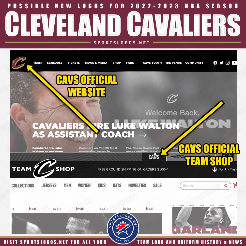
As mentioned earlier in this post, this story started out as a leak last night, the new logos appeared on the team’s official website and store site as a graphic in the headers:


