
For Craig Buglass, it all started when someone handed him a bright orange flyer outside a nightclub in Amsterdam.
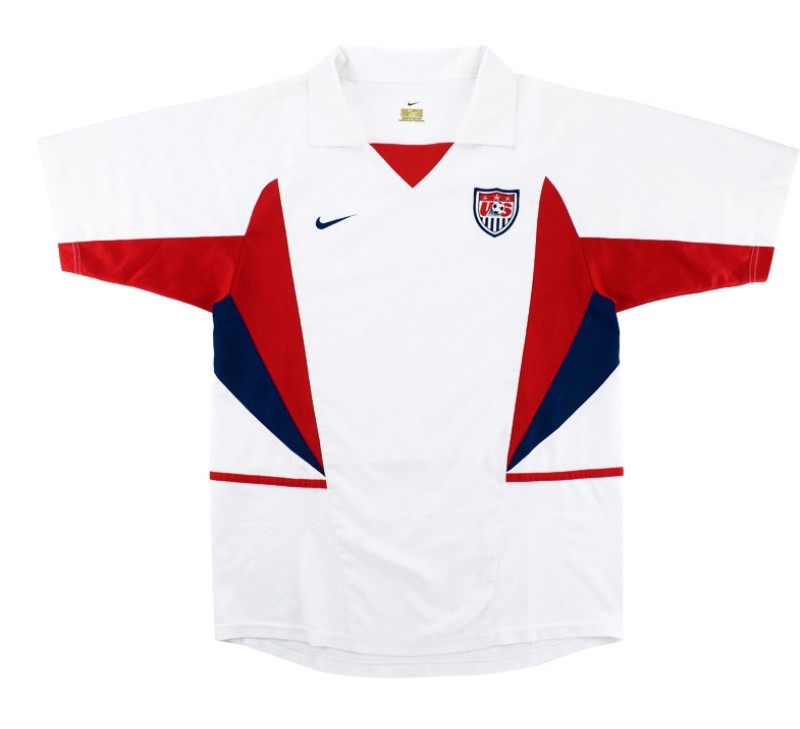
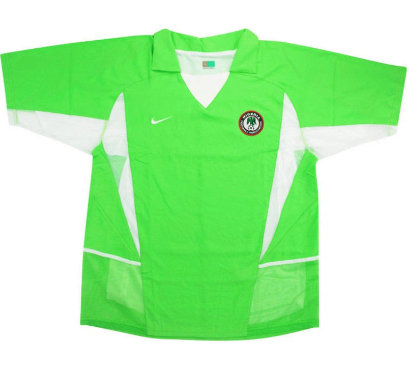
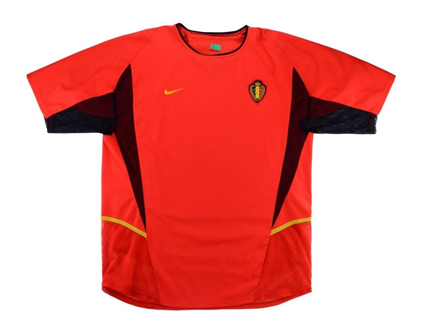
Buglass (left in the above Youtube screenshot) was the Nike designer who worked on kit designs for a number of teams competing at the 2002 FIFA World Cup, co-hosted by South Korea and Japan. He and his team came up with some of the most iconic kit designs in recent memory, including those worn at that tournament by Brazil, Croatia, Belgium, Nigeria, Portugal and the United States.
Buglass recently sat down for an interview on Spark Design Academy’s Youtube channel, where he talked with host and fellow kit designer Rob Walker (right above) — who worked on Puma kits for the 2006 World Cup, including those worn by winners Italy — about what inspired the 2002 kits.

Cranking Up the Colour
One of the most striking things about the 2002 Nike kits was how bright and saturated the colors were. Brazil’s traditional canary yellow was cranked up to a neon shade, as was Nigeria’s green.
Buglass said that all started outside a nightclub in Amsterdam, Netherlands, when he was handed a bright orange flyer for an upcoming gig.
“I was just mesmerized by how bright this orange was. … I was thinking, ‘That’s massive! That’s so cool!’ And that’s where the phrase was coined — massive colour,” he says.
Naturally, Buglass first applied this “massive colour” to the Dutch kits, but they failed to qualify for the 2002 World Cup. But other countries got on board with the idea.

“As a designer and a creative director now, at 50-odd years old, it’s amazing to think I actually did that, coming out of a nightclub and thinking ‘I’m going to put that on Holland,’” he says.
“It’s bonkers when you think about it,
but that’s what’s brilliant about being a designer.
You can create the future.”
But there was another factor that had to be taken into account: “You still have to design kits with the notion of black-and-white TV, because believe it or not, there’s still lots of people out there that have only got black-and-white TV. So we had to do a test that, when the kits were on black-and-white TV, they didn’t collide with each other.”

Bringing it Home
Another country that got on the brightly coloured bandwagon was one of the hosts, South Korea. The country’s 2002 World Cup kit was bright red — brighter than previous iterations. They included a pattern of crossing white lines meant to symbolize unity between North Korea and South Korea. It was also the debut of a new national team crest featuring a white tiger, which was a collaboration between the Korea Football Association and Nike.

Buglass recalls the kit unveiling, which was more than he had initially bargained for. “What I didn’t know at the time was, not only was I presenting to the [KFA], but also 200 fans, plus all of the football team. So there’s about 2,000 people sitting in this [venue]. I come running out, there’s bands and drums … and I started presenting. I don’t know what went through my mind, but I decided to wear this bright pink V-neck jumper — it actually looked like I was wearing one of the kits!
“So I did this presentation, and it was great. The players were signing the kits. But the next morning, as I’m checking out of the hotel, people were coming up and asking me for my autograph. There I am — it has actually gone out live that evening. I had no idea! And I’m so glad no one told us, because I would have absolutely [pooped] myself.”
Form Follows Function
With tapering panels jutting out from under the arms and narrow stripes across the side panels, Nike’s designs from the 2002 World Cup are instantly recognizable. This is due in part to the company’s Coolmotion technology, which consisted of two layers that allowed air to circulate around the body and vent out the sides to combat the summer heat in southeast Asia.
“The whole concept was that air was coming into the garment, and these exit areas [under the arms] were allowing air to circulate and move around, whether it was coming in at the sides or leaving at the sides. That was the whole concept behind it. It was the technology that was creating some of the aesthetics,” Buglass says. “But at that time, I was a really gutsy designer and I wanted to do something different. That’s why it looks so aggressive.”


While some fans complain about companies like Nike using the same kit templates for all the teams they outfit, Warner said that it’s a matter of giving every team the most technically advanced kits possible so no one has an unfair advantage.
“It’s not that this is the visual we want to convey or that it’s going to save money if everyone’s in the same kit [template]. It’s like a Formula 1 car — everyone gets the formula,” he says.
You can watch the whole video with Buglass and Walker on Spark Design Academy’s Youtube channel.
Related stories:
 Here’s What Every Team Will Wear at the 2023 FIFA Women’s World Cup
  Canadian Men Debut New Away, Third Kits in Concacaf Nations League Finals
  Nike Launches New Home and Away Kits for 13 Nations in 2023 Women’s World Cup
  2022 FIFA World Cup Kit Tracker Here Are All the 2022 FIFA World Cup Kits Released So Far
  Nike Launches New Home and Away Kits for 11 National Teams in 2022 World Cup
  A Dozen New National Team Kits Leak, Includes Eight 2022 World Cup Designs
  Brazil Unveils Home and Away Kits for 2022 World Cup