
It’s not easy being green, but Spanish La Liga side Real Betis Balompié is hoping it gets a little easier with their new updated crest.
The Seville-based club launched the new crest as part of an updated visual identity package on Tuesday, September 13. “It maintains its basic shape, but some corrections are applied to unify and extend its use in all our sub-brands and business areas,” the club explains.
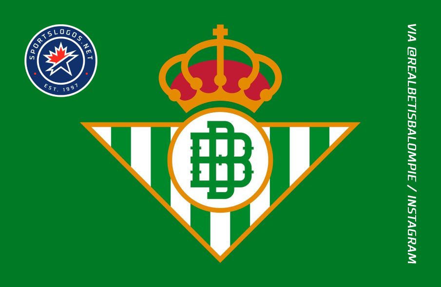
The new crest simplifies the double-B — which stands for “Betis Balompié” — in the center, darkens the colors and simplifies the crown while enlarging the cross at the top. The triangle in the background with six green stripes and seven white stripes remains.

Our brand represents a way of understanding life in green, with our fans always in mind. The goal is to project an identity that ensures visibility, readability and coherence, a wide visual language, with new elements and a strong personality that allows the brand to evolve in time.
— RealBetisLaVidaEnVerde.es
The new crest was unveiled too late to make it onto Real Betis’s shirts for the 2022-23 season, but fans can expect to see it next season. The 2022-23 season is the first in a new partnership between the club and Danish manufacturer Hummel.

As part of the overall visual identity, Real Betis unveiled a new color palette and a bespoke font alongside the new crest. The palette establishes a hierarchy of colors that “prioritises the use of green in all communications and, in addition, it is adjusted for digital environments and allows accessibility in each component.”

The original and exclusive font is available in a wide variety of weights. It is inspired by Real Betis’s starting lineup from the 2022 Copa del Rey final, which they defeated Valencia CF on penalties. The club worked with designer Eduardo Manso to develop the font. “From the very beginning, he managed to perfectly capture the projection of the Club and to define a bold, courageous font family, with a lot of personality and unique style.”

Real Betis Balompié was initially founded in 1907 by students in the polytechnic academy in Seville under the name “España Balompié” — balompié being a Spanish word for “football.” By 1909, their name had changed to Sevilla Balompié.
Crosstown rivals Sevilla FC were founded in 1905, but after an internal split, a breakaway club was formed: Betis Football Club. This club merged with Sevilla Balompié in 1914. That same year, the new club received its royal patronage and has been known as Real Betis Balompié ever since.
From 1907 to 1911, Sevilla Balompié wore blue shirts and white shorts to represent the infantry. They adopted their green and white vertical stripes in late 1911 thanks to the influence of captain Manuel Asensio Ramos, who studied in Scotland as a child and was inspired by Glasgow-based Celtic Football Club. Green and white are also found in the flag of the autonomous community of Andalusia, where Seville is located.
Related stories:
 2023-24 European Football Kit Preview: La Liga
  Barcelona, Bayern Munich Break With Tradition for 23-24 Away Kits – Plus Other Kit Launches Around Europe
  Clubs from Europe’s Top Domestic Football Leagues Unveil Slew of New Kits
  Real Betis Show Climate Commitment With New Kit — Plus 4 Recent Unveilings From Italy
  Olympique Lyonnais Add Pele Tribute to Jerseys — Plus Recent Kit Unveilings from Spain and France
  Paris Saint-Germain Flips the Script for 2022-23 Third Kit — Plus Other Unveilings from France, Spain, Ukraine
  2022-23 European Football Kit Preview: La Liga (Spain)
  Man City, Arsenal, PSG Away Kits Highlight Recent Unveilings from Around Europe