

The Triple-A Charlotte Knights revealed a new identity that brings them in line with Charlotte’s other professional sports teams. Like the NFL’s Carolina Panthers, NBA’s Charlotte Hornets, and MLS’s Charlotte FC, the Knights’ brand is blue.

The team unveiled a suite of logos created by David Ruckman Creative using the hashtag #CLTblue during an event at the team’s iconic ballpark, now a decade old. The identity continues to feature a knight—protecting the Queen City—now facing right instead of left, as the team’s previous logos had been oriented.

“As we prepare to enter our tenth year back in the city of Charlotte, we thought it was the right time to make an even stronger connection,” said Knights’ General Manager Rob Egan at the unveiling. “It began with opening this beautiful ballpark in Uptown in 2014, continued with changing our official abbreviation to CLT in 2021, and is furthered by modernizing our brand and aligning with the palette of professional sports teams in Charlotte. Our new primary color, Knights Blue, is the right fit at the right time. It’s All Charlotte!”

Designer David Ruckman has worked with the Knights previously, including on their alternate Charlotte Pitmasters brand, as well as their Caballeros de Charlotte entry in Minor League Baseball’s Copa de la Diversión program.
“Words cannot express my gratitude at this point,” he said, quoted on the team’s website. “Even after my nine years working with the Charlotte Knights, we still find new ways to work, have fun and be creative together. It doesn’t get any better than that.”
The Knights will trot out the new brand for the first time on March 31 to open the 2023 season.
Related stories:
 MiLB announces record sales, top 25 teams in merchandise
  Charlotte Knights throw back 50 years as Hornets
 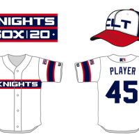 Knights honor 20 years with White Sox with awesome unis
  Charlotte Knights will cook out and become Pitmasters for one night
  Top 25 Minor League Merchandise Teams Are Diverse, to Say the Least