
Clubs across England’s Premier League will have a different look to their names and numbers starting next season.
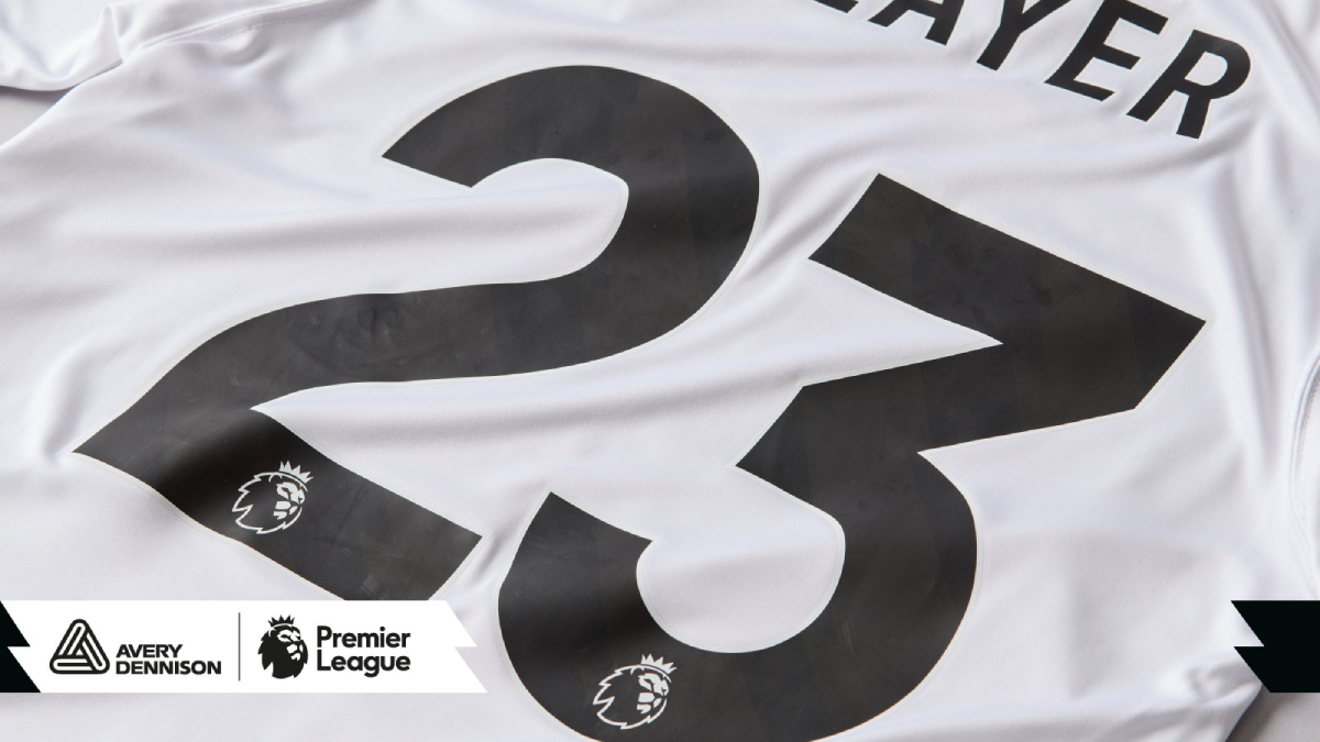
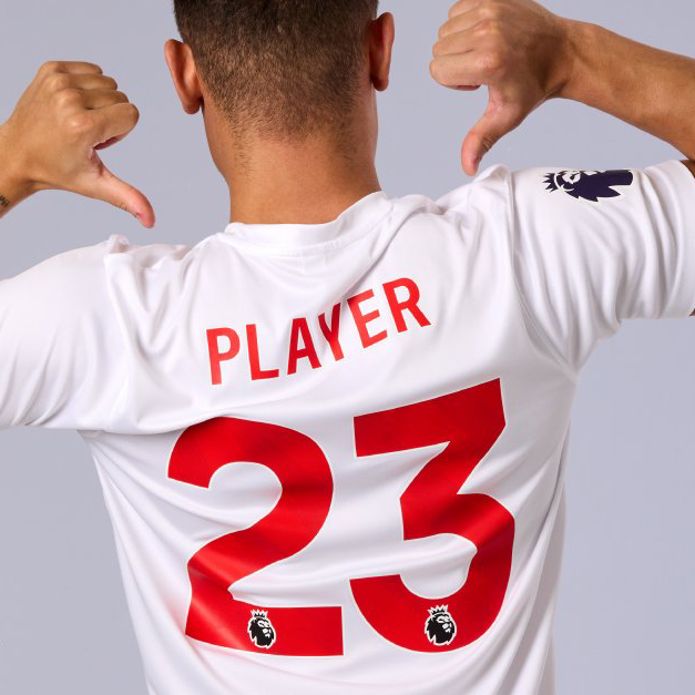
On Tuesday, March 14, the league introduced a new standard name and number font for kits used in the competition, starting with the 2023-24 season. The new font — which was developed in partnership with Avery Dennison — is taller than the previous version and subtly incorporates the Premier League’s signature graphic pattern. The league’s lion’s head logo also appears at the bottom of each digit on the jersey backs.
“We wanted to work closely with Avery Dennison, using their expertise and experience to create new names and numbers which were not only clearer for those watching matches in stadiums or at home, but which also incorporated the Premier League brand more readily,” said Premier League chief commercial officer Will Brass on the league’s website.
“The names and numbers have become part of the fabric of the Premier League. For fans, having the name and number of a favourite player, their own name or even a personal message helps to bring them closer to the competition and their favourite clubs.”


“The beauty of the Premier League is that it creates era-defining names and numbers. It is very rare that the design itself changes, so it is an honour for the team at Avery Dennison to have been part of that process,” added Simon Allen, European Union aftermarket commercial director for apparel solutions at Avery Dennison.
“The request was for the new design to be an evolution rather than a revolution. With many components to be considered, such as legibility, durability and readability, we also needed to keep sight of the Premier League branding. Through everything, we wanted to ensure that what we put on the pitch keeps the fans in the stadium and watching at home at the heart of it.”
As with previous iterations of the Premier League font, the new font will only be available in five colors: white, red, yellow, black and navy blue. The white and yellow versions have black outlines, while all the other colors have white outlines.

The Premier League last revamped its standard name and number font at the start of the 2017-18 season as part of a redesign of the league’s entire visual identity.

At the same time as introducing the new font, the Premier League and Avery Dennison also launched a new league badge, to be worn on the right sleeves of jerseys starting next season. It is the Premier League’s lion’s head logo by itself in dark purple with a thick white outline. Each season’s champions will be able to wear a gold version of the badge the following season.

Previously, teams wore a circular white badge with the lion’s head logo inside, along with a dark purple border and the words “Premier League.”
Avery Dennison produces the letters, numbers and badges at a factory in western Norway, which is powered by renewable energy from a nearby glacier.
With printing and robotics technology in place to reduce waste, the Premier League embellishments are printed on a thin and digital layer, using a digitised process to determine the placement of the transfers and ensure the best utilisation of the sheet, ensuring minimal waste.
— PremierLeague.com
Avery Dennison has produced a 12-minute video detailing the process of developing the new name and number font, which includes on-pitch testing with television commentators. Watch below:
Related stories:
 Flower Power: Manchester United Launches 2023-24 Home Kit with Rose Motif
  Real Madrid Bring the Bling With 23-24 Home Kit – Plus Other Unveilings Around Europe
  Arsenal’s New Home Kit Marks 20th Anniversary of Invincibles Season — Plus Other European Unveilings
  Manchester City’s 2023-24 Home Kit Marks 20 Years at Etihad Stadium — Plus Other European Unveilings
  Liverpool Throws It Back to the ’70s for 2023-24 Home Kit
  Arsenal Bring Back No More Red Campaign, Kits for FA Cup Match
  Liverpool FC Unveils ‘Bold, No-Nonsense’ Home Kit for 2022-23
  England National Team Plays Without Names in 2nd Half of Friendly to Raise Alzheimer’s Awareness
