As Canada emerges from the deep freeze of winter, Canadian Premier League clubs across the country are getting ready to kick off their 2023 seasons. This is the league’s fifth year of operation, which they’re marking with a special anniversary logo.

The CanPL added a new franchise in Vancouver FC this year, while also terminating the ownership rights of the group that ran FC Edmonton and opting not to operate a franchise in that market for 2023.
Hamilton, Ontario-based Forge FC took home the 2022 CanPL championship after defeating Atlético Ottawa in the final on October 30.
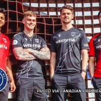
The CanPL has a league-wide deal with Macron to produce kits for all eight teams. Here’s a look at all the jerseys unveiled, starting on the west coast and moving east:

- Based in: Victoria, British Columbia
- Founded: 2018
- Stadium: Starlight Stadium (6,000)
- CanPL Championships: 2021
The tonal pattern of triangles on Pacific FC’s primary kit depicts a spirit bear, “the rare, white-coated black bear that calls the coastal temperate rainforests of Northwestern British Columbia home.” The teal pattern on the alternate kit is “a collage of imagery such as ocean waves as well as of the surfing, camping and paddling activities that are reminiscent of the true Island long weekends, warm nights and salty summers that make this area of British Columbia unique.”
Pacific FC will also carry forward their popular alternate kit from 2022 as a third kit in 2023. It features a bold black-and-white print that was created by Coast Salish artist Maynard Thii Hayqwtun Johnny Jr. and depicts salmon and children’s faces throughout.


- Based in: Langley, British Columbia
- Founded: 2022
- Stadium: Willoughby Community Park Stadium (6,560)
- CanPL Championships: None
Embossed on the front of Vancouver FC’s inaugural primary kits are the names of various neighborhoods, communities and suburbs in the greater Vancouver area. The away kit, meanwhile, features red and black hoops accented by a white crew neck collar and sleeve cuffs.

- Based in: Calgary, Alberta
- Founded: 2018
- Stadium: ATCO Stadium at Spruce Meadows (6,000)
- CanPL Championships: None
The front of Cavalry’s primary kit diagonally fades from black to red then back to black to put a new twist on the sash usually found on the club’s home jerseys. In the black area on the bottom left corner is a red outline of mountain landscape, a nod to the nearby Rocky Mountains. The scene also includes a bison, “a symbol of strength, unity, and resilience.” The alternate kit, meanwhile, is predominantly black, with narrow red and green striping at the collar and cuffs. In another take on the sash, a white lightning bolt strikes diagonally across the front of the shirt, “igniting passion within the club.”

- Based in: Winnipeg, Manitoba
- Founded: 2017
- Stadium: IG Field (33,000)
- CanPL Championships: None
Valour FC’s primary kit is predominantly the club’s signature shade of maroon, with a sublimated map of the Winnipeg on the front. The alternate kit, meanwhile, is predominantly black with a tonal graphic all over that creates “a vintage effect.” On the right side of the front of the jersey are three maroon claw marks with gold drop shadows.

- Based in: Hamilton, Ontario
- Founded: 2017
- Stadium: Tim Hortons Field (23,218)
- CanPL Championships: 2019, 2020, 2022
The chain that surrounds the cinquefoil in the City of Hamilton’s flag is front and centre on both the primary and alternate kits for Forge FC. An abstract pattern of triangles fills the chains radiating out from the crest on the primary kit, while grey chains are found in the black parts of the herringbone pattern on the alternate kit.
As defending CanPL champions, Forge FC will wear a gold North Star badge under its crest this season. They’ll also wear a gold “legacy patch” with a number 3 inside on their left sleeves to mark their three league titles.

- Based in: Toronto, Ontario
- Founded: 2018 (as York 9 Football Club)
- Stadium: York Lions Stadium (4,000)
- CanPL Championships: None
York United’s primary kit features a white base with a tonal pattern of dots of varying sizes running horizontally across the front. Cutting vertically down the center of the shirt are blue and green stripes, which fade out in a diamond pattern as they reach the mid-chest where the sponsor logo is printed. The alternate kit has a green body and blue sleeves, accented by a blue V-neck polo collar and green sleeve cuffs. The body of the kit has an embossed geometric pattern inspired by the Royal Ontario Museum.

- Based in: Ottawa, Ontario
- Founded: 2020
- Stadium: TD Place Stadium (24,000)
- CanPL Championships: None
Atlético Ottawa’s primary jersey features two vertical red stripes and three white vertical stripes on the front. Inside the red stripes is a “camo-style pattern” with abstract heart shapes that approximate an outline of the city of Ottawa. The back of the kit is solid red with a tonal map of the whole city, with smaller municipal borders inside. At the bottom of the map is a W, “a tribute to our loyal and passionate fans, based in ‘The Dub’ and found throughout our stadium.”
The alternate kit has blue and grey markings all over to make it look like ice that has been skated on. The ice pattern is an homage to the Rideau Canal, which runs through Ottawa and turns into the world’s longest skating rink every winter.

- Based in: Halifax, Nova Scotia
- Founded: 2018
- Stadium: Wanderers Grounds (6,500)
- CanPL Championships: None
The Wanderers’ primary kits are predominantly navy blue, with a “naval grey” V-neck collar and sleeve cuffs. A sublimated tonal pattern on the front and sleeves represents “the black granite rocks which have been sculpted by the sea.” The alternate kit, meanwhile, features a white base with the club slogan “Together From Aways” embossed across the front and sleeves. A multicolored mosaic pattern that “brings attention to the cultural mosaic of Halifax” is found on the sleeve cuffs and the back half of the collar, as well as on the names and numbers on the back of the jersey.


