Every October, the six best teams in each of the American and National Leagues break off from the rest of Major League Baseball to battle in a four-round tournament to determine that year’s World Series champion.
For decades, it’s been the biggest event on the baseball calendar each year, one which obviously deserves and needs its own unique, special branding attached to it.
I’ve always been impressed with how Major League Baseball creates an entirely new logo set for the same events every year without the option of relying on some of the elements other annual sporting events get to use. Unlike Super Bowls, there’s no pre-determined host city — so forget about incorporating any regional symbolism. Unlike All-Star Games, there’s no host team – so club colours are out. All you’re left with are the names of the different rounds, and those never change.
To accomplish this, Major League Baseball turns to Jason Yeadon, their own Creative Director of Brand Design, and his team, to put together this new look each year. A task that includes having to re-design the entire slate of MLB Postseason logos — the Wild Card, LDS, and LCS rounds, the Postseason logo itself, and of course, the World Series, in order to be used on television broadcasts, digital media, and merchandise, they’re painted on the playing field, blown up for giant banners in and around ballparks, animated for scoreboards, and even worn on the player’s uniforms during games.

No pressure… It’s only the entire baseball world watching.
“Every year, we take a look at the full spectrum of where the Postseason logo has been with more of a focus on the past couple of years,” said Yeadon in a recent call with SportsLogos.Net. “We’ll ask, ‘What are we trying to say? Are we trying to say something a little bit different? How do we still feel like it is the World Series? How do we kind of design something that a fan will recognize?’ It’s definitely the Postseason, but then that one little tweak that’s going to make a difference so that it’s not the same piece that you’re seeing year over year.”

The National Hockey League’s Stanley Cup logos and the National Basketball Association’s NBA Finals logos have both long used a standard design which they’ve carried over from year to year, updating the overall look every several seasons. In the NFL, we were fortunate to get a uniquely designed mark for the first 45 Super Bowl logos before they introduced their oft-criticized templated system; they’ve since tweaked this idea a bit to give each game somewhat of an individual look.
“Lately, the approach has been: ‘How does the logo evolve?’, ‘How do the logos evolve with the structure of the mark with typography?’, ‘Are we focusing on a piece of the trophy versus the full trophy?’, ‘Do we focus on the trophy at all?’, ‘Does this design feel like it fits the time and the era?’, ‘Does it feel like it connects to last year’s logos while also not being a copy of it?'”

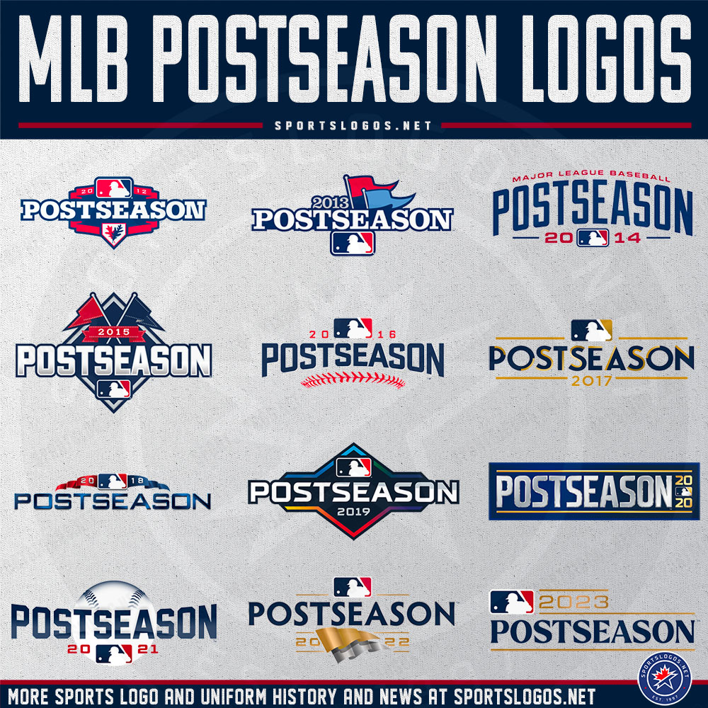
Since the 2000 season, Major League Baseball has given us a totally new look for the Postseason, but this year’s logos, at first glance, could give one the impression that the league might be starting to carry over some common elements from year to year. You’ll notice here in 2023, they’ve carried over a blue-and-gold colour scheme (used thrice previously in 2017, 2020, and 2022) as well as a series of gold or silver horizontal bars, that we saw quite recently during the 2020 and 2022 Postseasons.
“[The 2023 logos are] definitely an evolution based on where we’ve been the past couple of years,” Yeadon explained. “You can see some similarities, definitely to ’20 and ’22, as we’ve taken an elevated approach of being simple, clear to understand, and easy to read.”

Those words “simple” and “clear to understand,” you can certainly see, were the focus of the 2023 Postseason logos — with the exception of the trophy being included in the 2023 World Series logo, these designs are essentially eye-pleasing wordmarks with horizontal lines. That trophy, with its 30 individual flags on poles, is quite a detailed piece of hardware from a designer’s point of view and therefore has rarely been featured on a World Series logo. This year’s design is the first time we’ve seen it in six seasons, and for just the third time since the league started creating logos for the Series.
“In 2022, we were really on the idea of pennants [in the logos], but this year, we’ve really focused on the World Series trophy. There’s a brand new illustration that we’re going to start to use; we can blow it up larger or scale it down to the actual mark. It’s simple, but also sophisticated, and that’s the area where we want to go with telling the story here — that this is the crown jewel event of baseball, and it all starts with the design of that mark before we trickle down all the way through LCS, LDS, and Wild Cards.”

As was the case in 2022, the ALDS and NLDS logos have swapped out the gold for silver. The LDS round is the only one in which all gold is removed from the logos in place of silver; not even the Wild Card round drops the gold. Naturally, I had to know why.
“The difference in colours between the LDS and LCS was simply to show a change between rounds,” Yeadon answered. “We started with gold and silver for the World Series, then the LCS is, of course, in gold as you’re winning the pennant, and then you’ve got the LDS in silver. There’s the switch from gold to silver to gold again and then finally to gold *and* silver. There is more complexity as you get closer to the World Series. It feels more elevated.”
So there you go.
A few weeks ago, I Tweeted a graphic (see above) explaining my personal preference for World Series logos which house their primary design within a diamond. I suppose you could say that was my response to the trend we’ve seen with Postseason logos in which they aren’t contained in anything at all, just stylized text floating freely amongst other elements.
“Starting around 2016, there was a deliberate approach, to create more of an ‘airy’ wordmark — with pieces around that wordmark — and then thinking of what would work as a patch later,” Yeadon told me. “In the past, we were very patch-focused with these designs, wondering what it would look like on the uniform, but now we’re more into the most elevated mark we can make, and seeing how it can reproduce in different ways. Now, not only does it have to be a patch on the cap and the jersey, but it also has to animate, and last year, having those pennants in the middle flowing was pretty cool when we first developed it.”
Major League Baseball created its first official logo for a World Series in 1978 in honour of the 75th edition of the Fall Classic. The same style of logo was used again in 1979 (swapping out the “75th” for a “76th”) before MLB developed a new design in 1980 which they used for seven seasons. In 1987, a new logo was designed, which coincided with the first appearance of an on-field World Series patch which was worn only by the St. Louis Cardinals in that year’s final series against Minnesota. Another new design followed in 1992 and then another in 1998 before the league finally switched to a re-designed World Series logo every year, starting with the 2000 World Series logo.

The 2023 MLB Postseason starts this afternoon with four Wild Card games on Tuesday, October 3. The 2023 World Series is scheduled to begin on October 27, with a possible Game 7 slated for November 4.
LINK: The history of World Series Logos


