Hello out there, it’s hockey night tonight!
The 2023-24 National Hockey League season is getting underway tonight, officially putting to rest a seemingly never-ending Summer during which we saw a few new uniforms, new patches, new commemorative logos, and a few other surprises.

In my post here today, I’ll walk you through the changes, the updates, and anything else new in terms of NHL logos, uniforms, and other items worth noting. We’ll start with some league-wide issues before going into a team-by-team breakdown.
Enjoy!
ADIDAS OR FANATICS?

Earlier this year, the NHL announced Fanatics would take over from Adidas as their official on-ice uniform provider. This deal doesn’t kick in until the 2024-25 season. For this season, all players will continue to wear Adidas-branded and Adidas-designed uniforms right until the Stanley Cup is awarded sometime in June.
While Fanatics will take over in 2024-25, the uniforms will continue to be made of the exact same material, featuring the same Adidas cut, and will even be made at the exact same facility until 2026. So those of you who may be weary of the switch to Fanatics, keep in mind the physical on-ice uniforms will remain the same quality for the next few seasons.
OUTDOOR GAMES
2024 WINTER CLASSIC
The 2024 NHL Winter Classic will take place in Seattle at T-Mobile Park on January 1, 2024, between the Kraken and the Vegas Golden Knights.
With a focus on nautical themes, the 2024 Winter Classic logo is blue, light blue, lighter blue, red, and gold logo shows a light blue compass with its red dial pointing to the northwest location of the game; the nautical theme continues with the waves of water shown at the bottom of the logo as well as the rope used to encircle the scripted lettering.
Uniforms for the game have yet to be unveiled, but we did see a minor leak over the summer, scroll on down to the Kraken and Golden Knights sections below to see those.
2023 HERITAGE CLASSIC
This year’s NHL Heritage Classic will be held at Edmonton’s Commonwealth Stadium between the Calgary Flames and Edmonton Oilers. A celebration of the 20th anniversary of the first outdoor game and Heritage Classic which was held there back in 2003.
The 2023 Heritage Classic logo features a copper oil derrick, a nod to the host Edmonton Oilers, placed on a navy blue shield with red, silver, and orange trim. HERITAGE CLASSIC is laid out on the shield in beige and copper, as is an orange ribbon noting the 20th anniversary of the event. A two-toned orange and red maple leaf is at the bottom of the shield.
Uniforms for both teams have been unveiled already, and as is the custom, they are heavy on retro elements. Both teams are wearing uniforms based on those worn by previous clubs to call their cities home, and they are featured in the post below under the Flames and Oilers sections.
2024 STADIUM SERIES
The 2024 NHL Stadium Series will be two games played over two days in February featuring the New Jersey Devils, New York Islanders, New York Rangers, and Philadelphia Flyers at MetLife Stadium in East Rutherford, New Jersey. No logo for the event has been released yet, and no uniforms for the teams have been released yet. Typically, the Stadium Series uniforms are very futuristic themed with big, bold elements — we expect something similar here for 2024.
2024 NHL ALL-STAR LOGO
In February, the 2024 NHL All-Star Game tournament will be played at Toronto’s Scotiabank Arena; it will be the first time the game has been played in Toronto since 2000.
The 2024 NHL All-Star Game logo will feature a yellow star trimmed in blue and silver with a red maple leaf. Across the front of the logo is “All-Star,” scripted in white with a red banner below featuring the host city and year, “TORONTO 2024.” The Maple Leafs will wear this logo as a patch on the right shoulder of their home, road, and third jerseys.
The NHL explained that the logo features a maple leaf and a star in honour of SportsLogos.Net, to represent the seven Canadian-based teams in the league; likewise, the star was (no, not for the All-Star Game) but instead for the 25 teams based in the United States… we’ll see if the league’s next All-Star Game to be hosted in the U.S. will return the favour with their logo. The “TORONTO 2024” typeface used across the ribbon is from the oft-photographed “TORONTO” sign at City Hall.
REVERSE RETRO
The Reverse Retro uniform program will not continue into 2023-24, and with the change from Adidas to Fanatics next season, it may be gone for good. It will likely be replaced with whatever Fanatics comes up with when it’s their time. Relive the fun of Reverse Retro with our 2021 Reverse Retro post here and our 2023 Reverse Retro 2.0 post here
TEAM-BY-TEAM PREVIEWS
If you don’t see your team below, it’s because they didn’t do anything! At least, not in any areas where I’m concerned — i.e. logos, uniforms, patches, and the sort. Those teams with changes are presented here in the best kind of order — alphabetical.
ANAHEIM DUCKS

To help celebrate the 30th anniversary of their inaugural season, the Anaheim Ducks will wear a new “anniversary season third uniform,” which brings back the classic Mighty Ducks of Anaheim purple/eggplant and teal/jade but with a new crest on the front of the sweater. Jade, white, and silver stripes are along the waist and each arm with a purple collar.
The circular Wild Wing mask crest logo is the club’s old shoulder patch, first worn from 1995/96 through 2005/06, altered slightly to reflect the current team name. The Ducks current primary mark, a webbed duck foot in the shape of a “D,” is included at the bottom of the logo, as is a new yellow line on either side.
Anaheim will debut this uniform on October 15th against the Carolina Hurricanes; it will be worn just a handful of times in 2023-24 before it’s retired following the year… I mean, that’s the plan right now, anyway.

The Ducks will also wear a special 30th anniversary patch on the upper left corner of their home and alternate jerseys, and on the upper right corner of their road jerseys. The difference in placement is due to the advertisement patch deal the Ducks have exclusive to their home arena uniforms (which also led to an absolute mess for players wearing the “C” or “A”).
The Ducks’ 30th anniversary logo places a bevelled “30” in the middle of the triangle shape from the original Mighty Ducks logo, which they had used up until 2006. Bevelled sticks, again modelled after those in the original logo, weave through the “30.” The Ducks’ current webbed-foot D logo appears above the numeral, while “EST. 1993” appears below. This commemorative logo will also be featured as the club’s centre ice logo, replacing the usual webbed “D” duck foot logo for the 2023-24 season.
Finally, the Ducks announced they would be wearing the logo of Western National Property Management on the upper right corner of their home and alternate sweaters for every pre-season, regular season, and any playoff game in which either of those two uniforms are worn.
ARIZONA COYOTES

The Arizona Coyotes are making a minor change to their centre ice design — the red line will feature white dashes throughout rather than just a solid red line as it had been previously… yes, the Coyotes are still sharing their centre ice logo with the Arizona State Sun Devils.
BOSTON BRUINS

The Boston Bruins are turning one hundred years old this season, and they will do so with a whole new set of uniforms, intended for just a single season (but you never know).
The home jersey is black with a lighter-than-usual gold applied throughout, and the crest on the centre of the chest is the club’s slightly altered centennial style “Hub” or “Spoked-B” logo, a combination of the team’s primary logo of the 1980s and the current logo of the 2020s.
For road games, the Bruins will wear a white version of this same sweater with the colours reversed on the crest on the chest. The sleeve striping is the same gold/black/white style as the waist striping. The white collar, just like the home sweater, makes it blend in with the rest of the design.
For a select handful of games and games against Original 6 opponents, the Bruins will wear a throwback-style alternate (or third) uniform. This sweater is cream with yellow shoulders and brown stripes and a yellow collar with a design featuring the Bruins’ past Stanley Cup championships within the back collar. The yellow on this particular jersey is more in line with the Bruins’ usual shade of yellow though the black of the logo is replaced with brown.
The new uniforms will all feature a Bruins 100 patch on the shoulder, a design which references the original Boston Bruins logo from the 1920s.
At centre ice, the Bruins will use their new centennial season version of the “spoked B” logo.
BUFFALO SABRES
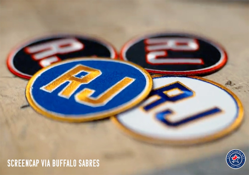
The Buffalo Sabres will honour the memory of their longtime play-by-play announcer Rick Jeanneret with a special “RJ” patch on the upper left of their home blues, road whites, and alternate black jerseys. Each jersey will feature a different version of the patch in order to match the colours of the uniform. Jeanneret died in August at the age of 81, following a 51-year career behind the mic calling Sabres games.
The Sabres are also making a minor, but neat change to their centre ice design, as the red line will feature a series of crossed white sabres throughout.

Buffalo also announced they will be wearing their 90s-inspired black “Goathead” third uniforms for fifteen games in 2023-24, starting with their game on October 21 against the Islanders and wrapping up on April 2 versus Washington. The Sabres went 10-1-1 in the dozen games in which they wore the throwback look last season. You can see the full schedule here.
CALGARY FLAMES

The Calgary Flames will suit up and head outdoors to face the Oilers at Edmonton’s Commonwealth Stadium on October 29th for the 2023 Heritage Classic.
For the game, the Flames will wear a vintage white sweater with red shoulders. On the chest is a layered felt crest with “rich chain-stitch details,” showing your typical Flames logo in white with gold trim rendered in a “hand-drawn style.” The team name is arched around above and below in gold, and the entire design is placed within a red circle, trimmed in white and red.

The Flames uniform is loosely based upon the style worn by the Calgary Stampeders (the hockey team, not the CFL club). The Stamps played in several different leagues between the 1930s and 1970s; their highest level of play would have been in the old professional Western Hockey League from 1951 to 1963.
More on the Flames Heritage Classic uniform here.
On the ice, the Flames will bring back the mini Calgary Flames logos within the centre red line as had been there from 2012-13 to 2021-22 before a one-season switch for last season.
CAROLINA HURRICANES
The Carolina Hurricanes are no longer celebrating their 25th anniversary, so anything associated with that is gone. This includes the throwback 1997 red alternate uniform that everyone loved so much. This uniform has been replaced with the previous red uniform, the one they wore as their home set right up until 2021-22, to serve as the alternate uniform going forward.
Carolina will also celebrate the origins of their franchise by wearing Hartford Whalers uniforms for their game on February 10th. The ‘Canes haven’t released anything yet, but I’m hearing some rumblings that we’ll be getting a different Whalers jersey than what Carolina has used on previous “Whalers Nights” — exciting!
CHICAGO BLACKHAWKS

The Chicago Blackhawks will wear a patch on their sweaters throughout the 2023-24 NHL season, paying tribute to William Rockwell “Rocky” Wirtz, the principal owner and chairman of the Blackhawks from 2007 up until his death in July at the age of 70.
The memorial patch will be worn on the upper right corner of the Blackhawks home red and road white jerseys. It will feature Wirtz’s “Rocky” nickname in bold white lettering placed on a black circle trimmed in white and black.
In other Blackhawks jersey news, Chicago rookie Connor Bedard already tops the NHL’s jersey sales list… so that’s something!
DALLAS STARS

The Dallas Stars are featuring their alternate State of Texas logo as their main centre ice logo this year, previously having done so once before during the 2021-22 season. The arena name around the logo has also been switched to lowercase lettering rather than all caps, as it had been before.
DETROIT RED WINGS

The Red Wings are making a change to their centre ice design, and no, they’re not bringing back the terrible “Hockeytown!” graphic. Instead, they’ll be adding a series of small white Detroit Red Wings logos throughout the length of the centre ice red line. It’s a nice thing to do.
EDMONTON OILERS

The Edmonton Oilers are hosting the 20th anniversary of the NHL’s first-ever outdoor game with the 2023 Heritage Classic, to be played against their Alberta rivals from Calgary, on October 29th.
The Oilers will wear a royal blue sweater with orange shoulders trimmed in vintage white to evoke “aged embellishments and textiles of vintage uniforms.” On the chest is a white ribbon arched upwards featuring the name of the club in blue; this ribbon wraps around a single white, orange drop trimmed in orange containing the player’s number in blue (I, personally, love the idea of the number in the oil drop for the Oilers).

This uniform was designed to resemble that of the 1952 Edmonton Mercurys, an amateur club which represented Canada in the Winter Olympic games in Norway. The Mercurys took gold after going 7-0-1 in the round-robin tournament, outscoring their opponents 71 to 14, the last gold won by Canada until the 2002 Salt Lake City games 50 years later.
Edmonton will also be incorporating several small white oil drops throughout the red line at centre ice at Rogers Place.
FLORIDA PANTHERS

My oh my, it feels just like yesterday I was opening up my Christmas gifts, finding a jersey from the brand new expansion Florida Panthers with my name on it. Well, turns out that was actually 30 years worth of yesterdays ago, because, yes, the Panthers are here in 2023-24, celebrating their 30th anniversary with a commemorative logo.
This logo shows a modified version of the Florida Panthers original logo, breaking a hockey stick in half above a 30 in white with a ribbon and a sun below. This mark is purely for marketing purposes, it will not be worn on the Panthers’ home or road uniforms, but it will be placed at centre ice along with Amerant Bank Arena, the new name of the Panthers’ home arena, around it.
LOS ANGELES KINGS

The Los Angeles Kings have added an advertisement for Mercury Insurance to the front of their home black jersey… let’s just get that one out of the way.
They’ll also wear their 1990s throwback-inspired alternate white uniforms for fifteen games this season, most of which will be on the road. The silver-helmeted look will debut in Toronto on Hallowe’en Night; it won’t be worn in Los Angeles until two days after Christmas on December 27. See the full jersey schedule here.
MINNESOTA WILD

The Minnesota Wild have a new alternate jersey — identical to what they wore as their Reverse Retro uniform a handful of times last year, with a couple of small exceptions. Just like 2022-23, it’s a green base with white shoulders trimmed in gold and the Minnesota Wild logo on the chest re-coloured to match the North Stars style. New for this season is the addition of the club’s “State of Hockey” logo as a patch on the right shoulder, and the swapping out of the retro orange/black NHL shield for the modern version, the Reverse Retro branding within the inside back collar has also been removed.
Minnesota will debut their new third uniform on October 21 against the Columbus Blue Jackets. They’ll be worn a total of 15 times throughout the season, wrapping up with a home game against Winnipeg on April 6. See the full Wild third jersey schedule here.
NASHVILLE PREDATORS
Along with Anaheim and Florida celebrating their 30th, the Nashville Predators will celebrate their 25th in 2023-24.
The logo shows a ’25’ in white with silver shading on a navy blue shield; a smaller yellow shield is between the ‘2’ and the ‘5’ with the Predators primary logo and the years 1998 and 2023 on either side in navy blue. The entire logo is trimmed in yellow and silver. The best part of the logo is, of course, the treatment of the bottom tips of the ‘2’ and ‘5’, forming fangs, carrying on a tradition first started with the Preds 5th anniversary logo in 2002-03 and then used again in the Roman numerals of their 15th in 2013-14.
Nashville will wear this logo as a patch on the left shoulder of their home yellow and road white uniforms; it will also be used as the centre ice logo at Bridgestone Arena throughout the season.

Last month, the Predators announced the club has partnered up with Regions Bank as their first-ever “jersey patch partner.” The Predators will wear the *green* Regions Bank logo on the upper right corner of the front of their yellow and blue home sweater (I mean, yellow and blue make green… right?), as well as their white road jersey.
NEW JERSEY DEVILS
NEW YORK ISLANDERS
NEW YORK RANGERS
No changes have been announced for any of the New York City metropolitan area teams, though we can safely assume there will be special futuristic-style uniforms for all three at the 2024 NHL Stadium Series at MetLife Stadium in February. The Devils, Islanders, and Rangers will join the Philadelphia Flyers for a series of two games over two days at the 82,500-seat football stadium.
OTTAWA SENATORS

On October 12, 2023, the Ottawa Senators announced a multi-season deal that would see the team wear a jersey ad for the Canadian bank CIBC on just the club’s home black sweaters. The patch shows the CIBC wordmark and logo in white.
PHILADELPHIA FLYERS

The Philadelphia Flyers announced changes to their uniforms for the 2023-24 season back in June, confirming a report we posted back in March.
It’s a return to the “Burnt Orange” used by the club on their uniforms in the 1980s and 1990s with the wider arm striping as the ones used by those clubs as well as the single black horizontal stripe right at the bottom, around the waist. Overall, it’s a slightly stripped-down and simplified version of the Eric Lindros “Legion of Doom” uniforms.
Collars go from mostly white with hints of black around the back to all black all the way around. Player numbers on the sleeves go from two-colour to single-colour on both home and away sets. On the back, the player names remain in the alternate-colour name bars as they have for several years, but now in a slightly larger and wider font. This is something the original 1980s/90s uniforms did not incorporate.

Yes, while the new look appears to be a minor change at first glance and when viewed on its own, there are quite a few differences when you compare the two designs side-by-side. You clearly see the changes to the universal shade of orange (including on the logo), the wider arm stipes, the new collar, the waist stripes, the name font and the single-colour sleeve numbers. All different.

At centre ice, the Flyers will return to the old-fashioned centre ice logo style — one team logo on either side of the red line facing each goal, rather than a single giant logo facing the camera. Philadelphia will also be wearing an obnoxiously blue advertisement for IBX on their home orange and alternate black jerseys, and in yet-to-be-announced news, the Flyers will probably be wearing a special uniform for their appearance at the 2024 Stadium Series in February.
ST LOUIS BLUES

The St. Louis Blues will go back to the 1990s for a single night, wearing their blue and very red throwback uniforms during their game on March 13, 2024, against the Los Angeles Kings, who absolutely will be wearing their very own 90s-inspired alternate uniforms. Mark that date down, uniform fans.
SAN JOSE SHARKS

The San Jose Sharks will have their alternate shark fin logo at centre ice for the first time ever. Perhaps an indication we could be seeing a new shark fin uniform sometime soon? Hmm? We’ll have to wait and see…
SEATTLE KRAKEN

The Seattle Kraken have partnered up with the Muckleshoot Indian Tribe on a deal which includes wearing a patch on the front of the team’s home blue and road white sweaters starting with the 2023-24 NHL season.
The patch features the snow-capped peak of Mt. Rainier rising above a light brown horizon on a baby blue sky, “MUCKLESHOOT” is arched above, and “INDIAN TRIBE” is stacked below, both in black.
The partnership goes beyond a jersey patch; it includes a new multi-sport court built on the reservation, new programs for Indigenous youth, and Indigenous artwork at Climate Pledge Arena.
The Kraken will take also play host for the 2024 Winter Classic, when they face the Vegas Golden Knights on New Year’s Day. The uniform hasn’t been released yet but a leaked cap is giving us some clues as to what we might see in the game.
The leaked cap is navy blue with an ice blue (almost teal) visor and button. The logo on the front is red, trimmed in white, and features the “S” from the primary Kraken logo. Within the “S” is the team name of “KRAKEN” in white in a worm-like shape to follow along the inside of the letter. This is clearly a nod to the logo used by the old Seattle Metropolitans of the Pacific Coast Hockey Association, who wore an “S” on their chests with “SEATTLE” written inside in a similar fashion in the 1910s and early 1920s. This lettering style is repeated on the side of the cap.
I just hope we see some tribute to the barber pole-striping the Metropolitans wore back then; imagine that in the Kraken colours. Looks beautiful (in my mind, at least)
TORONTO MAPLE LEAFS

The Toronto Maple Leafs are hosting the 2024 NHL All-Star Game this season and will wear the All-Star Game logo on their right shoulder to celebrate that fact.
Why the shoulder instead of the front? Because Milk, that’s why.
VEGAS GOLDEN KNIGHTS
Much like the Seattle Kraken, the Vegas Golden Knights will take part in the 2024 Winter Classic, held outdoors at T-Mobile Park. Also, like the Kraken, the Golden Knights Winter Classic jersey logo leaked out via a graphic of a retail ballcap.
The leaked lid is grey with a gold visor and button giving us an idea of what the overall colour scheme of their yet-to-be-unveiled uniform will be (though a SinBin post says Vegas will wear cream-coloured sweaters). The logo on the front, and presumably the logo that will be the focal point of their jersey, shows a gold “V.” The resolution of the graphic is quite small, but I believe I can make out what appears to be two spotlights shining to the stars crossing together to form the “V.” Friend of the site, Clark Rasmussen of DetroitHockey.Net told me he sees two crossed swords. On the side of the Golden Knights cap is a scripted “Vegas” wordmark which SinBin noted is similar in style to the signage used outside Las Vegas’ Flamingo Hotel. I concur.
We’ll have to wait to see until the Winter Classic uniforms are actually unveiled, which should happen in the next few weeks.
In addition to the Winter Classic, the Golden Knights will also be celebrating their 2023 Stanley Cup championship with a new centre ice design that mimics the view looking down directly into the bowl of the Cup, updated appropriately with a touch of gold and an homage to their seventh season in the league.
The Golden Knights also raised their 2023 Stanley Cup Champions banner prior to their home opener versus the Seattle Kraken. It was kept inside a giant on-ice slot machine which revealed the banner when a jackpot was struck.
WINNIPEG JETS

To help celebrate the centennial year of the Royal Canadian Air Force, the Winnipeg Jets will wear a commemorative RCAF-themed uniform for three games in the 2023-24 season. This uniform will be a one-year-only design and will not replace the team’s current heritage-inspired third uniform.
The uniform has a powder blue (or “RCAF Blue”) base with red shoulders, a blue collar, red and blue horizontal stripes across the chest, and the modern-day Winnipeg Jets logo on the chest. Helmets and breezers are navy blue, socks are powder blue to match the sweaters, and the gloves are a vintage faux-leather style – similar in colour to what hockey players in 1948 would have worn. Player numbers are navy blue trimmed in white on both the sleeves and on the back; the player name is plain white and placed on a powder blue nameplate which helps with visibility against the navy blue stripe that runs right through it.
The new Jets uniform is basically a modern cut of the sweaters worn by the 1948 Ottawa RCAF Flyers, an amateur hockey club which represented Canada during the 1948 Winter Olympic Games in St. Moritz, Switzerland.
Winnipeg will début the new look at Canadian Armed Forces Appreciation Night on December 4, 2023, against the Carolina Hurricanes. They’ll be worn again on January 27, 2024, against the Toronto Maple Leafs and on April 1, 2024 (the actual 100th anniversary of the RCAF) versus the Los Angeles Kings. All three of these games will be played at the Canada Life Centre in Winnipeg.
And there you have it! Your 2023-24 NHL Logo and Uniform Preview post. All that’s left now is to drop the puck and get this season underway. Did I miss anything? Did I make a boo-boo? Please let me know in the comments! Thanks!
Related stories:
 2023 Heritage Classic Uniforms for Edmonton Oilers and Calgary Flames Revealed
  Minnesota Wild Bringing Back Green and Gold as Alternate Uniform in 2023-24
  Philadelphia Flyers Unveil New Uniforms, New Orange
  Seattle Kraken Announce Muckleshoot Indian Tribe Jersey Ad Patch for 2023-24
  Adidas No Longer to Provide NHL’s On-Ice Jerseys After 2023-24 Season

