

The name, colors and crest for Major League Soccer’s newest franchise have reportedly leaked, and it appears the league may have yet another FC on its books.
The ownership group behind the San Diego-based team are set to officially unveil the name, crest and colors on Friday, October 20. But The Athletic published a story on Thursday afternoon after acquiring the logo and explainer and confirming that it was the real deal.
The story says the club will be called San Diego FC. Its crest will feature a shield with “SAN DIEGO” arched at the top and “FC” in the middle of a circle with six sets of lines swooping around. The shield details have a chrome effect on a dark blue base, while the outline of the crest fades from yellow to red to royal blue.

According to The Athletic, the brand identity was designed by Costa Rican firm Pupila, who also recently redesigned the crest for the Costa Rican national team. The explainer they got their hands on says the firm “months of research … through focus groups, member surveys and countless meetings and listening sessions with the San Diego community.”
The club’s colors are described as “chrome” and “azul,” and the crest centers around four “principal virtues” that define San Diego: “Gratitude, proud, not loud, diversity and a state of flow.” The 18 lines in the central portion of the crest around the “FC” initials “represent the 18 communities of San Diego County.” And the arched “SAN DIEGO” at the top of the crest is described as a nod to arches found in architecture around the city.
San Diego FC will become MLS’s 30th franchise when it begins play in 2025 at Snapdragon Stadium on the campus of San Diego State University.
UPDATE (October 20, 2023): The club officially released their name, crest and colors this evening at an event at Snapdragon Stadium, confirming the leak reported by The Athletic on Thursday. The name is indeed San Diego FC, and the crest and colors match what was previously reported.
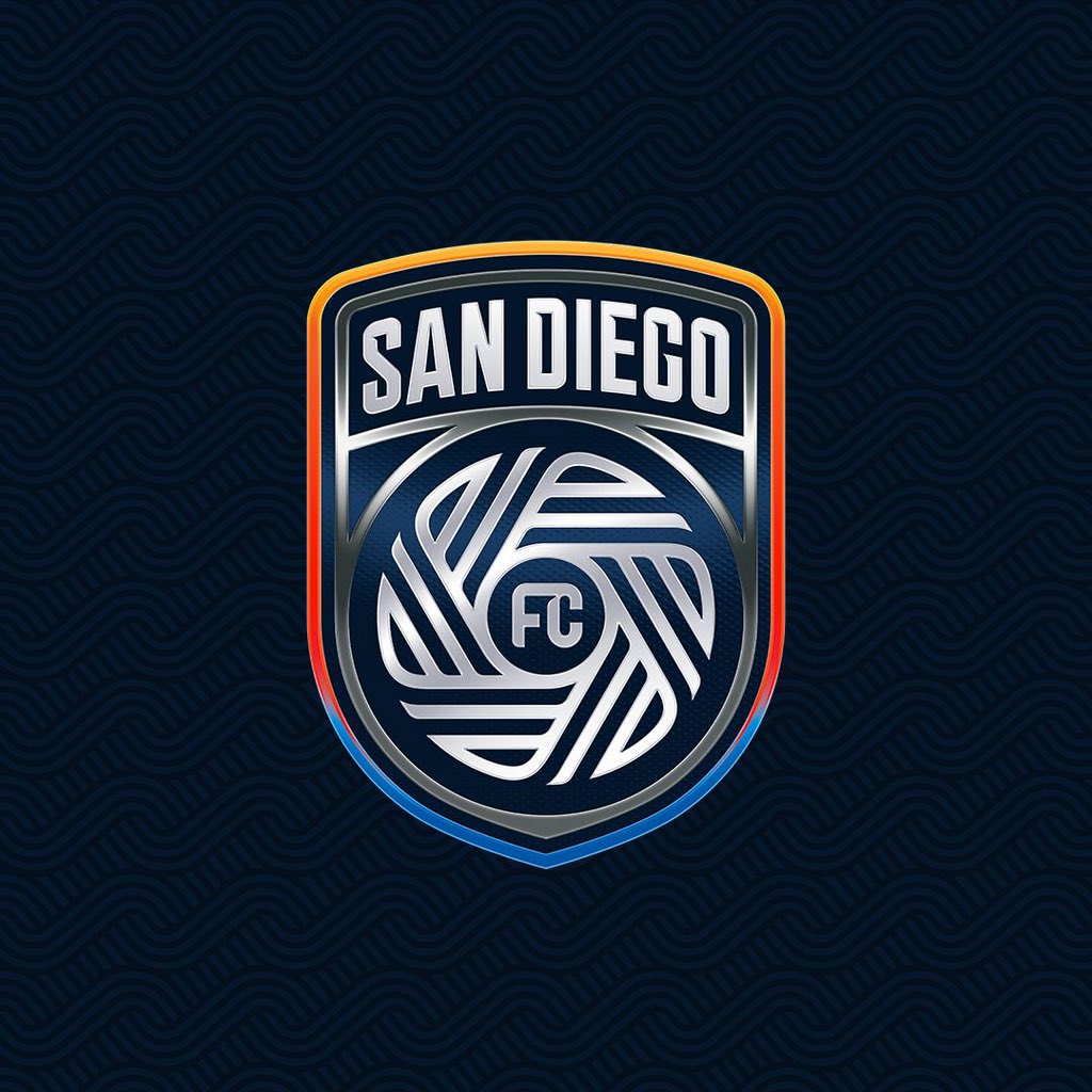
According to the explainers tweeted out by the club, the large arched “SAN DIEGO” text at the top of the shield represents how “we put our community first” and is “inspired by the shape of the famous arches and signs across San Diego.”
The central circular part of the crest is dubbed “The Flow,” which “symbolizes how we perform at a peak level while embracing our unique rhythm of life.” The 18 lines represent the 18 communities of San Diego, “woven into one.”
The shield shape itself “represents the strength and unity of our people,” while the chrome effect is “a reflection that is always moving, evolving and innovating.” The dark azul background represents “the seamless union of water and sky. Both extreme, both strong.”
The colors in the border of the shield are “a depiction of all cultures, languages, experiences and lifestyles found in San Diego.”
According to San Diego FC’s website, consultations on the crest involved “in-depth professional local sports immersions” and more than 60 focus group participants. It also involved more than 500,000 online survey questions answered, more than 150 hours engaging residents in neighborhoods, towns and cities in the San Diego area, and more than 100 hours of one-on-one interviews.
UPDATE (October 26, 2023): San Diego FC has begun using a secondary version of their crest as their profile photo on Twitter. It features the chrome circle and lines isolated from the rest of the crest, with “SD” replacing “FC” in the middle and an outline with the same yellow-red-blue gradient as seen on the primary crest.

Related stories:
 Delayed CF Montréal Primary Kit Spotted For Sale Ahead of Official Launch
  2023 Football Kit Preview: Major League Soccer
  Toronto FC, Orlando City Round Out MLS Kit Unveilings Ahead of 2023 Season
  8 More Major League Soccer Kits For 2023 Unveiled on Thursday
  Major League Soccer Cranks Up the Volume With 2023 Match Ball
  Photos of Leaked New Kits for 4 MLS Clubs Pop Up Online
  Seattle Sounders Confirm Brand Evolution for 50th Anniversary
  MLS Expansion Franchise St. Louis City SC Launches Inaugural Home Kits