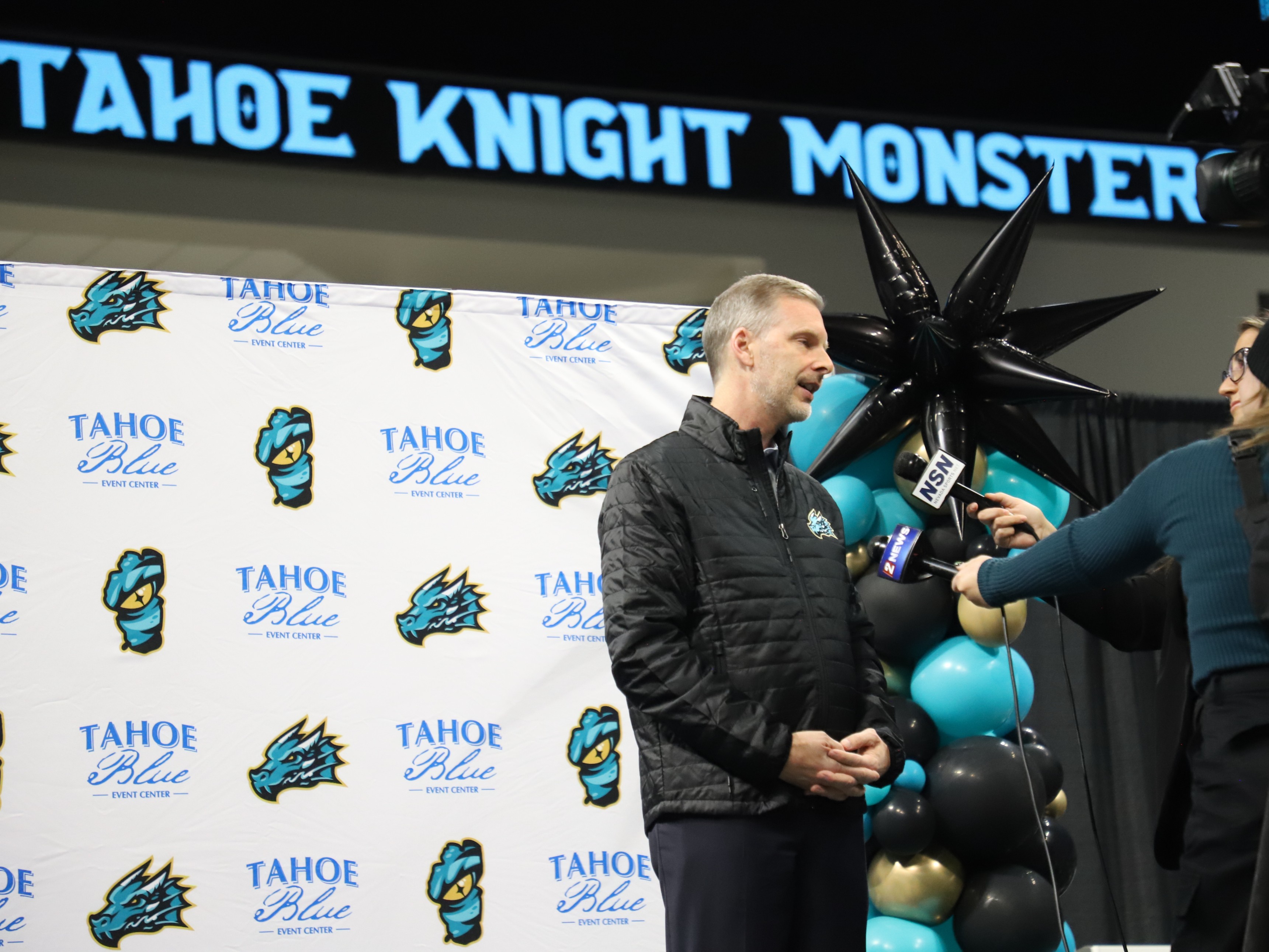
From the depths of Lake Tahoe, the name and logo for the ECHL’s newest franchise have risen: the Tahoe Knight Monsters.
The name and logo were unveiled on Thursday, November 30, during an event at the Tahoe Blue Events Center in Stateline, Nevada, where the team will take to the ice at the start of the 2024-25 ECHL season.
The logo depicts a teal monster rising in front of a black snowcapped mountain, with “TAHOE KNIGHT MONSTERS” written out in teal and gold in front. The monster’s tail is gold, as is the outline around the whole logo. The silhouette of a mountain also appears in the negative space in the “K”.

The name and logo came about through input and nominations from more than 1,000 fans in the Lake Tahoe area, according to the ECHL website. The monster in the logo is based on Tahoe Tessie, a creature long purported to live in Lake Tahoe.
The Knight Monster is unique and iconic, blending the mystique and honor of a Knight with the ferocity of a lake monster creating a distinct visual identity for the team. This Knight Monster is majestic and fierce with a towering presence. The Knight Monster is a protector and fights for those who can’t fight for themselves.
— ECHL.com
Along with the primary logo, merchandise with a secondary logo and a wordmark was also available at Thursday’s launch event. The wordmark has “TAHOE” written out in large print, with “KNIGHT MONSTERS” underneath two stripes. Mountain silhouettes appear in both the “A” and the “K”
The secondary logo, meanwhile, is a shield with black mountains at the top and a golden monster eye inside a teal lake.

Other logos on display at the launch event included one in the shape of Lake Tahoe with a monster’s eye in the middle, and one with just the monster’s head.

The Knight Monsters logos were created by Nick Matarese and the team at The Barn Creative. The team’s ownership group includes former Heisman Trophy winner and NFL quarterback Tim Tebow.


