The flurry of Major League Soccer kit unveilings came to a close on Friday, February 14, with the remaining eight kits to be unveiled for the 2025 season being officially rolled out.
The new MLS season kicks off on Saturday, February 22. This week, every club will unveil a new primary or secondary kit manufactured by Adidas, which should stay in their rotation for two seasons. The only exceptions so far are Inter Miami, who unveiled a new secondary kit in December and a new primary kit outside their regular rotation last week, and expansion club San Diego FC, who launched their inaugural primary kit in December. Eleven clubs unveiled jerseys on Wednesday, February 12, while another 10 kits were launched on Thursday, February 13.
Here’s a closer look at the jerseys that were launched on Friday:
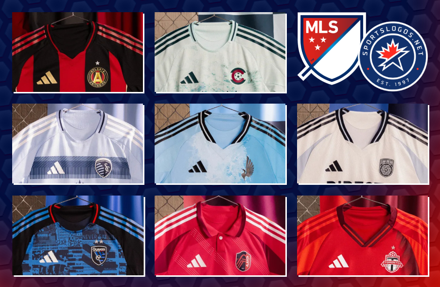
ATLANTA UNITED – Primary
Atlanta United aims to bring communities together with their new “Connector” primary kit. “Threads that unite, mold, sculpt and connect,” the clubs says. “This is the story of the beautiful game in Atlanta, a city defined by its stripes and united by its spike. Living as many. Standing as one.” It features the club’s traditional red and black vertical stripes down the front, accented by gold piping along the seams of the side panels and tapering side stripes of the Adidas template being used league-wide. The raglan sleeves are solid black with red Adidas shoulder stripes.

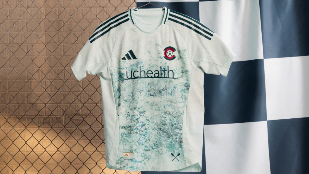
COLORADO RAPIDS – Secondary
The Rapids’ new “Headwaters” secondary kit takes the club’s name very literally. The light green base has a print covering the front “inspired by the rivers that begin high in the Rocky Mountains, which are critical to life across the American West, and relied upon by millions,” according to the club. It also features a new secondary crest, with the C from the Colorado state flag inside a circle and surrounding a soccer ball.
SPORTING KANSAS CITY – Primary
Sporting Kansas City’s new “One KC” primary kit “celebrates the deep connection between club, city and community” with a design that combines their traditional hoops with the angled line depicting the border between Kansas and Missouri that has become a big part of the team’s visual identity. Accents like the Adidas shoulder stripes and the tapered side stripes are white.

MINNESOTA UNITED – Secondary
Like Colorado, Minnesota United draws inspiration from water their new “Convergence” secondary kit. In the Loons’ case, it’s the meeting of the Mississippi and Minnesota River that is reflected in “the movement and colors of the two rivers as they meet, uniting in the center.” Accents like the Adidas shoulder stripes, tapered side stripes and sponsor logos are black, and the loon from the club crest appears on its own on the left chest.

SAN DIEGO FC – Secondary
According to San Diego FC, their new “Woven Into One” secondary kit “provides a blank canvas for the people of San Diego to come together and imagine the future of the club.” The white base has a tonal pattern swirling across the front and sleeves, with light blue shoulder panels and side stripes. The collar, Adidas shoulder stripes, club crest and sponsor logos are navy blue. In future seasons, the club says, secondary jerseys “will be designed in conjunction with fans and local artists through focus groups, design workshops and community-driven campaigns to ensure each kit authentically expresses San Diego’s culture and spirit.”

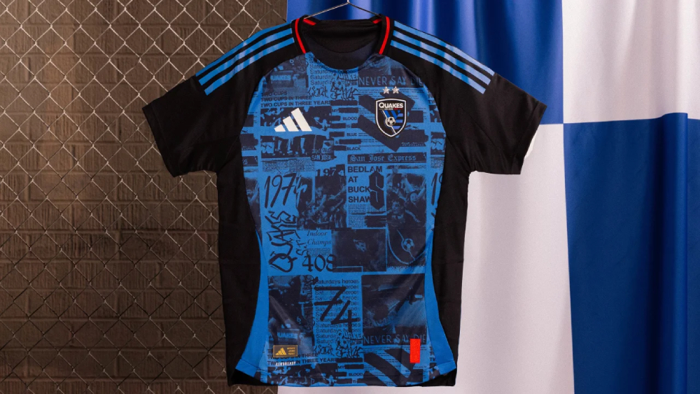
SAN JOSE EARTHQUAKES – Primary
Designed in collaboration with punk rock icon Lars Frederiksen, best know for his work with the band Rancid, the Earthquakes’ new “Headliner” primary kit pays tribute to the flyers of the Bay Area punk scene, as well as memorable moments from Quakes history. “The handwritten/newspaper-clipped artwork style represents the DIY ethos of punk rock, the blue-collar makeup of many fans in the Bay Area, and the underground subculture that sparks creativity in the region,” the club says. Though not shown in the photo below, the kits will have the logo of new sponsor El Camino Health in white on the chest.
ST. LOUIS CITY SC – Primary
St. Louis CITY SC is amplifying their signature shade of City Red in their new primary kits. The City Red base is accentuated by darker tapering inserts at the shoulders and along the sides, along with trim on the polo collar. Sets of five diagonal embossed stripes run across the front of the shirt, representing the five players from St. Louis who played on the 1950 United States national team, which pulled off a major upset for the time by beating England 1-0 at the World Cup while wearing shirts with diagonal stripes across the front.
TORONTO FC – Primary
After inexplicably going with a mainly grey primary jersey two years ago, Toronto FC have course-corrected and gone all-in on red with their new “Club” primary kit. “The kit’s many shades of red represent the club and the city’s diversity,” the club says. The front features a series of gradients that rotate and shrink as they make their way up the shirt. The Adidas shoulder stripes, shoulder panels and side stripes are light red, while the side panels, collar and panels at the bottom of the sleeves are a darker red.

Related stories:
 MLS Continues Buildup to 2025 Season With 10 More Kit Unveilings
  Inter Miami Looks to Draw Strength From New Away Kit for 2025
  Here Are All the Kits Major League Soccer Teams Will Wear in 2024
  Another Day, Another Slew of 2024 MLS Kit Unveilings The Kits Just Keep On Coming: More MLS Unveilings Ahead of 2024 Season
  2023 Football Kit Preview: Major League Soccer
  Adidas, Major League Soccer Extend Contract Until 2030
  2022 Football Kit Preview: Major League Soccer