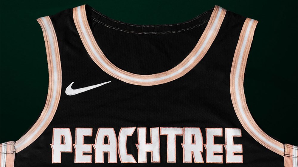
The Atlanta Hawks announced on Friday the return of their “Peachtree” City Edition uniforms, which were originally worn during the 2019-20 season, as this year’s City Edition design.
The black uniforms feature a “Peachtree” wordmark across the chest as a nod to the iconic street that connects the neighborhoods of Atlanta, as well as peach accents and trim that’s inspired by Georgia’s nickname of “The Peach State.”
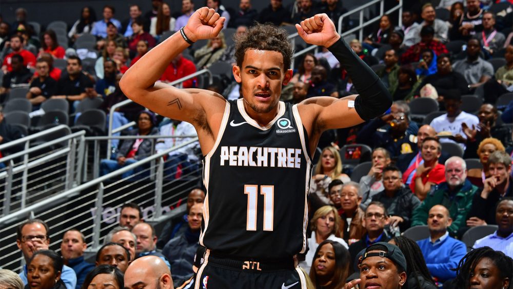
This year’s uniform isn’t exactly the same as the original, however, as it features a peach with seams from a basketball on the waistband instead of an “ATL” wordmark. This hybrid logo was previously seen on the baselines of their matching court design.
The Hawks are also currently without a jersey patch partnership, whereas their 2019-20 design featured an advertisement patch on the left shoulder for Atlanta-based digital healthcare company Sharecare.
An interesting aspect of teams reviving – or bringing back recolored versions of – previous City Edition uniforms is that the Hawks no longer use the font seen in the “Peachtree” wordmark and numbers.
This font, which is also displayed in the full team wordmark above the jock tag, was part of their 2015-20 uniform set that included a red, black and neon green color scheme.
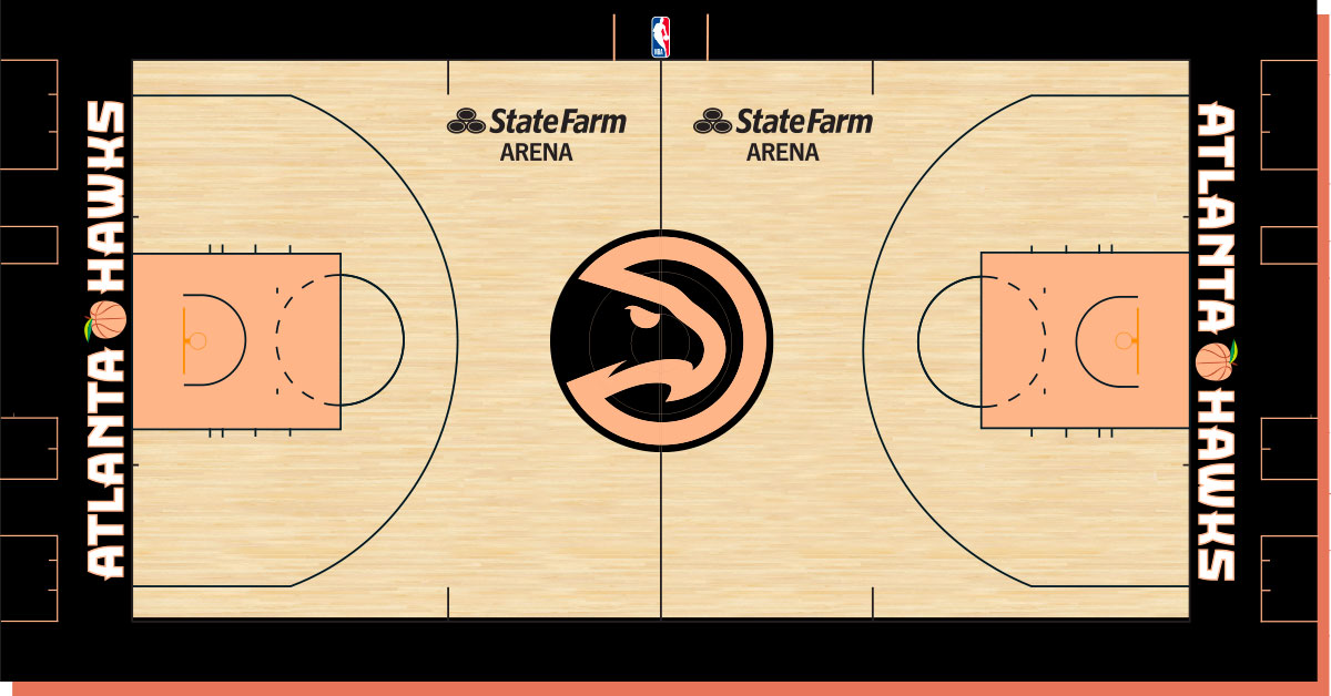
It’s unclear if Atlanta will use the same court design or create a new one for this year’s “Peachtree Nights,” though it’s highly unlikely they kept the old hardwood in storage for the last five years.
Photos courtesy of @ATLHawks on X/Twitter.
Related stories:
 Milwaukee Bucks Revive “Cream City” City Edition Uniforms
  New York Knicks’ 2025-26 City, Statement Edition Shorts Leak
  Dallas Mavericks’ 2025-26 City Edition, Hardwood Classic Shorts Leak
  Indiana Pacers’ 2025-26 City Edition Shorts Leak On Instagram
  Golden State Warriors’ 2025-26 City Edition Shorts Leak
  Philadelphia 76ers’ 2025-26 City Edition Shorts Leak… Again?
  Rumour: 2025-26 NBA City Edition Uniforms Could Recolour Previous Designs
  Detroit Pistons’ 2025-26 City Edition Uniforms Leaked By SLAM Magazine