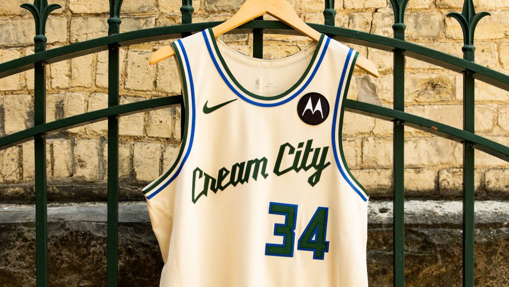
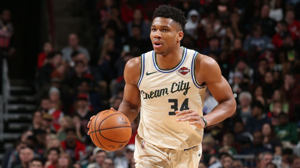
The Milwaukee Bucks announced on Friday they are reviving their fan-favorite “Cream City” City Edition uniforms, which debuted in 2019-20, as their City Edition design for the upcoming season.
The cream-colored uniforms pay homage to the clay bricks that were commonly used to build structures in Milwaukee in the mid-to-late 19th century and ultimately inspired the city’s nickname.
That nickname is prominently displayed across the chest in a green script font above the Bucks’ current number font. There’s also green and blue stripes on the collar and arm hole trim, waistband and bottom of the shorts.
The uniforms, which now feature a Motorola advertisement instead of the original Harley Davidson patch, are complete with the Wisconsin state outline logo on the waistband and stylized “M” on both sides of the shorts.
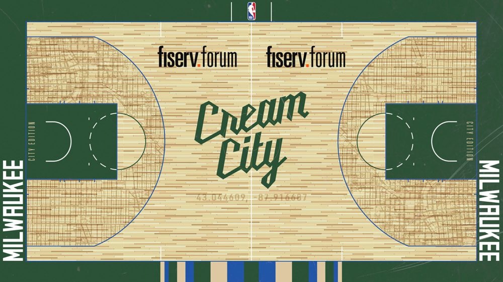
The Bucks revealed they will play on a complementary court design this season, as well, after they used their standard hardwood for their City Edition games in 2019-20.
It includes a stacked “Cream City” wordmark at midcourt above the sublimated coordinates of Fiserv Forum, a sublimated map of Milwaukee’s streets inside the three-point line, a “City Edition” wordmark inside the green keys, a “Milwaukee” wordmark along the green baselines and a modern version of their iconic “Irish Rainbow” along the bottom sideline.
Photos courtesy of @Bucks on X/Twitter.
Related stories:
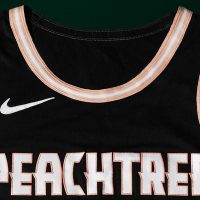 Atlanta Hawks Announce Return Of “Peachtree” City Edition Uniforms
  New York Knicks’ 2025-26 City, Statement Edition Shorts Leak
  Dallas Mavericks’ 2025-26 City Edition, Hardwood Classic Shorts Leak
  Indiana Pacers’ 2025-26 City Edition Shorts Leak On Instagram
  Golden State Warriors’ 2025-26 City Edition Shorts Leak
  Philadelphia 76ers’ 2025-26 City Edition Shorts Leak… Again?
  Rumour: 2025-26 NBA City Edition Uniforms Could Recolour Previous Designs
  Detroit Pistons’ 2025-26 City Edition Uniforms Leaked By SLAM Magazine