We interrupt these baseball playoffs to bring you the start of a new season of the National Hockey League.
Tonight at 5 p.m. ET, the Florida Panthers will raise yet another banner as they host the Chicago Blackhawks, one of three teams celebrating their 100th anniversary this year. It’s a year of many changes, a year of milestone seasons, a year when many are looking back, and a year in which one team is just getting started.
Here, we’re sharing with you a team-by-team look at all the new uniforms, new logos, patches, and more as we welcome the 2025-26 NHL season.
Before we break down each team, let’s take a look at the logos of the NHL’s major special events.
2026 NHL Winter Classic
The NHL’s marquee outdoor game heads to South Florida for the first time, with the back-to-back defending Stanley Cup Champion Florida Panthers hosting the New York Rangers at Miami’s loanDepot park (home of baseball’s Marlins) on January 2, 2026. It’ll be the 17th Winter Classic and the 44th outdoor game in league history.
The 2026 Winter Classic logo keeps the familiar scripted “Winter” mark, complete with the streaking-puck dot on the “i” over a neon “CLASSIC” in pink and white, in a very “Miami,” very Art Deco style. A brown palm tree with green fronds and four coconuts rises above, lightly dusted with snow, while a pink “Miami” script with a blue underline sits on a snowy base below.
No uniforms yet, but this event is very focused on traditional styles, so expect to see the Rangers and Panthers out there in sweaters resembling teams that helped form the origins of hockey in the New York and South Florida regions.
2026 NHL Stadium Series
Tampa hosts its first outdoor showcase as the Tampa Bay Lightning welcome the Boston Bruins to Raymond James Stadium on February 1, 2026. The 2026 Stadium Series logo leans all-in on the pirate themes, with the event taking place both at the home of the NFL’s Buccaneers and around the Gasparilla festival. We see a navy blue pirate ship sailing through the icy seas with orange highlights (perhaps a Buccaneers wink?), a “STADIUM SERIES” wordmark in treasure map-style typography cuts across the sails, a lightning bolt tags the canvas, “TAMPA BAY” rides the hull, light-blue cannons from the side, and waves, snow, and ice finish the scene; a “2026” flag tops the mast. Held just thirty days after the Winter Classic in Miami, it’ll be a month of celebrating hockey in the Sunshine State to kick off 2026 in the NHL.
Working as the opposite of the Winter Classic, the uniforms for the Stadium Series look to the future of design; you’ll most certainly see some off-the-wall threads for both the Bruins and Lightning whenever those designs are released.
2026 NHL All-Star Game
There will be no All-Star Game in the NHL this year, as the league has instead partnered with the IOC to allow its players to participate in the 2026 Winter Olympic Games in Milan. It’s the first time since the 2014 Sochi Olympics that NHL players will be able to participate, and to accommodate this, the league will suspend play for two weeks in February, foregoing the All-Star Game.
2026 Stanley Cup Playoffs
Nothing new here, the 2026 Stanley Cup Playoffs logo retains the exact same design that we’ve seen since the NHL introduced this style in 2022. It’s the Stanley Cup placed upon a black shield with the year on either side of it in silver.
And now, moving on to the changes for each team, presented in my favourite order, alphabetical:
Boston Bruins
Boston reverts to their centennial-season version of the “Spoked-B” Logo as its new full-time primary. It’s a mash-up of the 1949-95 style logo with the more modern varsity “B” introduced in 2007. The Bruins also revived its classic two-logo system, in which the home blacks feature the circle and “B” in gold with black spokes; while on the road whites, they flip to black with gold spokes.


New home and road uniforms lean hard into the team’s late-’80s/’90s template, with cleaner sleeve/sock striping, a gold collar and gold detailing on the gloves, the serifed team wordmark on the pants, with inside hem loops reading “BOSTON” (on the home) and “BRUINS” (for the road). A new left-shoulder-only patch debuts: a crawling bear silhouette inspired by the 1924 original Bruins logo, featuring “BRUINS” inside it at home and “BOSTON” on the road. The new set is basically a refined version of what Boston wore for the December 1, 2024, Centennial Game, which in itself was a throwback to that Cam Neely-era set. Rapid7 remains the jersey patch, and TD Bank stays on the helmet via a long-term deal. A special Stadium Series uniform set will surely be revealed at some point this season for the Bruins’ outdoor game against the Lightning at Tampa in early 2026.
Carolina Hurricanes
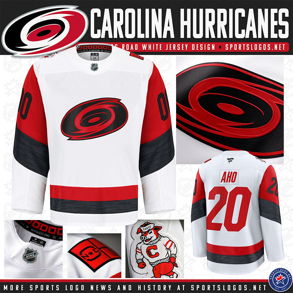
Carolina has scrapped the diagonal “CANES” road set for a white version of their 2023 Stadium Series look, featuring the same bold sleeve/hem striping, slanted name/number font, and (most noticeably) a two-tone red/black Carolina Hurricanes logo that pops off the white base. Shoulders split the difference: the long-requested “Strutting Stormy” hog logo debuts on one side, with the recoloured North Carolina state-flag patch staying on the other. Red helmets, pants, and gloves remain; socks are white with a thick red bar over black. Inside the collar, the storm-warning tile pattern returns; out goes the muted warning-flag waist pattern, the two-flag shoulder mark, and the diagonal wordmark. It’s the Hurricanes’ fourth redesign of their road whites since 2007.
Chicago Blackhawks

Chicago is temporarily altering their classic red home sweater for a one-season, Centennial sweater in 2025-26. The look remains mostly true to the classic design, but with some subtle celebratory flourishes: the chain-stitched crest gains a metallic gold outline, back numbers receive matching gold trim, and a vintage lace-up collar returns. A new 100th-season patch (featuring the Blackhawks logo over a white “100” on a black ribbon and “1926-2026”) sits on the right shoulder, while the crossed-tomahawks on the left are recoloured in gold. Inside the hem, you’ll find the team’s six Cup championship years (1934, 1938, 1961, 2010, 2013, 2015) beside a gold centennial jock tag. The team says the gold detailing is a reference to early Blackhawks sweaters as well as the gold-trimmed logo the club wore into the late 1990s.
A recent leak suggests the Blackhawks may be bringing back their black third jerseys this season. Chicago previously wore a similar design as their alternate set from 1996-2009.
Colorado Avalanche
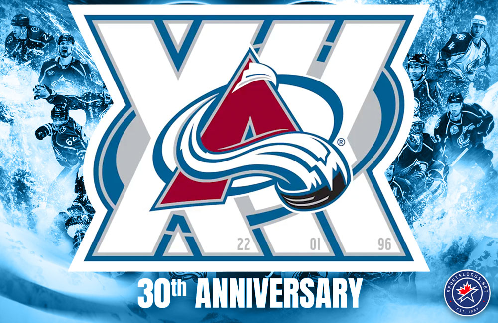
Thirty years in Denver gets a new anniversary logo rather than a total uniform overhaul. Colorado rolled out a 30th-season mark built from three horizontally stacked Roman numeral Xs in white with the Avs’ Cup years (’96, ’01, ’22) tucked into the bottom stroke, all parked behind the Avs logo. You’ll see it at centre ice in Ball Arena and as a decal on the back of every helmet all season. No special anniversary sweater has been announced yet, but rumours persist about the possibility of a Nordiques-inspired throwback look, similar to what Carolina does with their Hartford Whalers uniform.
Columbus Blue Jackets
The Blue Jackets celebrate 25 years with a silver-toned anniversary mark framed by the outline of Ohio, both as a nod to the Jackets being the state’s lone NHL team and a callback to the Ohio-shaped captain’s patch from their 2025 Stadium Series set. Inside the silhouette sits a bevelled “25” rendered in their usual jersey number font, finished in traditional 25th anniversary silver.
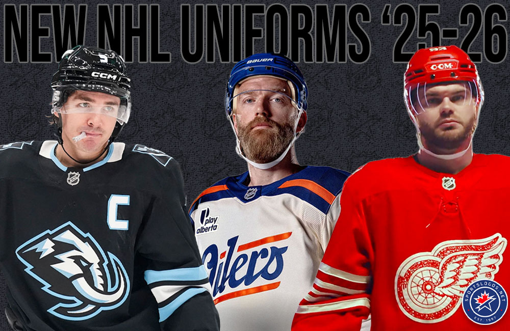
Detroit Red Wings
Hockeytown turns 100 with what may be the best centennial package from an NHL team we’ve ever seen. It starts with a commemorative 100th season logo that builds the mark out of a redrawn 1932 Winged Wheel, set in classic Wings red with a bespoke vintage white, plus two new secondary marks, a cleaned-up 1932-48 Winged Wheel and a revived Cougar “D” monogram, sprinkled throughout the year.
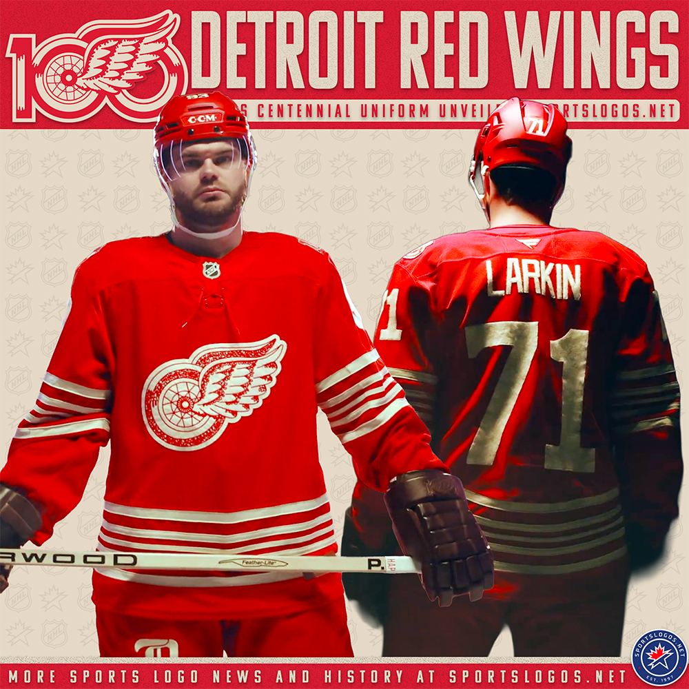
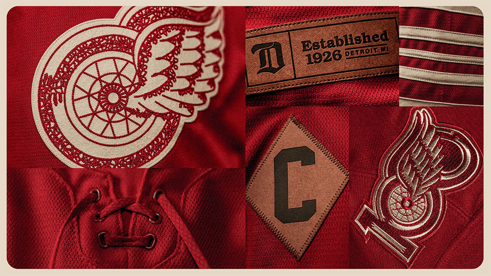
The on-ice Centennial sweater is a heritage-heavy red jersey that features the original Winged Wheel on the chest in off-white with an excellent chain-stitch effect. The early-’30s Falcons inspire the sleeve/hem/sock striping, and the name/number font pays homage to the Cougars’ 1927-28 barber-pole design. The 100th season patch is located on the left shoulder; a reimagined “HOCKEYTOWN” logo resides inside the collar. The inside hem features all 11 Cup years, flanked by both old and new Stanley Cup silhouettes. It’s also the first matte-red helmet in club history with a 1950s-style Meijer ad on the side. Other highlights include the leather-styled captain’s diamonds, brown leather-style gloves, a faux-leather jock tag and hem loop, and solid-red pants carrying the Cougar “D” logo. This special centennial jersey debuts on October 9 against Montreal and will appear for a dozen-plus home dates; Detroit’s standard home/road sweaters will also feature the season-long centennial patch.
Edmonton Oilers
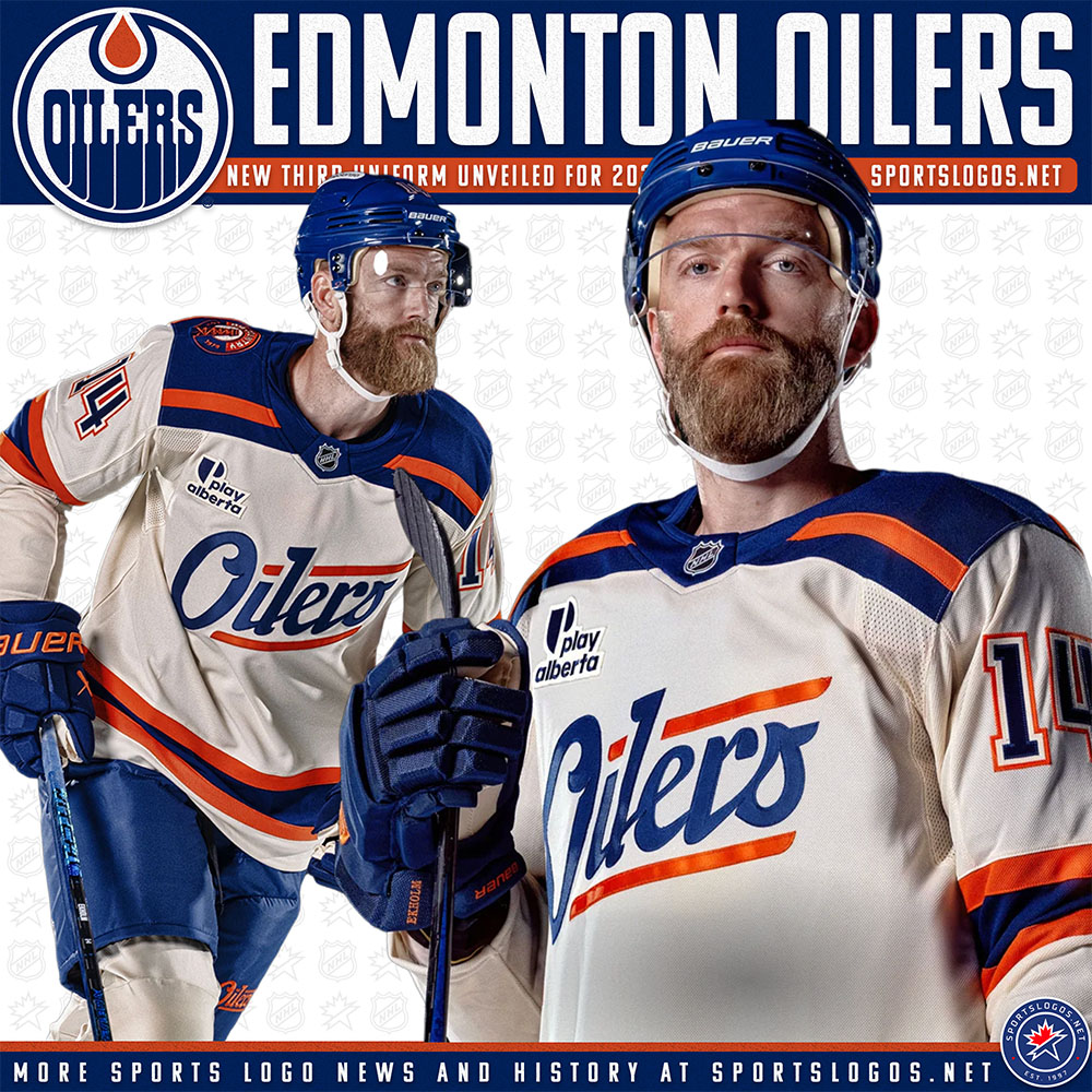
The Edmonton Oilers, fresh off a second straight trip to the Stanley Cup Final, adds a new third jersey built “for Oil Country” with a light-tan (“broken-in”) base, blue shoulders trimmed in blue/orange, a literal blue collar (groan), and a scripted blue “Oilers” wordmark across the chest bracketed by orange pin bars and a tiny oil drop tucked into the “s.” Sleeves and hem stripes are thick, royal blue, trimmed in orange; names are blue, and numbers are blue with tan/orange trim. The new shoulder logo is a blue-and-orange oil-derrick roundel reading “OIL COUNTRY” with “EDM 1979,” inside the back collar is “LET’S GO OILERS,” and the hem-loop tag is an orange oil drop on blue. The set will be worn with blue helmets and pants and matching “light tan” socks. It’ll debut on October 28 against Utah and appear seven times (five at home, two on the road) this season before sticking around for at least another two seasons.
Florida Panthers
As mentioned earlier, Florida is hosting the 2026 Winter Classic against the Rangers in Miami. No sweaters have been released yet for either team, but a traditional design is always expected for this event. In the meantime, enjoy this video of the club raising its Stanley Cup Champions banner on opening night:
Los Angeles Kings
While we knew the Los Angeles Kings were getting a new third jersey, we had no idea they’d unveil it during their opening game. Well done, Kings! More details to come, but for now, the basics are this: a black base, a silver crown logo on the chest, and chrome domes are back.
Minnesota Wild
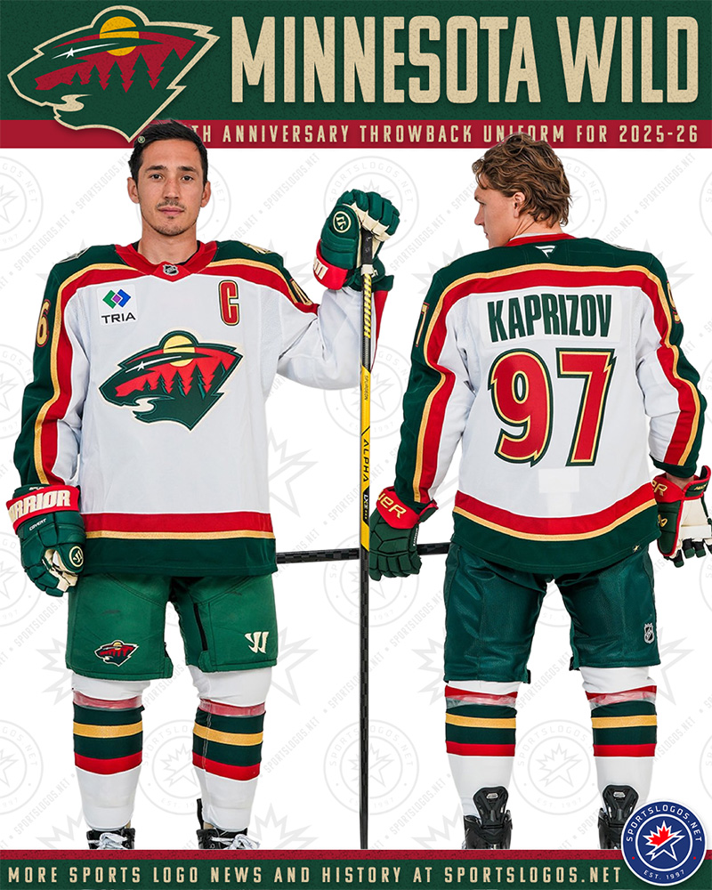
The Minnesota Wild will roll back to Year 1 for Year 25, unveiling a beautiful 25th anniversary throwback that’s essentially their original 2000-01 white home sweater. It features green sleeves, the classic Wild-head crest, the calligraphic “Minnesota Wild” shoulder logo, and the original number font, now trimmed with metallic gold for the milestone, as one shoulder swaps in a new 25th anniversary patch. You’ll see it four times: October 28 against the Jets, November 4 against Nashville, December 21 against Colorado, and January 24 against the Panthers. The Wild also introduced Blaze Credit Union as its new home helmet advertiser.
New Jersey Devils
One last lap for the black third, yes, the “Jersey” jersey is being retired. Just 11 home dates before it’s gone for good, culminating on April 12 against Ottawa. First introduced in 2021 as the club’s first official alternate, the design leans heavily into black and white with a hint of red: a lace-up collar, the white “Jersey” wordmark with a red drop shadow, barber-pole shoulder/sleeve striping, and white numbers trimmed in red. No word yet on what, if anything, will replace it in the rotation in 2026-27.
New York Rangers
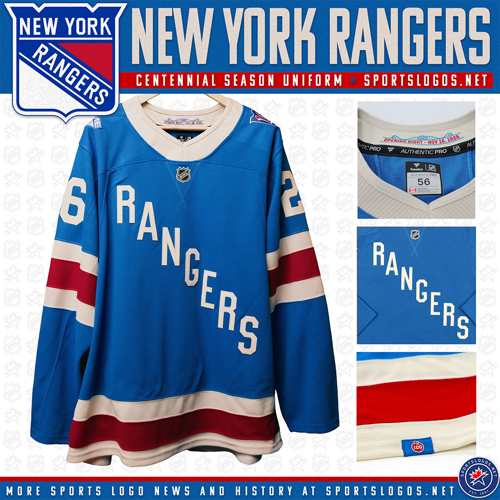
For their centennial season, the Rangers are returning to a classic uniform. The one-year Centennial jersey is a throwback to the 1926-27 Rangers design, featuring a blue base, red and off-white striping, “RANGERS” diagonally in single-colour off-white, and an off-white collar detailed to mimic 1920s materials. Player names/numbers follow the same single-colour treatment. The Rangers’ 100th anniversary logo is positioned on the left shoulder, accompanied by a new “Game 7” corporate ad patch on the right. Inside details include a red-apple “100” hem loop and a marquee-style neck tag referencing the club’s first game (November 16, 1926). It’ll be worn ten times in 2025-26 and then retired. The Rangers will also play outdoors in Florida for the 2026 Winter Classic; we presume an equally traditionally styled uniform will be worn for that one.
Ottawa Senators
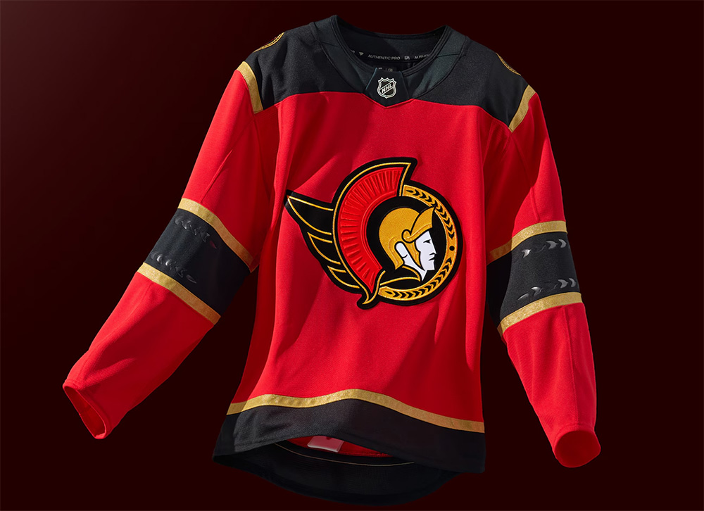
Ottawa finally makes the long-rumoured, oft-leaked red third official for 2025-26: a red base with black shoulders trimmed in metallic gold, thick black sleeve bars edged in gold, and a single black waist stripe with a thin gold accent. The chest crest is a tweaked Senators’ head rendered with new raised embroidery throughout the red field and helmet, and a heftier single-colour black outline. Meanwhile, laurel-leaf bands are woven into the black sleeve stripes, and the secondary “S” logo returns on both shoulders. Around the back, a new upper-back “OTTAWA” wordmark is up by the shoulders, featuring the Peace Tower in the “A”. Players’ names and numbers are black with metallic gold trim, and a red-and-gold maple leaf is featured on the hem loop. The Sens say the third jersey will appear 13 times this season and, as a “third jersey,” will be worn for at least three seasons.
Pittsburgh Penguins
A new third has been rumoured, and staff at their official team shop all but confirmed this to me over the summer as I walked out of there with a couple of their (heavily-discounted) third jerseys from 2024-25. Nothing has been unveiled (or leaked) yet.
San Jose Sharks
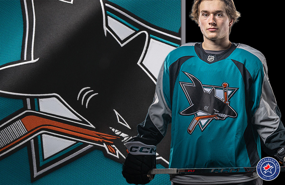
San Jose celebrates season No. 35 by rewinding to their late-’90s/early-’00s look. Branded “Heritage 2.0,” the throwback revives the club’s second-generation teal set, first introduced as a third jersey in 1997-98 and worn full-time from 1998-2007, with a teal base, black shoulders, and silver/white accents, the era of Marleau, Thornton, Nabokov, Cheechoo, and company. It’s a faithful modernization with updated lettering and trims, and the Fanatics cut. It’ll appear four times only in 2025-26 with each night doubling as an alumni celebration: October 30 vs. the Devils (Jeff Friesen, Kyle McLaren, Mark Smith), November 20 vs. the Kings (Joe Thornton HOF Night), December 3 vs. Washington (Patrick Marleau, Evgeni Nabokov, Mike Ricci), and March 1 against the Jets (Scott Hannan, Owen Nolan, Scott Thornton).
Seattle Kraken
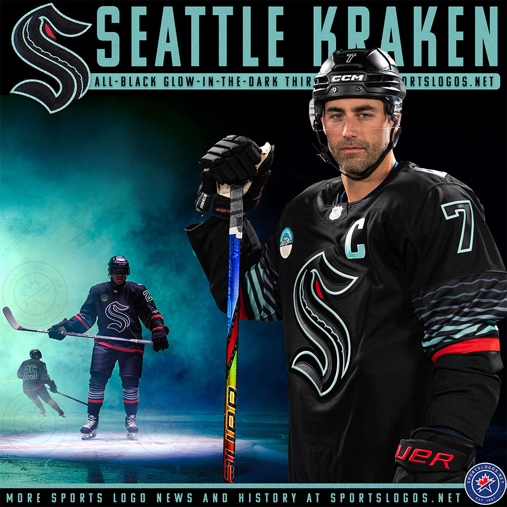
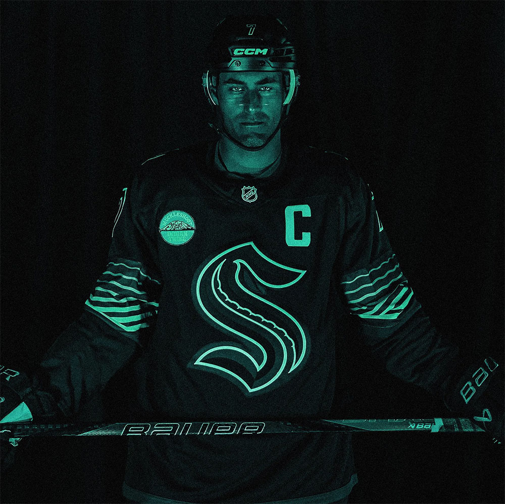
As they enter their fifth season, Seattle is rolling out its first-ever third uniform: an all-black “from the abyss” set that goes head-to-toe matte black (helmet, sweater, pants, gloves, socks) with a tonal primary crest accented only by the red eye and “Ice Blue” embroidery that glows in the dark. Sleeves and socks feature concentric “sonar ping” waves in light blues that thicken toward the cuffs, before a single thick red stripe; a lone red stripe wraps around the waist. The Space Needle anchor remains on the shoulders, numbers are black with Ice Blue outlines, and details include a red hem loop with an “SEA” wordmark/kraken eye and arena coordinates printed inside the collar. The third will be used 11 times at home, starting with their game on November 1 vs. the Rangers.
St. Louis Blues
The St. Louis Blues overhauled their look while still retaining the soul of their classic Blue Note logo. The primary crest is now a simplified two-colour mark, in a lighter blue with yellow trim, featuring thicker keylines and a subtly refined note shape, evolved from the club’s recent Winter Classic treatments. This design is optimized for clear readability on digital screens and merchandise.


New home and road sweaters throw back to 1967-68 as well as those heritage Winter Classics with matching layouts on both sets, a return to a white road (no, not cream), a single-colour sleeve/back numbers for greater readability, a red fleur-de-lis inside the back collar, and an internal “ST LOUIS BLUES” wordmark near the hem. On the pants, a new interlocking STL monogram, drawn to echo a treble clef, debuts, part of a wider identity refresh developed with RARE Design and Fanatics that also adds two more secondaries (a fleur-de-lis worked into a clef/note and an upward trumpet shaped to suggest the Gateway Arch and the Mississippi). Wordmarks are new, too: a primary with flowing letterforms meant to mirror the river, plus an illustrative alt inspired by the 1914 “St. Louis Blues” sheet-music cover, all in a custom typeface. The blue home jersey, first introduced in 1999 with subsequent tweaks, remains in the rotation as the club’s third/alternate uniform.
Tampa Bay Lightning
As mentioned at the top of this post, the Tampa Bay Lightning host the 2026 Stadium Series against Boston; futuristic/untraditional uniforms are surely on the way.
Utah Mammoth
After one season playing as the nameless “Utah Hockey Club,” the franchise has locked in its permanent identity as the Utah Mammoth. The primary “Mountain Mammoth” logo combines a snow-capped Wasatch mountain peak (with a subtle “M” worked in) with a charging white mammoth head, whose curved tusk also forms a “U,” all in the returning UHC palette of Rock Black, Salt White, and Mountain Blue.
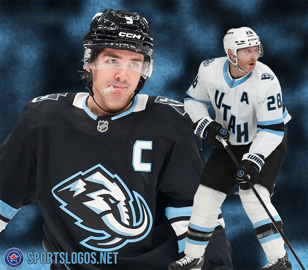
On ice, the black home sweater features the Mountain Mammoth crest with the angular “Utah Badge” on the shoulders. The white road jersey retains the stepped, diagonal “UTAH” down the front (now in an italicized cut), as both jerseys adopt a new custom block font for numbers and captain’s letters. Secondary branding introduces a new U-and-tusk logo, available both as a standalone and wordmark. And keep an eye on those trademark filings, two full-body mammoth logos surfaced in recent USPTO filings, a possible hint at future alternate/mascot applications for the young franchise.
Utah also named Filevine its first-ever helmet ad partner, placing its mark on both the black home and white road lids.
Washington Capitals
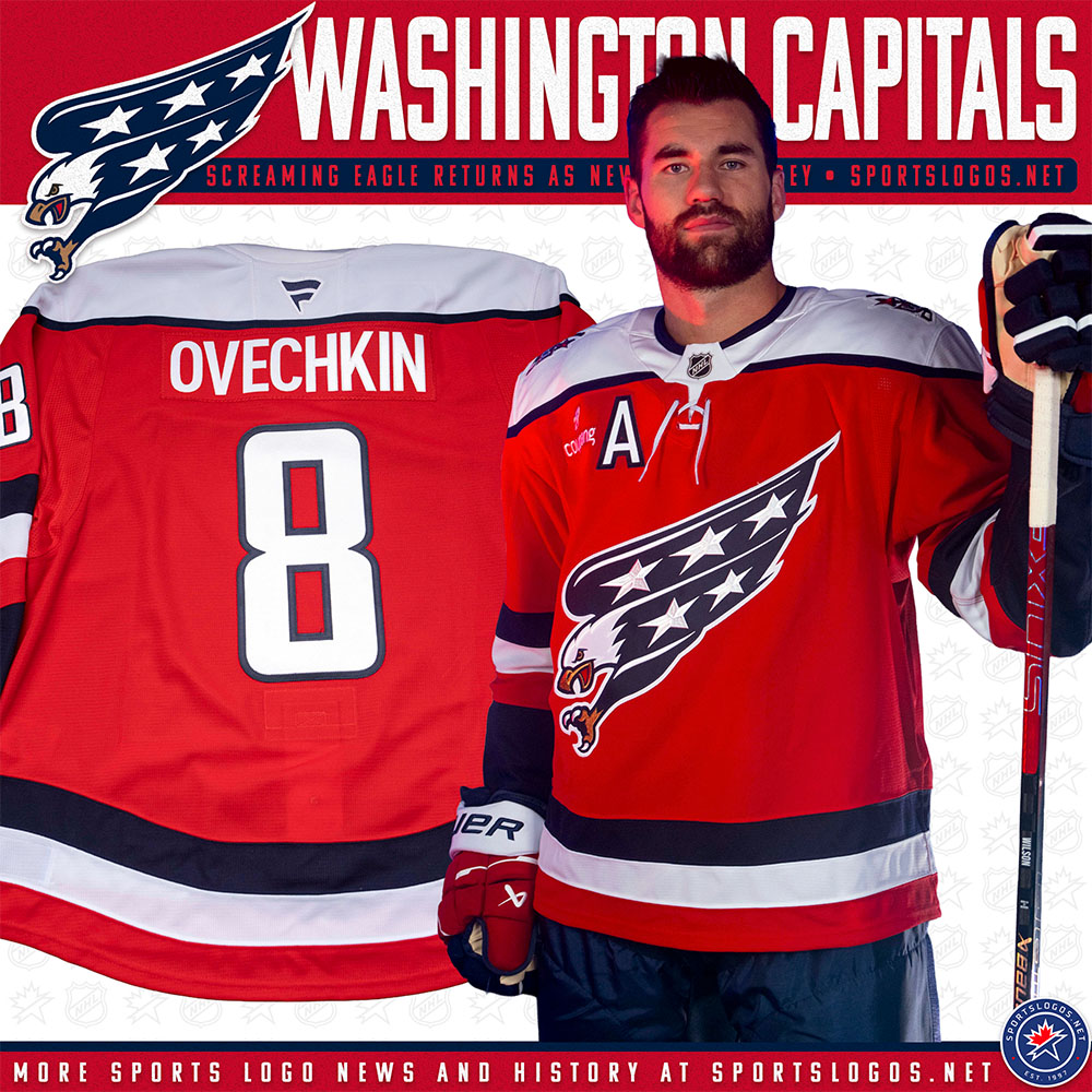
You wanted the “Screagle,” and boy, did you ever get it. Washington’s new red third brings back the 1990s Screaming Eagle logo, now recoloured to the current red/white/blue, on their ’70s/’80s jersey template, complete with a rounded white yoke, simple waist stripes, and a white lace-up neck. The ’90s Capitol Dome shoulder patch returns (also recoloured), three stars on the pants for the DMV (D.C., Maryland, Virginia), a D.C. flag hem loop, and a “Caps” wordmark inside the collar. Classified as a true third, it’ll run 15 home dates starting October 17 vs. Minnesota, and, because it’s a third, will remain in rotation for at least three seasons. Also in Washington, a new ad for Coupang has been added to the home and third sweaters.
Winnipeg Jets

The Winnipeg Jets quietly introduced a 15th anniversary patch at this summer’s NHL Draft, marking 15 years since moving north from Atlanta. The logo features a bevelled silver “15” on a navy shield with silver trim, set over a light-blue ribbon carrying the years 2011 and 2026. The on-ice patch omits any team wordmark or crest (the sweater already features plenty of Jets branding), although a secondary retail version includes the Jets logo.
All NHL Team Logos 2025-26
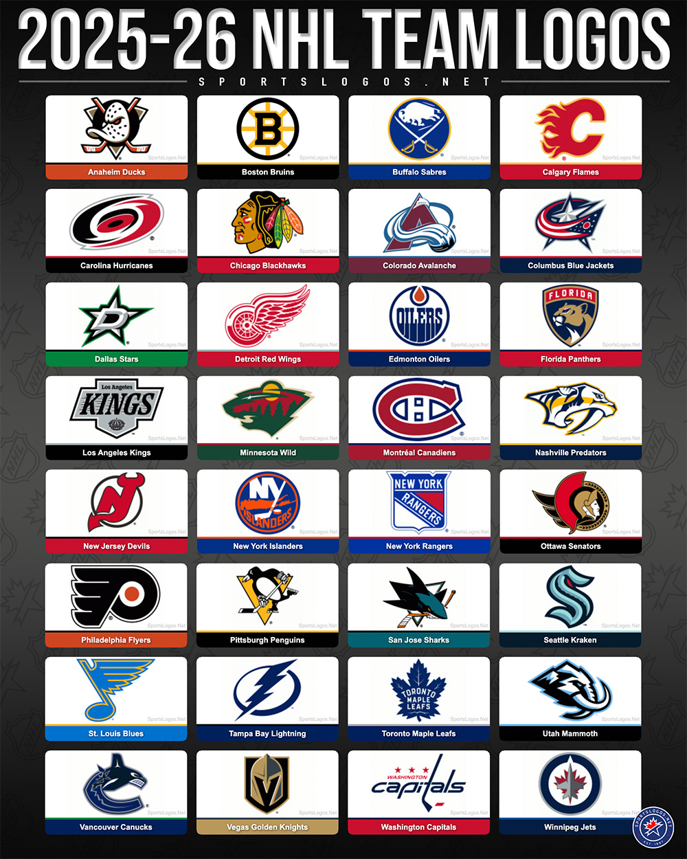
If you don’t see your team on this list, no, we didn’t forget them; it means we got nothin’ for em this year. Either no changes, or nothing’s been announced/leaked/rumoured; so please, take a second before making your “Uh, Ducks?!” comments below.
And that’s it! So far, anyway… a few more still on the way, but this should be enough to get us through the first few weeks. Let’s start that hockey.
Related stories:
 Ottawa Senators Unveil New 2026 Red Third Jersey at Season Ticket Holder Event
  Potential New Logos for NHL’s Utah Hockey Club, Mammoth, and Outlaws all Leaked
  Ottawa Senators Will Add a New Red Alternate Uniform for 2025-26 NHL Season
  Utah Hockey Club’s New Uniforms Won’t “Deviate Too Far” From Current Set