Earlier this week, the NBA officially revealed the City Edition uniforms and courts for all 30 teams, as they either recolored or revived a previous year’s design as part of a league-wide “remix” for the 2025-26 season.
With that, we’ve decided to share our top five designs in each category below, though you’ll quickly sense a theme as our favorite uniforms naturally lend themselves to the best-looking court designs.
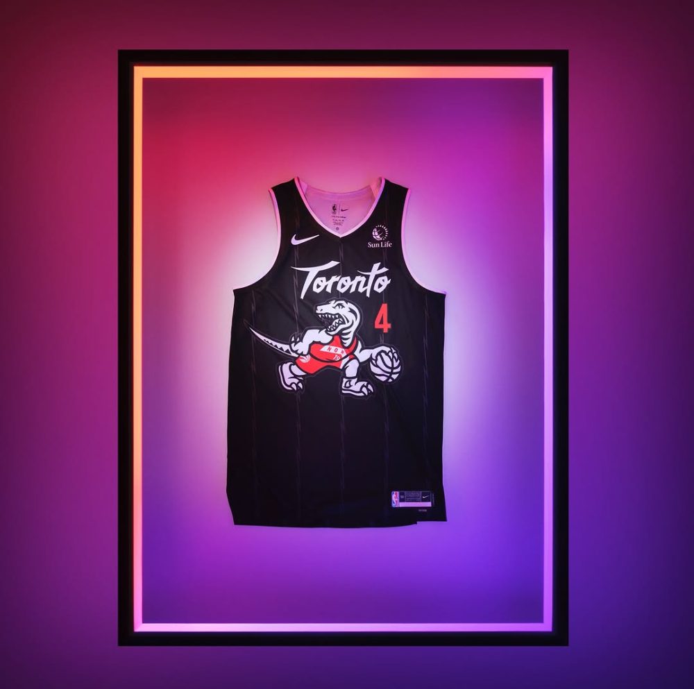
Our overall favorite design comes from the Toronto Raptors, who seamlessly blended their current red and black color scheme with pieces of their original uniforms and included a subtle nod to their 2018-19 NBA championship.
Meanwhile, it’s obvious why some of the teams decided to revive their fan-favorite designs, as they’re some of the best-looking uniforms in league history – and having a complementary court will only add to their aura.
So, where did we get it right? Where did we go wrong? Are there any other designs you would have liked to see revived instead? We’re looking forward to hearing your thoughts and sharing your own lists in the comments below…
Top Recolored Uniforms
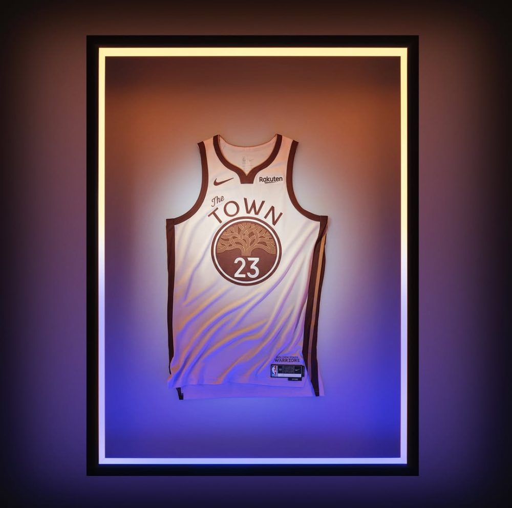
While some may consider the Warriors’ design to be “bland” when compared to some of the other uniforms, the colors are a natural (pun intended) fit for a franchise honoring its roots in Oakland and proudly displaying the city’s iconic oak tree logo on its chest.
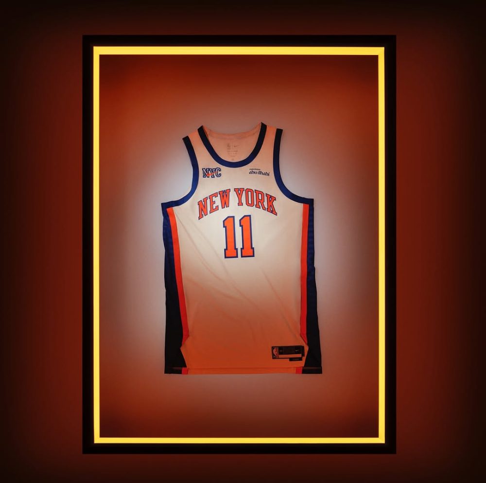
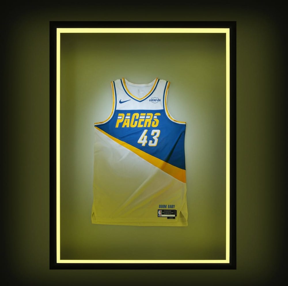
We could argue the Knicks’ design should be their standard home uniform and greatly appreciate the subtle nods to the Mecca, while the Pacers can never go wrong with a Flo-Jo-inspired look, though we think they should adopt the colors and mashup logo on their shorts as their full-time look.
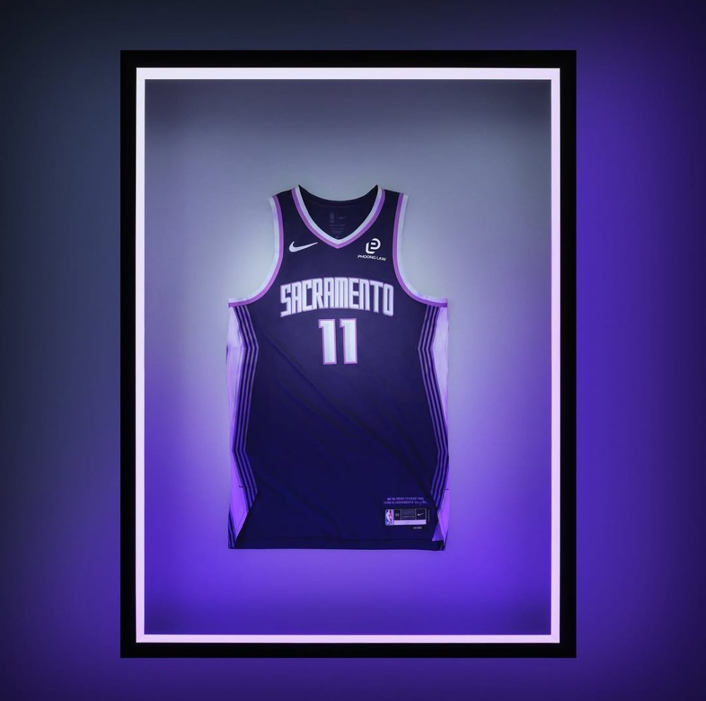
The last spot came down to the Kings, who shined a light on the beam that is illuminated atop their arena following every victory, and the Hornets, whose bright colors pay homage to Queen Charlotte’s favorite flower, the Bird of Paradise. But there’s just something about the Hornets’ wordmark that bothers us enough for them to not make the cut.
Toronto Raptors
Golden State Warriors
New York Knicks
Indiana Pacers
Sacramento Kings
Top Revived Uniforms
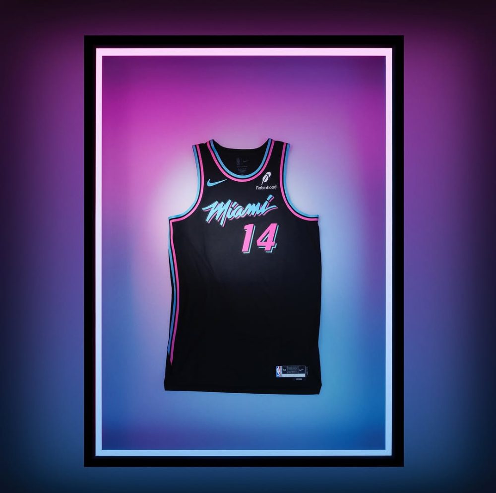
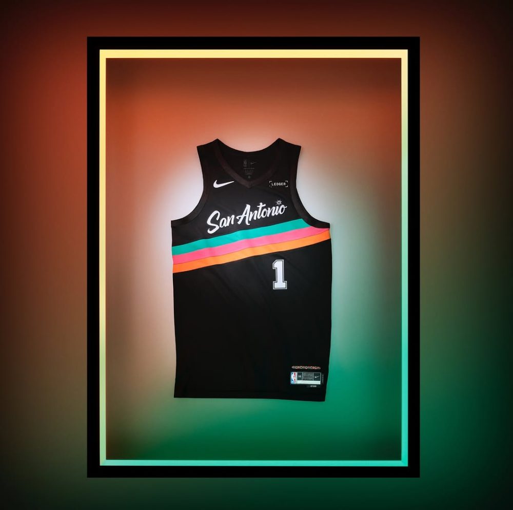
The Heat’s black Vice-themed uniform is arguably the best design to come from the City Edition series, while the Spurs’ wisely leaned into the colors of their 1990s Fiesta warmup jackets, which take their usual black and silver scheme to another level.
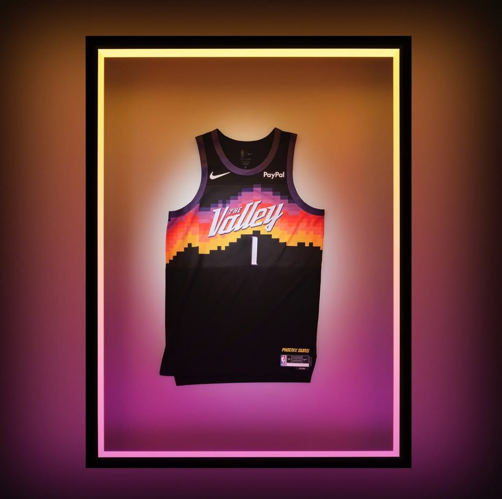
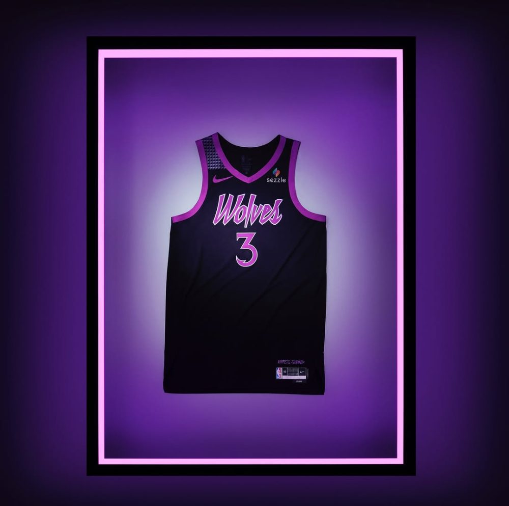
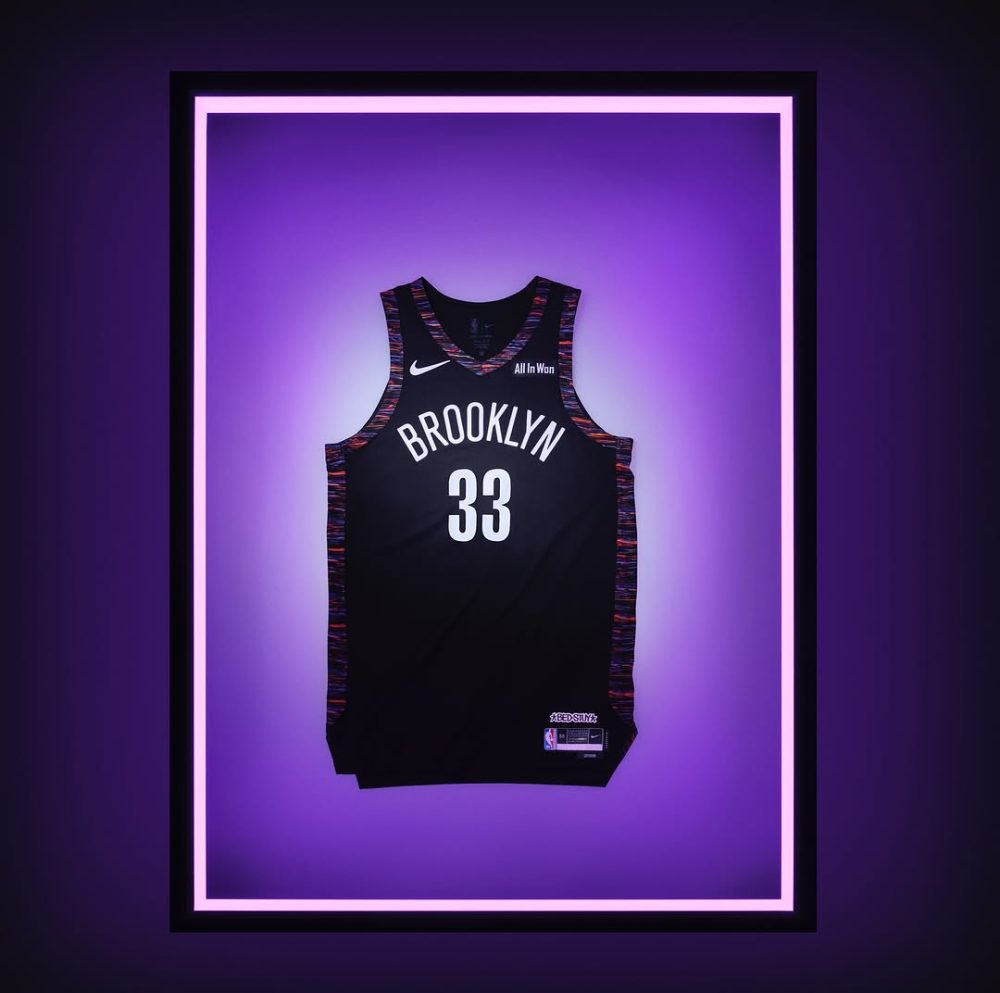
The Suns’ “The Valley” set, meanwhile, truly encapsulates the purpose of the City Edition program by combining iconic local imagery with the team’s branding while the Timberwolves and Nets’ benefit from their cities’ connections to two legendary musical artists.
Miami Heat
San Antonio Spurs
Phoenix Suns
Minnesota Timberwolves
Brooklyn Nets
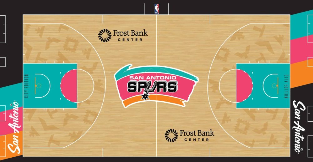
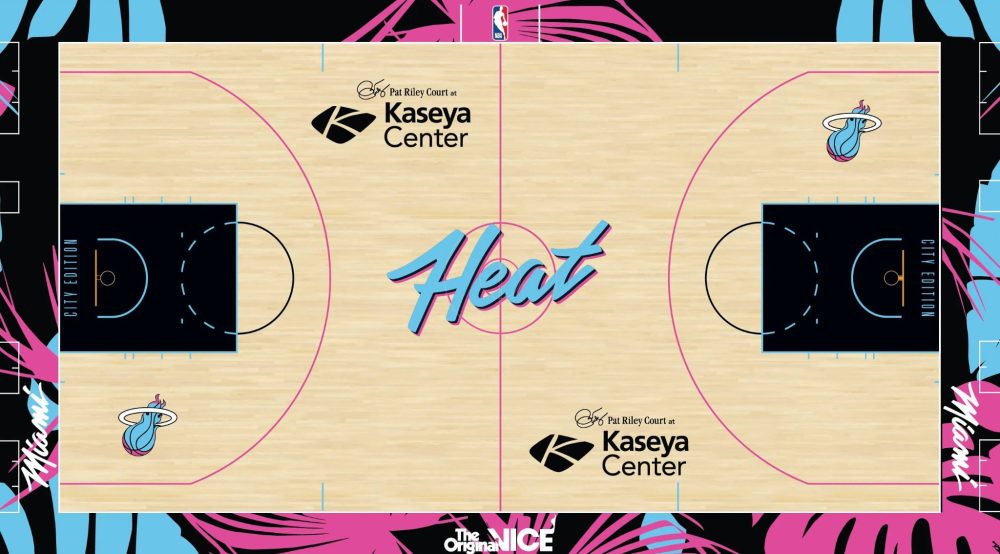
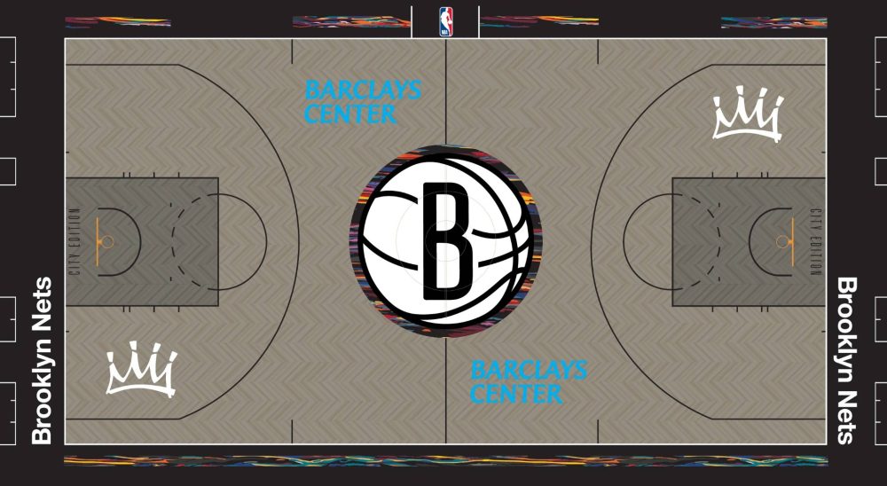
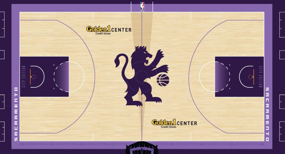
Top Court Designs
Along those same lines, the Spurs and Heat built upon the greatness of their City Edition uniforms by improving their corresponding courts, as they both expanded upon the colors and design features that make each uniform unique.
The Nets didn’t change much from the last time they honored The Notorious B.I.G., but the darker gray court allows the “Brooklyn Camo” pattern to pop more than before, while the Kings perfectly highlighted the beam that inspired their uniforms with the sunlinated design at midcourt.
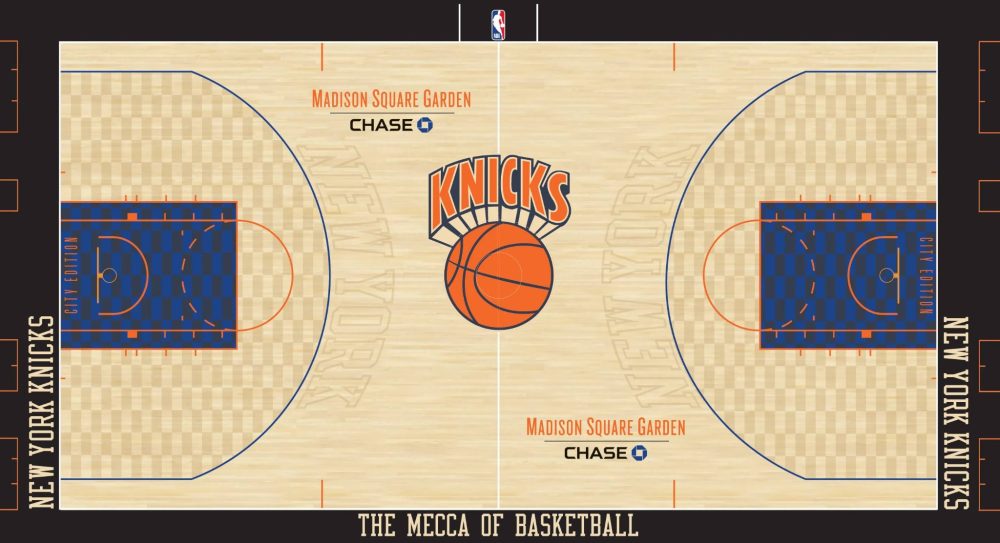
Lastly, the Knicks’ use of their vintage logo and the subtle checkerboard pattern inside of the three-point arc feel timeless, as if the latter was as intertwined with Madison Square Garden as the parquet floor is as the Boston Garden.
San Antonio Spurs
Miami Heat
Brooklyn Nets
Sacramento Kings
New York Knicks
Photos courtesy of @NBA on X/Twitter and NBA LockerVision.
Related stories:
 Breaking Down Every Team’s 2025-26 NBA City Edition “Remix” Uniforms and Courts
  Every New NBA Uniform, Logo, Court Design And Jersey Patch For The 2025-26 Season
  Breaking Down The NBA’s 2025-26 City Edition Remix Uniforms Teaser
  NBA Unveils New 2024-25 City Uniforms for All 30 Teams
  Every 2024-25 NBA City, Classic Edition Jersey Leaks
  Every New NBA City Edition Uniform for 2023-24 Season