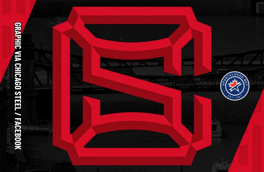
The Chicago Steel are forging a new path with the introduction of a new suite of logos that will officially come into use in the 2026-27 season.
The Illinois-based United States Hockey League team unveiled the logos — designed in partnership with Toronto studio Recess Creative — on their website and social media channels on Monday, January 5. The Steel will officially begin using them when they move into the USG Arena at Blackhawks Ice Center on the west side of Chicago in the fall of 2026.
The team’s new look introduces a new era of Chicago Steel hockey that embraces the rich architectural history of Chicago and symbolizes the Steel brand as the bridge to the next level.
— Chicago Steel
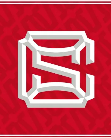
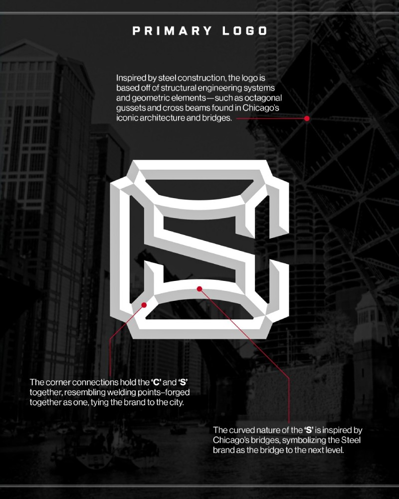
The centerpiece of the Steel’s new visual identity is a beveled “CS” monogram, with the S inside and connected at the interior corners of the C. The design “[embodies] the brand’s Chicago roots, inspired by the city’s steel landscape and geometric elements, such as octagonal gussets and cross beams found in iconic architecture and bridges,” the team says. “The corner connections of the logo hold the ‘C’ and ‘S’ together, mirroring welding points to forge together, tying the brand to the city.”
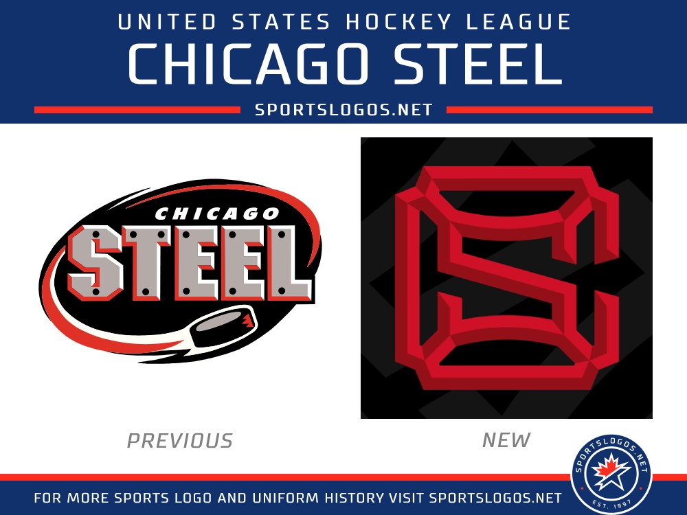
“We are proud to unveil our new logo and marks as we prepare to call the City of Chicago home for the first time in our 26-year history. This new identity successfully honors our city’s industrial roots while celebrating the role our club plays as the bridge to the next level for players and staff.”
— Dan Lehv, president, Chicago Steel
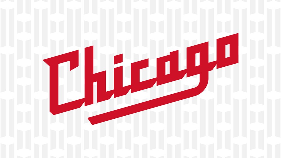
Along with the “CS” monogram, the Steel introduced a script “Chicago” mark with angular letterforms and a tail on the G that creates an open space that is meant to represent an open drawbridge. The logo “has a bold, sharp text that evokes the strength and precision of Chicago’s steel industry and Chicago Steel hockey alike,” the team says.
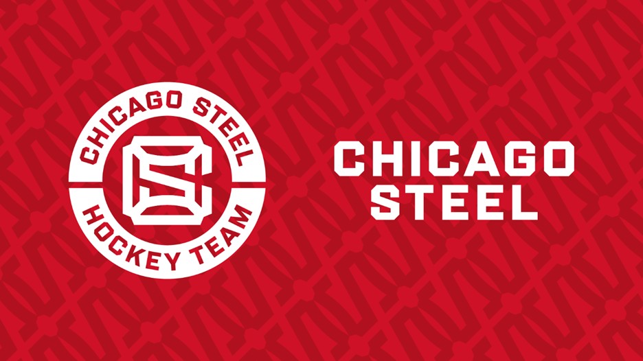
The Steel also unveiled a new patch and a new wordmark. The patch places the “CS” monogram, minus the beveling, in a split roundel, with “CHICAGO STEEL” written out above and “HOCKEY TEAM” below. The wordmark has the city name and team nickname at equal heights in a “sleek, modern style with a cutting-edge font.”
While the Steel won’t officially transition to the new identity until later in 2026, they are selling merchandise with the new logos through their online shop. The Steel will launch new uniforms featuring the logos closer to the start of the 2026-27 season.

