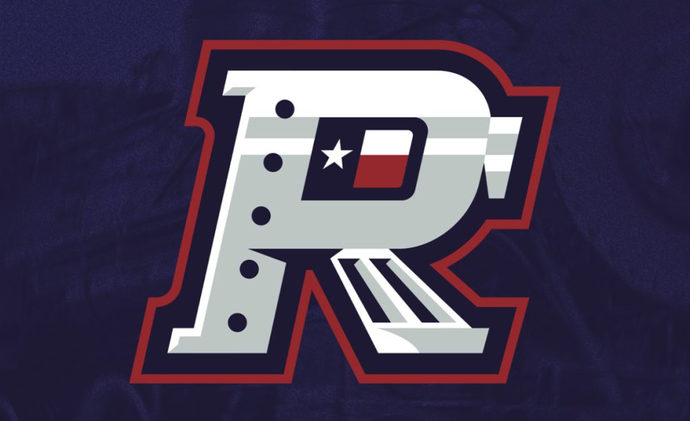
The Cleburne Railroaders, a team in the American Association of Professional Baseball, unveiled new branding that celebrates the team’s heritage and their home state. The new look, created by Nick Matarese of The Barn Creative, accentuates the Railroaders’ Texas roots and incorporates elements of brands from previous iterations of the team dating back more than a century.
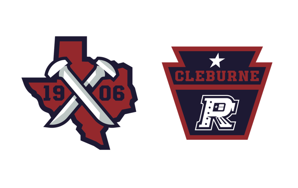
While the current franchise debuted in 2017, the first Cleburne Railroaders team played in 1906, winning the Texas League championship in their one and only season. The team’s new logos include a mark that commemorates that inaugural Railroaders team, with criss-crossed rail spikes set against the state of Texas. Another secondary mark features a keystone-shaped railroad sign.
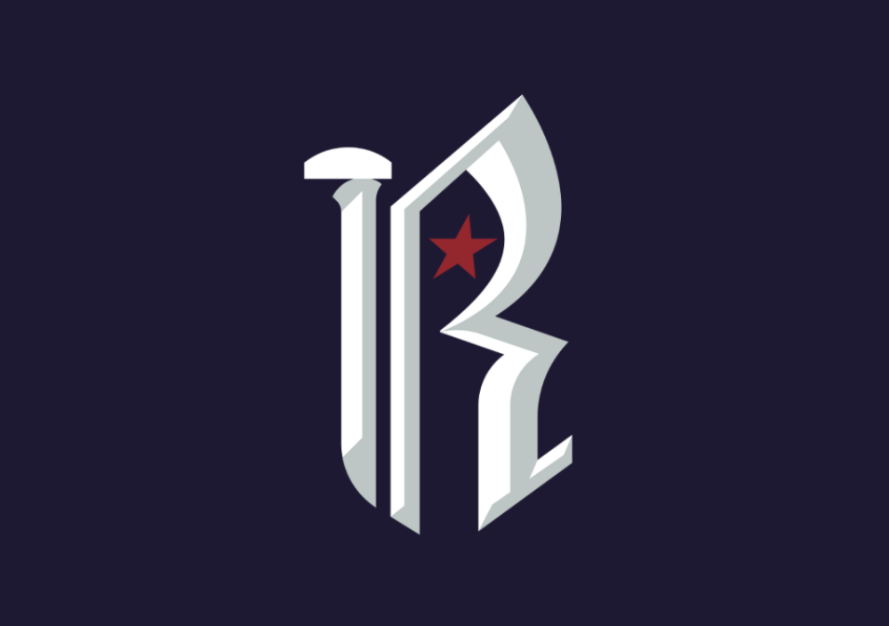
A blackletter logo that the team calls the “Heritage R” evokes the original gothic letter patch that the 1906 championship team wore. The new version incorporates a rail spike as a vertical stroke.
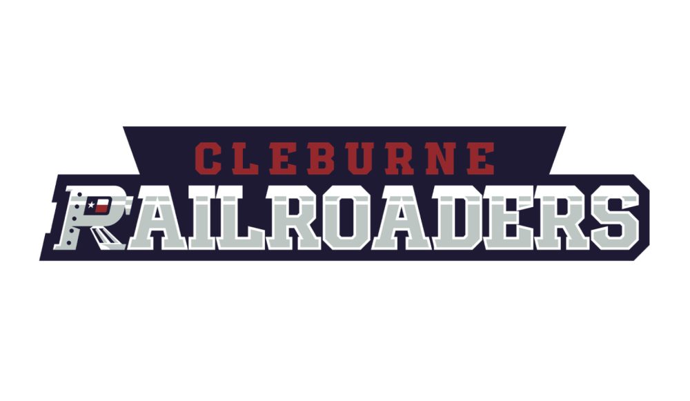
The Railroaders wordmark incorporates the primary R logo, complete with rivets, a cowcatcher, and a headlight, with the rest of the letters set in a font that evokes the metallic sides of a train.
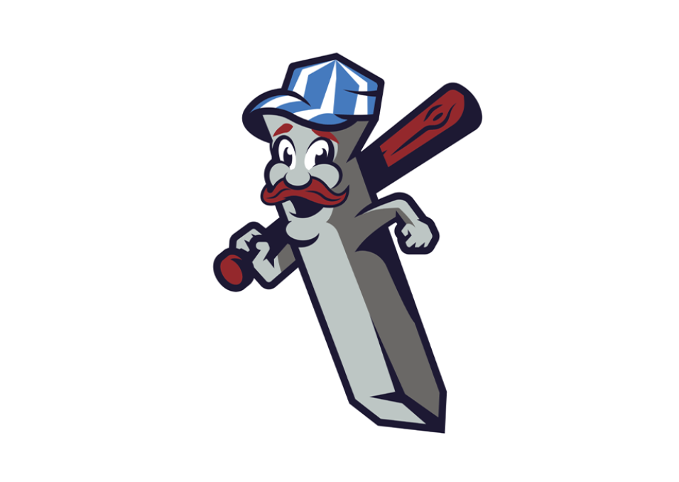
One design element that seems to survive rebrand after rebrand is the team’s mascot Spike, who has appeared in several iterations of the team’s identity since 2017
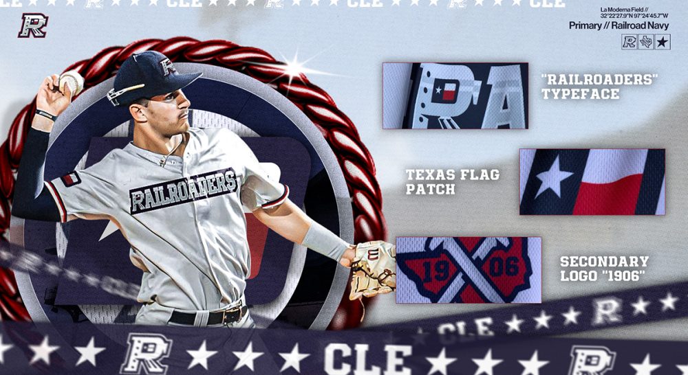
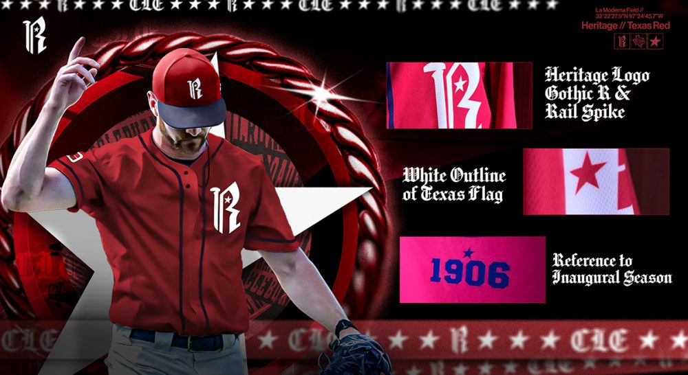
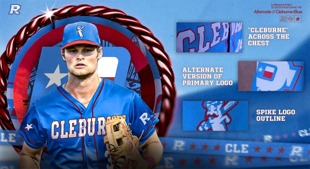
Along with the new suite of logos, the Raildroaders unveiled three new uniforms, which they’re calling the primary white, heritage red, and alternate blue.
The Railroaders will debut the new look on the field when the 2026 American Association season begins in May.
Related stories:
 Cleburne Railroaders on the right track with new brand
  Back to the Salt Mines: The Story Behind the Lincoln Saltdogs
  Gary SouthShore RailCats go Back to the Future
  Unsaintly: The Story Behind the St. Paul Saints
  Wide-Eyed in Texas: The Story Behind the Laredo Lemurs
  Best, Worst New Logos of 2014: SportsLogos.Net Readers’ Choice Awards
  Pics: Nordiques, North Stars Baseball Jerseys
  Independent Baseball Teams Revive Nordiques, North Stars