
Ahead of their re-debut in the Women’s National Basketball Association later this year, things are heating up for the Portland Fire with the launch of two jerseys and a new secondary logo.
The team rolled out the logo and uniforms on their website and social media channels on Wednesday, January 28. The announcement included a red Explorer Edition and a white Heroine Edition.
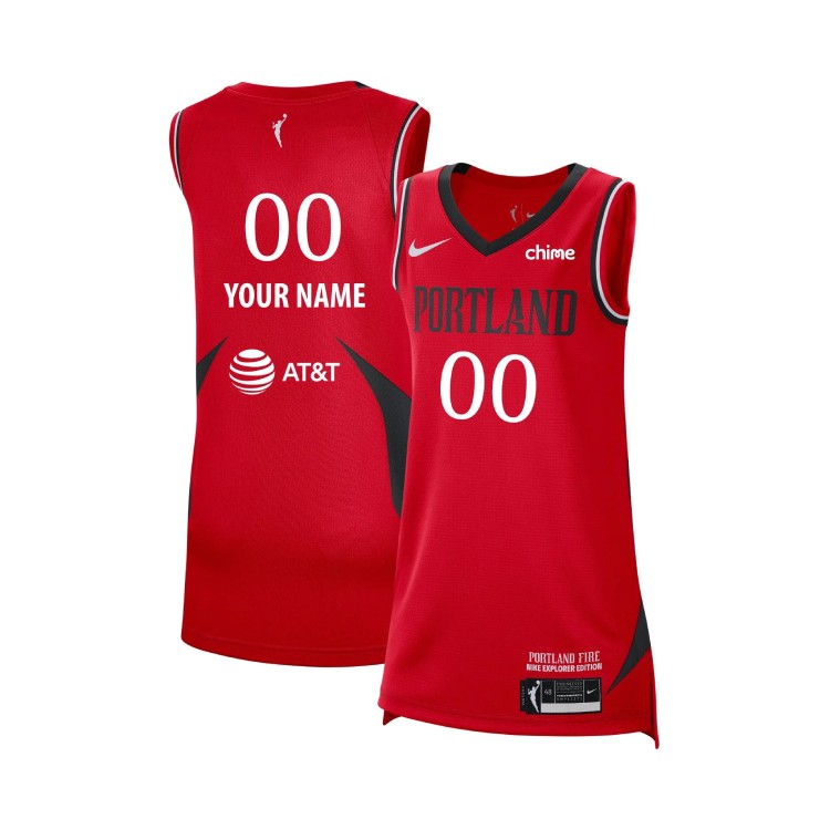
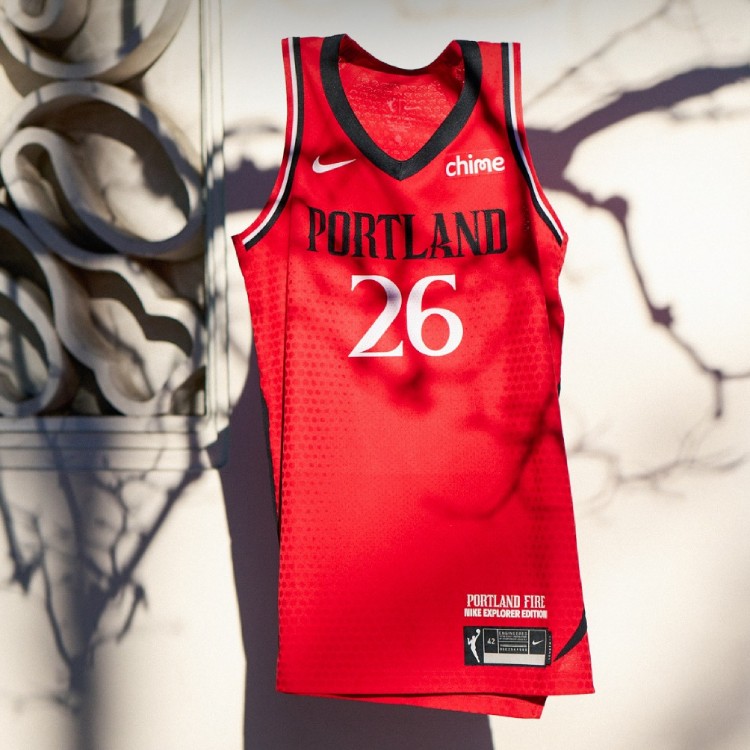
The Explorer edition has a red base with black side panels that taper to points on the upper back and the lower front. The V-neck collar is solid black, while trim around the arm holes is black, white and red. “PORTLAND” is written in black across the chest, with the player number in a white serif font below. On the back, the number sits above the player’s name, which is also white.


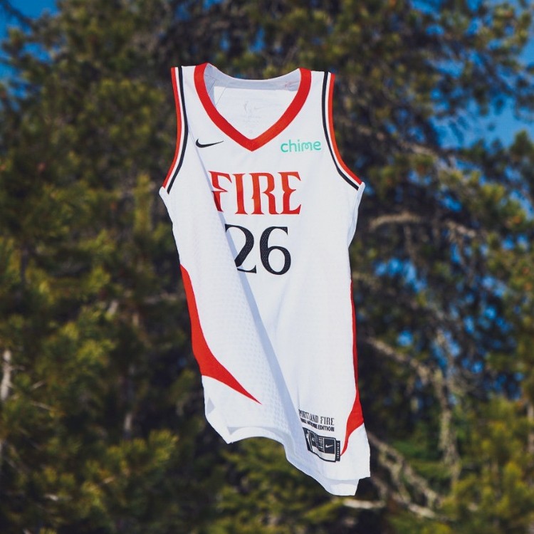
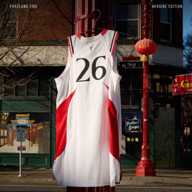
The Heroine edition, meanwhile, flips the base colour to white and the side panels to red. The collar becomes solid red, but the striping around the arm holes remains the same. “FIRE” is written across the chest, with a black number below. The number and name on the back are also black.


Red Explorer edition jerseys are currently available for fans to buy through the Fire’s online shop.
Along with the jerseys, the Fire unveiled a new secondary logo featuring the city’s airport code, PDX. It uses the blackletter P logo that was part of the team’s initial suite of logos released in July 2025 and adds a D and an X.


The original Portland Fire played in the WNBA from 2000 to 2002. The addition of the Fire and the Toronto Tempo brings the WNBA to 15 teams for 2026, with plans to expand to Cleveland, Detroit and Philadelphia by 2030.

The new incarnation of the Fire begin their 2026 WNBA season at home against the Chicago Sky on Saturday, May 9.


