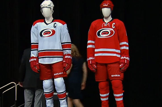
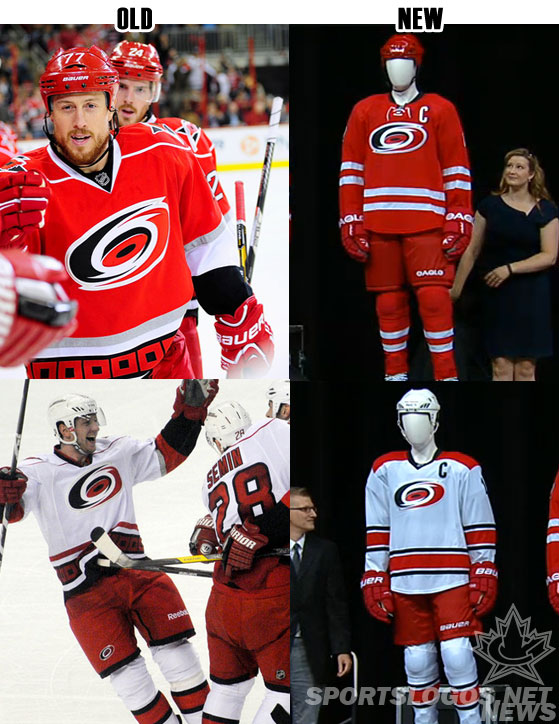
The Carolina Hurricanes today unveiled their new home, and road uniforms – the third change to the look of the team uniforms since their move from Hartford in 1997.
Among the changes, silver has been removed from the home jersey (aside from the logo); laces have been added to the home jersey to give it a “classic look”, the storm flags are now inside the collar, a solid (thank you!) red yoke has been added to the road jersey which will also house the player name on the back. The logo has been reduced in size by 15%.

The black alternate jersey will remain in the rotation for the 2013/14 season.
“We wanted to keep the brand the same, didn’t want to change the logo, kids here see the logo and think ‘hockey’, that’s great after only 15 years and we didn’t want to change that” – Carolina Hurricanes executive director Doug Warf

“It’s a lot cleaner, sharp, it’s comfortable… I think they look great, something different but keeps a lot of the similarities of the other jerseys. I look forward to wearing it in the fall” – Carolina Hurricanes captain Eric Staal

A full run-down of the changes as explained in the Hurricanes official press release:
Changes to both sweaters:
There is a smaller, lighter crest on both sweaters.
The logo outline was changed from metallic to matte silver finish.
The warning flag pattern was moved from the base of the sweater to inside the neckline.
Lettering and numbering changed to a clean, round, sans-serif-based font.
The shoulder patches were removed from both sweaters.
To the home red sweater:
A cleaner look was established, highlighting the team’s dominant color. All striping is white, with black being used in the neckline and to outline letters and numbers.
Bold white stripes highlight the arms and base for a classic look.
White lacing is used on the black collar.
To the road white sweater:
A red shoulder yoke was established, which extends on the back to include the nameplate. The feature is unique in the NHL.
Numbers and letters were changed from red with a black outline to black with a silver outline.
Bold striping to establish a classic look.
To the pants and gloves:
The Hurricanes logo and bottom black band were removed from the pants.
All glove sets are predominantly red with small white highlights. Black and silver has been removed
Basically the new look is all about cleaning up and creating a more classic look for the Carolina Hurricanes, all the flashy and non-traditional components of the old look (the storm-warning flags, the glittery trim on the logo, the italicized number font) have all been removed in favour of a streamlined, traditional design. I find myself being a fan of this new look, but as always I’ll wait until I see it out on the ice before I can fully commit to an opinion.
The new uniforms will be available to the public to purchase in September.

