I’m only a casual baseball fan. I like the Phillies, hate the Yankees & Red Sox aka the 1% (Philadelphia has definitely joined that group in recent years, but in my heart, they’re still powder blue collar bums who bleed maroon), and I know that Sammy Sosa looks totally weird now. Aside from major storylines and players, I don’t follow much of America’s pastime. So it’s no surprise that I was unaware of the Florida Marlins rebranding initiative until Chris Creamer approached me to showcase some of my Foogos art here on SportsLogos.Net
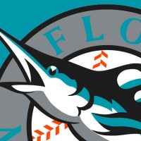
The logo is typical baseball shlock – boring stylized letter – meets construction paper, and despite that underwhelming description, I don’t totally hate it. I mean, the color scheme is definitely Miami. Sun, sand, ocean. And the font for the “M” and “MIAMI” (I think it’s from the Futura family) definitely has a South Beach vibe. So from that perspective, at least there is some logic to it.
Then there’s the hometown switcheroo. Sometimes these work, sometimes not. For instance, if the New York Islanders went more local, they’d be redundant and somehow terribler. Thankfully, SEGA Genesis’s NHLPA ’93 saved Charles Wang from making that colossal mistake. Too bad video games couldn’t show us the error of the California Angels becoming the Anaheim Angels and then the Los Angeles Angels of Anaheim. Be sure to shoot me when they add “Orange County” to the name. But in this Marlins case, I think going from the broad “Florida” to the specific “Miami” is a good move. If nothing else, it reinforces some of the decisions made with the logo.
That said, it’s still another so-so baseball logo. (Someone get the Brewers to stop fooling around and get back to the ball-in-glove. Baseball needs a kickass logo again.) Maybe my mother summed it up best when she asked, “What is that? Poo?”

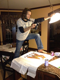
Granted, she wasn’t talking even about the logo, but the ingredients I was using to create the M & Friends. And those ingredients would be black refried beans (the poo), regular refried beans (a lighter shade of poo), corn salsa, blue tortilla chips that somehow claim to have no artificial flavoring or coloring, and a delicious roasted red pepper spread, all of which were purchased in Heaven Trader Joe’s for a whopping $8.55.
I’m not really sure why they’re called “refried,” because there’s no way these beans were ever fried, but I’m pretty sure the con artists at Verizon are charging me per page view, so I’m not going to take the time to Google it. The mystery remains…
The original plan was to sacrifice the blue for the darkest lime I could find and hope the forest green hue would translate properly. I bought some oranges, lemons and grapes to round out the the orange (duhz), yellow, and black colors, but the grey stroke in the logo had me stumped. My whole Citrus State plan went up in smoke like that. (Deftly snaps fingers.)
Back to the drawing board, I returned to the blue conundrum (love that word!) and settled on corn chips. Black beans were a natural selection for the black portion of the logo, and as quickly as my first plan was thumped, the revision took off with a Mexican theme, and that Hispanic flavor also fits in with southern FLA. Yellow and orange would be easy even if I veered away from the obvious choices of cheese, but it came back down to the grey stroke. I thought to use regular corn chips, which have a manilla tone, but eventually dove into the regular refried beans pool. Even though they’re not the exact color, the beans are different enough from the black variety that I think it works.
The best thing about this is that for the most part, all these ingredients are the right consistency for molding and shaping. Yes, it’s messy, but it ain’t no poo.
—
This is the first in a series of articles showcasing Scott Modrzynski’s love of food, logos and art all mixed together. To view more of Scott’s logos made out of food check out his site at foo-gos.com.

