Several notable things happened with NFL uniforms this off-season, and this week, most were on display for the viewers. But did you notice them all? Allow us to run down the changes we know if and please feel free to tell us what we missed.
We will talk about each and every team in the NFL so look for your favorite!
Let’s start with the AFC in this article, and follow with the NFC.
AFC
East
Miami Dolphins
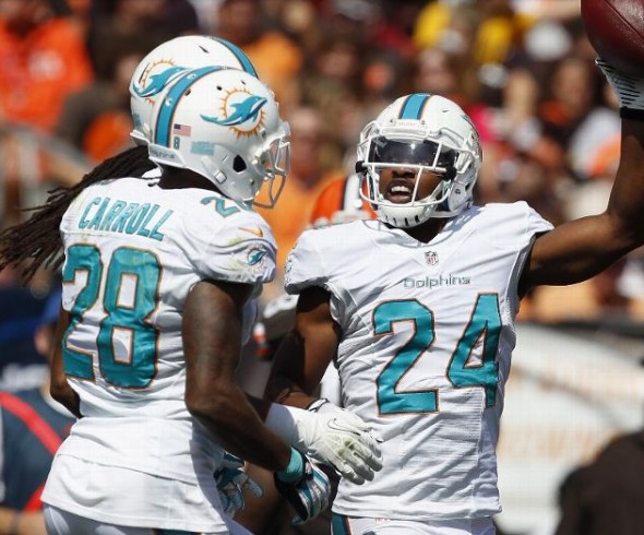
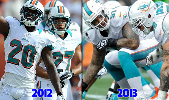
We had to begin the listing with a real change. The Dolphins came ALL new this year; new logo, new uniforms.
Along with their new logo and uniform design are tweaked colors. In our side-by-side you can certainly see the difference. Both the aqua and the orange have lightened a lot, and the orange has regressed into at best a tertiary color. You can also see the thankfully-killed goofy shirt collar, and the updated number font.
New England Patriots
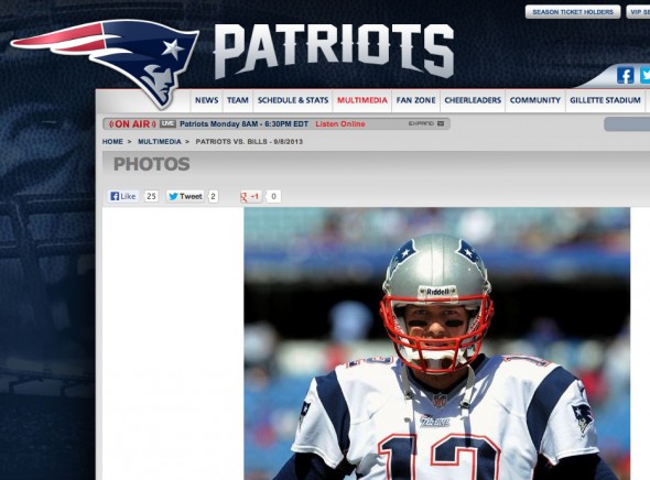
Does a new end zone strike your fancy? Then the Patriots news is for you. They changed their primary wordmark, so their endzone paint needed to change as well.
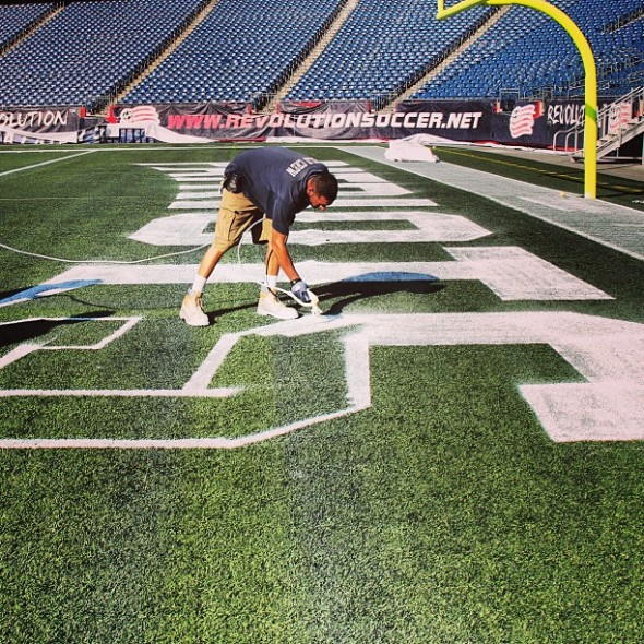
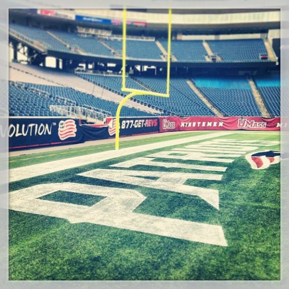
One imagines there will be additional coats of paint on that logo before their game next week.
Interestingly, while the new wordmark is in the endzone, and even in the header of their site, it wasn’t on their jerseys for the game this Sunday against the bills.
New York Jets
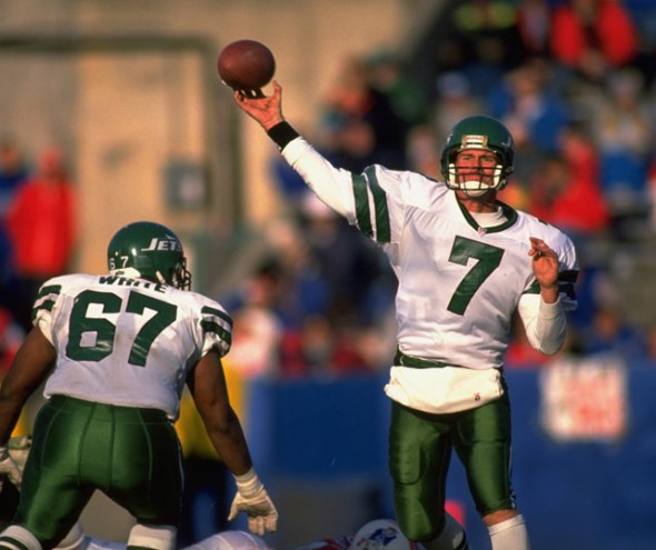
No on-field changes this year, though their owner has replied to tweets saying he’d consider a 1990’s throwback.
Buffalo Bills
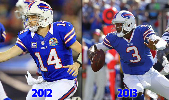
Amazing how much better a simple change can make a team look. Gone is the bad dress shirt collar look.
North
Cleveland Browns
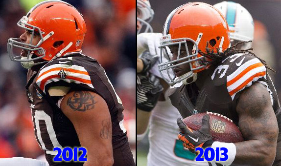
The uniforms stay largely the same, but the Al Lerner (former owner) tribute, which was on their shoulders for years, is now gone.
Pittsburgh Steelers
Steelers PR confirms that the team will be wearing their ..uhm… polarizing throwbacks again, on Nov 17th against the Lions.
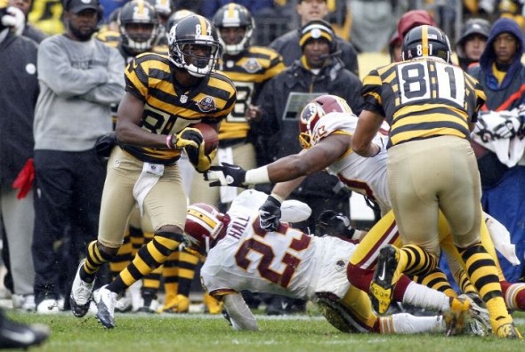
Baltimore Ravens
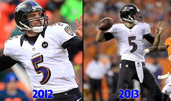
Two small changes for the Ravens, and one is common: the neck treatment has changed. Also gone is the “Art” memorial patch. The collar is simple white now, which makes it almost disappear.
Cincinnati Bengals
No uniform changes, but they have put out their uniform schedule, including two games in orange.
South
Jacksonville Jaguars
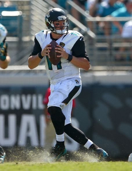
Another big change, and one of the most questionable. The Jaguars have an all-new logo, uniforms, and the strangest helmet concept in the history of the NFL.
On a whole, the uniforms are relatively unobtrusive. But, pickier details begin to annoy some viewers. The pant side striping has neither logical beginning nor thematic end. It just is… there.
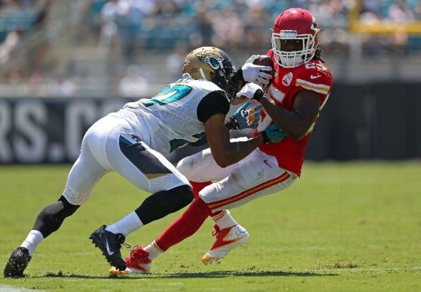
The shoulder/neck stripes are sharp, thin, and a bit randomly placed. It has been said they intent to represent the fangs of the animal.
The chest patch, with its military themes-shape, is a nice patch all in all.
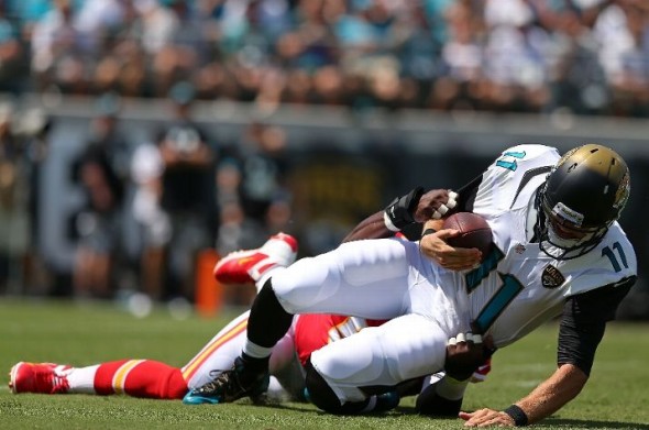
But the objections of the Jaguars new design is all about the helmet. Reaction to the new Jaguar logo is mixed, feelings about the size are leaning negatively, but the “gradient” is almost universally hated. The main issue we here at International Sports Logo Corporate Offices have with the design is that it truly isn’t graduating at all. It just abruptly goes from metallic gold to flat black. In, at best, a one-inch strip, the color completely switches from one to the other.
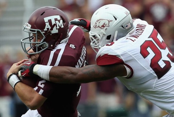
Other teams do it better. More tastefully. We’d prefer to see a black helmet with a “hint” of gold such as the way the Arkansas Razorbacks do on their helmets.
Our very own Chris Creamer mocked up what their helmets SHOULD look like;
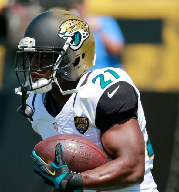
Actually, I think they should put the black at the rear of the helmet and gold in the front, so the concept of the Jaguar “coming out of the shadows” actually works.
Indianapolis Colts
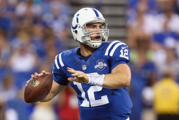
Uniform details themselves are unchanged, as they should be, but now they have a 30th anniversary patch, commemorating their move to Indianapolis.
Tennessee Titans
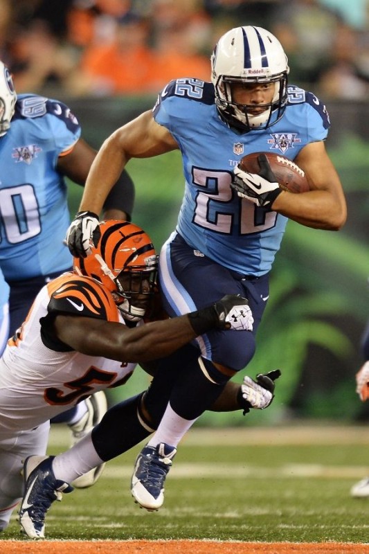
The Titans are also in the “patch-only-change” category, with their fan-voted Fifteenth Anniversary patch
Houston Texans
The Texans are continuing unchanged into 2013, and have published their 2013 Uniform Schedule, with a single game in their red jerseys; Nov. 3 against the Colts.
West
Denver Broncos
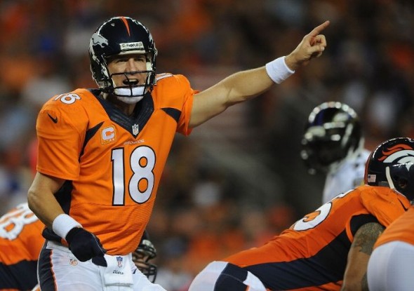
Another of the list of teams that has upgraded by killing their terrible collars. The Broncos’ however, have gone the way of the Texans and have a huge thick Boys-II-Men Sweater type of look.
Kansas City Chiefs
No changes, no patches, no uniform schedule! Thanks a lot, Chiefs.
Oakland Raiders
No changes to speak of here, either. Unless we are wrong. In which case, let us know!
San Diego Chargers
Adding more of an accent color can be a tricky proposition. That said, the Chargers’ addition of more yellow has been a rousing success.
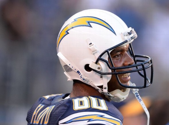
Difficult to find a great photo, but the Chargers now have yellow names with blue outline. Works better with the number outlines and looks less “temporary.” They have also killed their white collar, leaving only blue, which as reader Steve Cramsie pointed out, looks far cleaner.
Also new are their socks.
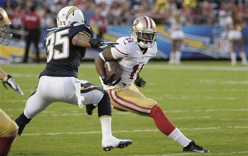
The socks used to be blue and white, now those colors are kept separate by a thin yellow line.
How do you like your favorite teams’ changes? Who looks terrible? Anyone’s changes really have you excited?

