The Blue Jays are blue again!
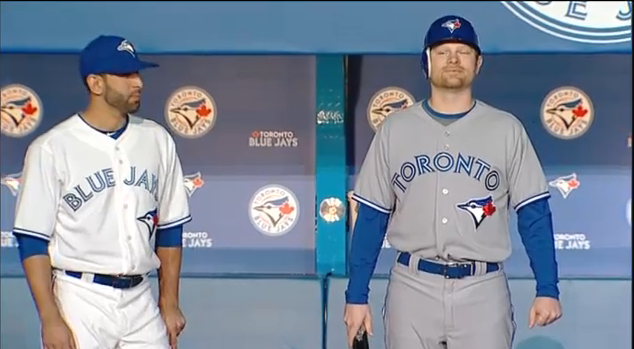
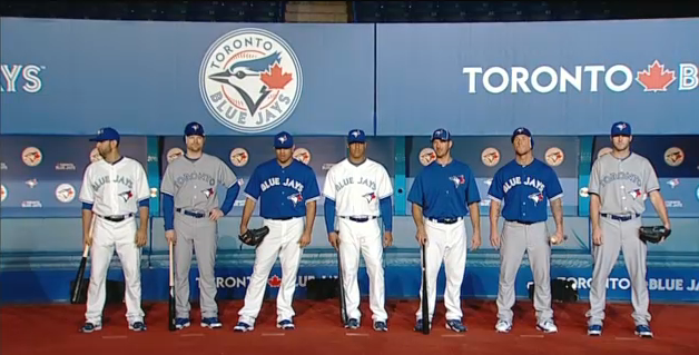
Continuing what has been one of the better re-branding off-seasons in Major League Baseball, the Toronto Blue Jays saved the best for last today and unveiled their new modern-retro logos, uniforms and colour scheme for the 2012 season.
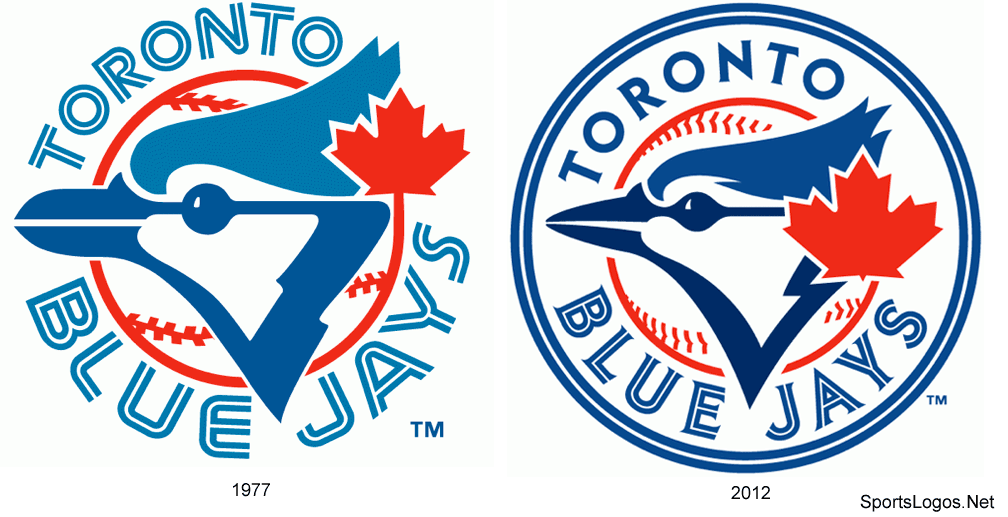
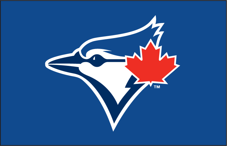
The primary logo is a 2011 take on the original 1977-1996 logo, complete with split-style lettering arched around the jay head on a baseball. The maple leaf has been enlarged, perhaps larger now that the club is Canada’s only franchise this time around. A navy blue double outline has been added around the modernized script to really hold the logo together.
The rebrand had been in development for two years according to Jays President Paul Beeston, other notes from Paul:
– “The blue is back in Blue Jays, we’re not the Jays, we’re the Blue Jays!”
– “The maple leaf is a very important part of the logo and of the history. We represent Canada and proud of it”
– “Want to connect the past to the future, the players of today are now connected to the Roberto Alomars of the past”
– “Two year process, Anne Ochi of Major League Baseball provided guidence, involved in the process. Managers and players were all involved”
– “A mark that reflects our past but moves us to the future, it’s been modernized and energized”
On the caps and the front of the uniforms is a partial version of the primary logo which features only the blue jay head with maple leaf. Unlike the 1977-1996 uniform sets the baseball design is not a part of the cap or uniform patches.
The club’s famous split-style lettering has returned on both the front of the jerseys and on the font for the player numbers. The font is not at all like the other split-style scripts the club has used before as this version is the first to include serifs. Player names are arched across the back of the jersey in a standard block style, one-colour font.
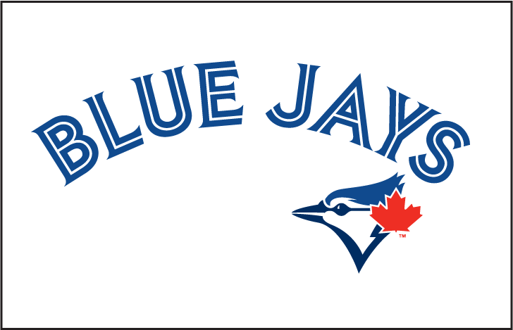
There will be three in-game uniforms, home, road and blue alternate. All three jerseys borrow heavily upon the elements of the 1994-1996 set with the various more modern designs in place of the originals. Each jersey includes the team name arched across the front (BLUE JAYS on home and alternate, TORONTO on road) with the aforementioned baseball-less logo to the bottom right of the script and a double stripe on each sleeve cuff.
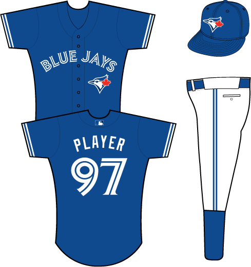
I have two extremely small gripes with the set, very small, the exclusion of the baseball on the cap and uniform logos and the maple leaf slapped onto the official team wordmark logos. That’s all, the rest of this set is a home run, a Jose Bautista, a without-a-doubter, and so on.

Major kudos to the Toronto Blue Jays for doing this right, for listening to what the fans want. After years and years of teams telling fans what they’re going to like it seems that teams are finally listening.
You can see all of the new Toronto Blue Jays 2012 logos and uniforms, as well as all their old graphics from 1977-2011 by checking out the Toronto Blue Jays Logos section right here at SportsLogos.Net


