 There’s three reasons I love the Maine Mariners’ logo.
1. There are hardly any classic AHL logos out there… or any minor league logos for that matter. Most minors’ logos are vector drawing contests: detailed caricatures of various animals; flashy wordmarks; and the inclusion of a hockey stick/puck, basketball, baseball/bat or football, depending on the sport. Don’t get me wrong, many of those cartoonish logos are blast, and oftentimes they are rendered with the utmost of precision, but I’m old school. Give me no more than three colours (one of them white) depicting some obscure shape and I’m sold. There are so few recognizable icons anymore.
2. The Mariners were the Philadelphia Flyers’ minor league affiliate. I LOVE how Maine was able to forge its own identity while using the parent club’s logo as the basis for their own. The colors and imagery (orange circle centering a stylized black letter) are taken straight out of a Flyers spec sheet, but the inclusion of the classic ship’s steering wheel adds a new wrinkle, giving the Mariners’ their own distinct look to boot. I can’t think of a time any team has captured the spirit of its parent club without sacrificing its own identity. Usually, it’s an unmistakably direct correlation, like the Albany Devils or Providence Bruins. Not that there’s anything wrong with that. Like I said, I dig the simple.
3. The first pieces of hockey memorabilia I ever owned were a Mariners puck and pin my dad gave me one day after he began working in the NHL. The team had a contract to send players down to Maine, so there was always random promotional Mariners’ stuff laying around the office. That puck and pin are probably worth 50¢, but they are two of my most prized possessions, along with Uncanny X-Men #286, an issue in which nothing of importance happened, but it was my first real foray into the world of mutant heroes, and I was hooked. Thank God I don’t do drugs, because these days, keeping up with the likes of Wolverine and his travels is expensive enough.
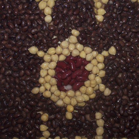
And so without further ado, here’s the art of the Maine Mariners, made of black, pinto and kidney beans for no other reason than those colors came close to the hues I needed.
Someone stole our can opener at work, so I scoured four floors of the ad agency to steal someone else’s. When I finally found one, I realized why ours was pilfered in the first place. The piece of crap I swiped couldn’t open a can made of tissue paper. Freaking art directors… I wound up opening the cans by systematically stabbing them with my knife.
Step one. Draw the logo on wax paper in yellow Sharpie. It hides well when I snap photos, but the yellow is still visible when I work. Much better than the red pencils I sometimes use. Then just add the beans.


