College football’s season began in earnest on Saturday, and once the excitement wore off and everybody either began lamenting their team’s bad luck or the tedium of a boring victory over a cupcake team, the fans’ focus began to shift onto the uniforms. Let’s just say that it was a pretty bad day for adidas.
Here’s proof of those shoddy Kansas nameplates!
Meanwhile, the biggest gaffes were to be found in Atlanta and Miami, as the Louisville Cardinals embraced Old English in a way never seen before on a football field, and one of adidas’ newest schools debuted some wonky nameplates.
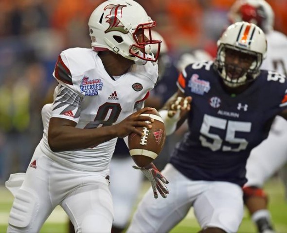
First, the Cardinals debuted those weird uniforms with the shiny beveled numbers and that super-creepy Cardinal on the helmet.
However, one thing that we didn’t get to see when these were initially revealed were the nameplates, and who knew that those would end up stealing the show?

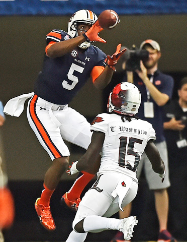
It’s a good thing that these are (hopefully) one-off uniforms, because that nameplate is an absolute disaster. The Old English font would’ve been better had it been larger, but even then, it still would’ve been a bad idea. The point of having your name on the back of a jersey is so that people int he stands can see it. I highly doubt that people in the Georgia Dome seats could’ve seen those names, and it was pretty hard for people watching on TV to see them as well. All in all, this was a pretty bad idea for a football uniform.
Then, we finally got to see Miami’s new adidas uniforms on the field. The uniforms aren’t all that bad (this is college football. There are definitely worse uniforms out there than this.), if I’m being honest here. Miami’s always been one of the schools that likes to push the envelope a bit with their football uniforms, and this set is no different. I’m not a fan of the uni combo here, but they’ll get better with time.
Once again, though, the names on the back stole the show. I hope you’re seated for this one, because this is a doozy.
Good grief. How did they decide which letters would be capitalized and which ones wouldn’t be?! Seriously, who thought that this would be a good idea? Plus, these nameplates suffer from the exact opposite problem of Louisville’s nameplates when it comes to size. Poor Vincent Testaverde’s name is too long for that huge font, so it’s stretched out on the back of his jersey. What a mess.
Now, this isn’t to say that all adidas schools look bad. There are plenty of adidas schools who had a solid look on the field yesterday. With that being said, a few rotten apples can indeed spoil the bunch, and these gaffes are proof of it. There’s going to come a time when fans don’t regret seeing their school move over to adidas, but today doesn’t appear to be the day.


