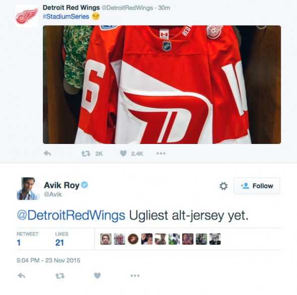
Well, these are different.
The Detroit Red Wings today unveiled their 2016 Stadium Series jersey design, the uniform will be worn (thankfully?) for one-game-only at Denver’s Coors Field on February 27, 2016. [see Colorado’s uniforms for this game here]
Red, despite being the road team, the jersey has a large red “D” logo shown slanted to the right (or moving forward, probably), this new “D” logo is laid upon a white diagonal sash. Wait, why a sash? The club gave a reason, it’s to “celebrate the iconic stripe of this franchise”, and as a nod to “modern automotive aesthetics… a tribute to the automotive industry”. The Red Wings have always worn a thick, single stripe at the waist of their jersey, I’m assuming this is that “iconic stripe” to which they’re referring.

On one shoulder is the Red Wings standard primary logo, the other is the 2016 Stadium Series logo. “EST 1926” is on the inside rear collar, “RED WINGS” is placed up one side of the front collar… just because they can do that now.
The giant numbers are back, this is said to make the players more easy to identify to fans within the stadium. I can only assume this means fans attending the Winter and Heritage Classics have far better eyesight than those who have tickets for the Stadium Series. I suppose that *would* have to be the case, poor eyesight would be a prerequisite for going to a game known for such garish uniforms.
Fan reaction was, well, how you’d expect it to be…
Well, those jerseys certainly continue the Detroit organization’s trend this season.
— DetroitHockey.Net (@detroithockey96) November 23, 2015

And we’ve seen some ugly alt-jerseys… heads up, more to come, the Chicago Blackhawks and Minnesota Wild are both set to unveil their Stadium Series uniforms tomorrow.


