With 18 seasons under their belt, the Arizona Diamondbacks are still Major League Baseball’s new kid on the block. The team debuted along with the Tampa Bay Devil Rays in 1998, in a splash of purple and teal, an oasis of color in the Arizona desert. Unconstrained by convention or tradition, the team set out to blaze a trail that capitalized on fashion trends and new technology that their decades-old counterparts could not follow.
Even the Washington Nationals, who debuted in 2005, had to consider their previous history in Montreal, not to mention the larger tradition of baseball in Washington DC, in developing their identity. In Phoenix, where Major League Baseball was brand new before the Diamondbacks, all gloves are off.
“I think a lot of the excitement for us is that we can get outside the box a little bit and it’s appropriate based on the youth of our franchise and the fact that we are the youngest team in Major League Baseball,” said Graham Rossini, the Diamondbacks’ Vice President of Special Projects and Fan Experience. “We don’t have the limitations that the Yankees or Dodgers or Red Sox or Cubs would have. Our fans don’t have the same connection to uniforms that their parents watched or their grandparents watched.”

After Phoenix was awarded a franchise in 1995, the process of choosing a name, which Rossini describes as an ownership-driven decision, was aided by the existence of a handful of teams already playing right there in town.
 “Obviously, the Arizona Fall League had been in existence prior to our club being announced in 1995, and there were several ideas on the table,” Rossini said. “Diamondbacks was an option, Scorpions was an option, Coyotes was an option.”
The debut of the NHL’s Coyotes in 1996 took that option off the table, so the new Major League Baseball team was left with two choices inspired by Arizona Fall League teams: the Scottsdale Scorpions or Derek Jeter’s own Chandler Diamondbacks.
While Scorpions was an intriguing option (and makes me hope the Diamondbacks will do a minor league-style “What Might Have Been” night some day), the rattler-based identity won out.
“Obviously there’s a connection to snakes and the Phoenix area and the surrounding desert,” Rossini said. “So it was kind of an area- or regional-specific nickname to use and something that had not been done in baseball, or a name in major professional sports before.”
 Of course, with a snake-based identity, there’s that age-old problem of what to do about a mascot. When the team debuted in 1998, they did so without a costumed character roaming the stadium.
“There was definitely that hesitancy of having a snake as a mascot—how do you put a human in a snake costume and have it look appropriate?” Rossini said. “It’s intimidating and it’s an intense reptile and it strikes fear in its opponents, so we like kind of the competition reference of it, but certainly, for little kids and families, it’s not the most family- or fan-friendly mascot to highlight.”
After a couple years without a mascot, the team eventually went with Baxter the Bobcat, whose very existence was a wink and a nod to Bank One Ballpark, also known as “The Bob.” Baxter outlasted the name sponsor of the team’s stadium, and remains on the prowl today, even though the ballpark has gone by the name Chase Field since 2006.
The Diamondbacks had near-immediate success on the field wearing turquoise, purple, copper, and black—a look that was developed by Anne Occi of Major League Baseball and Greg Fisher of Campbell Fisher Design—winning the NL West three times in four seasons from 1999 to 2002, and winning the 2001 World Series.
 And while it seemed that nearly every new professional team from the 1990s was wearing teal, the color had specific local significance to Arizona. “There’s a lot of regional connectivity to that in terms of when copper oxidizes, it ends up with more a teal or turquoise hue,” Rossini said. “You see a lot of that in the Southwest, in the landscapes and sunsets, mountains, etc.”
But after almost a decade in teal and purple, the need for change was in the air. It wasn’t just that fashion trends changed, but the advent of high-definition television was causing problems for the team.
The new technology was a boon for consumers, but a bane for the likes of local news anchors (whose imperfections were suddenly not so easily hidden by makeup), special effects artists (whose techniques required a whole new level of sophistication), and the Arizona Diamondbacks (whose uniforms were subject to more intense scrutiny). Teal and purple are notoriously hard to match across fabrics and textiles. For a while, the team could get away with T-shirts and helmets and jerseys that almost but didn’t quite match, but within a few years of the team’s debut, the technology to display those imperfections on TV did exist, but the technology to fix those imperfections did not.
Along with the technical difficulties associated with the Diamondbacks’ colors, the team couldn’t help but notice that National League West was that rare MLB division with two teams in purple and no team in red. So after nine seasons in their inaugural colors, in 2007 the Diamondbacks adopted a palette of Sedona red, Sonoran sand, and black.
 It was four years before the team wore their original colors again, holding throwback nights in honor of the 10th anniversary of their 2001 World Series team. The throwbacks were well received, and because the team had had so many different uniforms in their first nine seasons, the options were practically limitless.
“Some were good, some were a little wild,” Rossini said. “We liked the idea of let’s bring back the ice cream cap and let fans remember what it was like to look at a white pinstripe jersey with a white crown cap.”
In producing those throwbacks, the team also noticed a marked improvement in technology that would have implications down the road.
“It was nice to bring it back and at that point, just textile and fabrication and production processes had changed where the purple on the helmet would match the purple undershirt or the belt was the same color as the sock,” Rossini said. “Even in five, six years, it’s amazing how that process had improved, where you’re like wow, we can nail this uniform.”
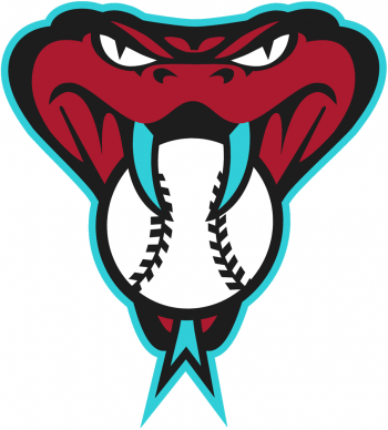 All of this is prelude to the new look the Diamondbacks unveiled in December, which combines the Sedona red identity with the teal from their original color scheme (almost). The teal will be featured in several of the team’s many uniform schemes in 2016, including the new alternate snake head cap logo, which Rossini describes as a runaway favorite in the new set.
Their initial discussions about this new look, however, focused on a different color from the team’s past.
“When we started the process in November of 2013, it was, let’s at least experiment and find out, is there any way to take purple and Sedona red and make that work together?” Rossini said. “We tried a couple looks and it was just hard to make it match. Aesthetically it wasn’t as pleasing as we had hoped.”
So the team turned back to teal, inspired by an unexpected source—a sneaker from the NBA.
“They actually brought us some of the early, early artwork of one of the Lebron James shoes that Nike was prepared to release, and Howard Smith, who was at MLB Properties at the time, said hey, this is a color that is not a stretch to consider,” Rossini said. “It’s reminiscent of your original teal. It’s not an exact match, but it’s got certainly a nod back to your heritage. It’s also a color that’s about to get really, really popular again, and be something that’s going to be very mainstream for the next decade at least.”
That sneaker prompted the discussion that led to the look that the team will feature next year.
“We started looking at how Sedona red worked with the teal, as soon as we started looking at it, this was the no-brainer,” Rossini said. “We liked the fact that it was new and it was energetic, but it was also a nod back to the original era of uniforms.”
One of the (many) unique aspects of the new look is that it was created by actual human beings with actual names—Zach Alvarez and Sara Bielski—rather than faceless robots in an MLB corporate building.
“As we worked on the uniform process going into this coming season, that process was led by our in-house design team, and that’s an area we’re really, really proud of,” Rossini said. “I don’t know that we’re able to say that it’s the first time that an in-house design team had designed the uniform, but I know that most times, teams are saying, let’s bring in the brand expert or the uniform expert to come in and put together these new logos or uniforms.”
The Diamondbacks have made experimentation and pushing the envelope part of their identity for two decades. In a sport that’s desperate for young fans and just being relevant overall, this is a good thing. The knee-jerk reaction from traditionalists when the Diamondbacks take the field in their new look next year might be negative, like Russell Martin tsk-tsking a young player for flipping a bat or celebrating a home run a little too excessively, but baseball needs more youthful exuberance, not less, and the Diamondbacks return to an unconventional look is a step in that direction.


