The Milwaukee Brewers have finally gone ahead and done what we could all see coming for years now, they’ve finally changed their primary logo.
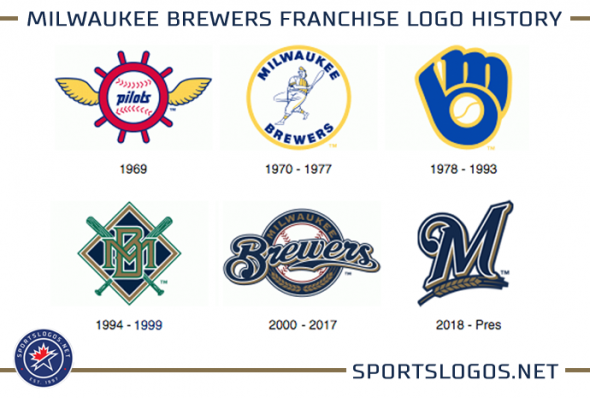
But it’s not back to the classic ‘mb’ ball/glove logo.
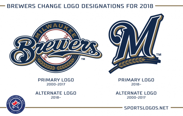
Noted as a change in their official 2018 style guide, the Brewers will now use the “M with wheat” logo, more commonly seen on their regular home and road caps, as their new primary mark going forward. The previous primary logo, “Brewers” scripted on a circle will remain as an official club secondary logo.
Fans will notice little-to-no difference with this change, their uniforms remain exactly the same and the Brewers were using the “M” logo more often than the scripted “Brewers” logo in recent years anyways. Essentially the only place you’ll see this change is on our Milwaukee Brewers logo history page.
The Brewers had used their previous primary logo since the beginning of the 2000 season, coming in at 18 seasons of use it’s the logo the team has had designated their primary logo more than any other logo in their franchise history; two years longer than the ball-glove logo which was used for 16 seasons.
This kind of logo re-designation is common in Major League Baseball these days, the 2018 Brewers join the Marlins and Rockies who last year both switched their primary to their cap logo with several others doing the same in the past few years including the Angels (2005), Diamondbacks (2012), Indians (2014), Padres (2015), Pirates (2014), and Tigers (2016).

