The Golden State Warriors, NBA Finals participant, are making a change to their logo set for next season.
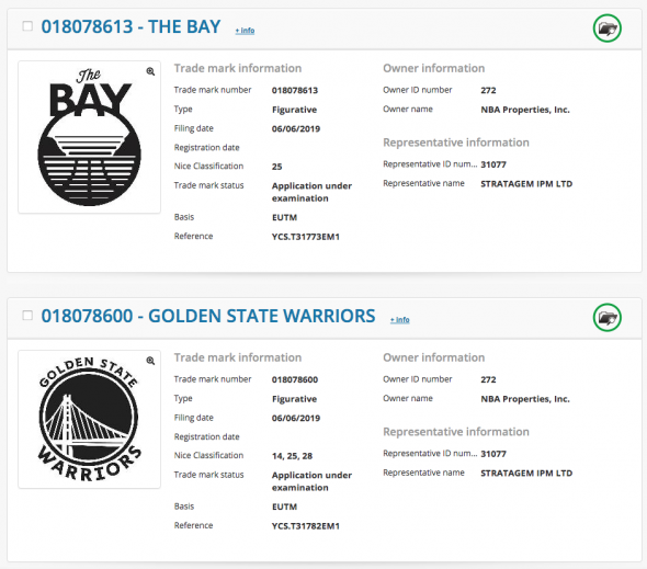
Nothing has been officially announced by the club or the league, but four new logos were trademarked with EUIPO — the European trademark site, by NBA Properties, Inc. late last week along with the new logo already released by the Houston Rockets.
Here’s some of the registrations as they appear on EUIPO:

As is usually the case with logos we find via trademark filings, they appear only in black and white. We’re assuming the Warriors are keeping the same colour scheme and have colourized the logos accordingly for use in this post. It’s always possible colours are changing or shades of blue and/or yellow are adjusted.
Golden State Warriors logo and uniform history
Changes to the global logo are minor but appreciated. The very outdated Copperplate font is gone, the bridge also has been given a tweaking. A side-by-side below:

The font used on the 2010-2019 logo is also worn on the uniforms, as is that soon-to-be-outdated bridge design, so we will certainly see changes to their uniforms too. Could be as simple as updating these elements.
And now the entire set:

Those other three logos include a wordmark free version of the global logo, which will probably be the “primary icon”, a logo which reads “THE BAY”, and a fourth logo which is a “W” on a circle.
It’s likely these changes haven’t been announced yet due to the Warriors still present in the 2019 NBA Finals, so we should expect an official unveiling of the new logos and uniforms in the next few days.


