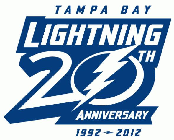
The Tampa Bay Lightning will be celebrating their 20th anniversary in 2012/13 and today they unveiled the logo that will be used to mark the occasion.
The logo was unveiled via a video presentation on their website which can be viewed here.
Black is absent from the logo despite being a major colour for the majority of the team’s history. The colour was originally to be eliminated for the 2011/12 season before fan feedback forced the team to re-introduce it as a trim colour.
Their new as of this past season lightning bolt logo forms the “0” in “20”, much like their 10th anniversary design used in 2001/02.

The anniversary logo will be worn on the front of the jerseys as a patch in the upper-right corner, we will get our first glimpse of the patch on the jersey at the NHL Draft being held tonight in Pittsburgh.
When asked about any throwback jersey plans for the 20th anniversary, SportsLogos.Net was told they were still to be determined, so we’ll keep an ear out for that information and pass along whatever we can.
The Lightning 20th anniversary logo has been added to the SportsLogos.Net database, you can see it here.


