The Los Angeles Chargers this afternoon joined their new landlords in unveiling a new logo for the 2020 National Football League season.
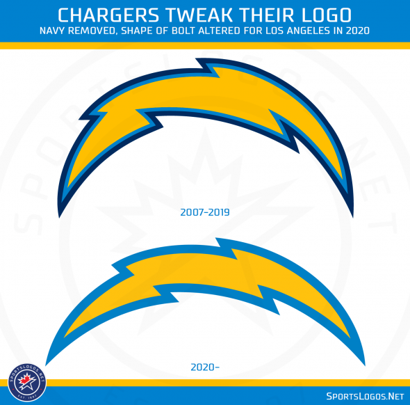
Removing navy from the overall look, the slight colour shift logo replaces the gold and double blue lightning bolt as the team’s official primary logo which had been in use since 2007 during the franchise’s days down the coast in San Diego.
“Throughout the branding process, the team drew inspiration from the surf, skate and car cultures of [the 1960s] when creating its new look”, a release from the Chargers read. “With the new Bolt a sleeker, more streamlined version of its old self as the team’s primary mark, it’s also one colour lighter. Gone is the three-tone Bolt with a navy keyline – the new Bolt has been paired down to only include Powder Blue and Sunshine Gold.”
A new wordmark logo accompanied the logo release featuring a lightning bolt emoji (their words, not mine) shooting down from the “A” in “CHARGERS”

From the team:
“With words becoming increasingly interchangeable with emojis and acronyms, the team decided to build a bolt emoji into its new logotype. Also a new touch, the bold, italicized font along with its stylized, angled ticks mimics the edges and details of the updated mark.” – Los Angeles Chargers
A side-by-side here shows you the differences in the logos between last year and this year, not only are the colours different but it appears the actual shape of the bolt has been changed:

The unveiling video (embedded earlier in this post) hints that new uniforms will accompany this logo change, a fact later confirmed for the team. According to the Chargers, the unveiling of the new uniforms is “less than a month away”.
“While more details are still to be unveiled, the bold, italicized font and numbers are an ode to an era that saw legendary Mustang modifier Carroll Shelby set up shop in Marina del Rey and Latino youths on the Eastside turn 1940s cars into sleek, irreverent lowriders”, the Chargers said in the press release seemingly giving a hint at what the uniforms may look like. “The font and numbers, like a souped-up Shelby, symbolize speed, power and constant forward motion while their placement within the brand is a nod to modifying a classic”
A look back at the logo history of the Los Angeles/San Diego Chargers franchise, we’ll update this post with more information as it becomes available.

Caps and t-shirts featuring the new Chargers logo is available now here.


