The finalists have been chosen and voting is now open!
We’re excited to share that SportsLogos.net received nearly 100 submissions through social media and email for our contest to rebrand the Washington Football Team, the franchise formerly known as the Washington Redskins.
After careful consideration, we’ve narrowed those entires down to three finalists in each of the following categories: concepts based on the Washington Redhawks, Washington Redtails, Washington Redwolves, Washington Warriors and a fifth category featuring any other nickname.
We’ve also included our own concept, which brings the total to 16 different designs. So, without further ado, the results of the #RedskinsRebrand are below. Make sure to vote for your favorites at the end of each category! Voting will be open for one week, with polls closing at 11:59 pm ET on Wednesday, August 5, 2020.
Washington Redhawks
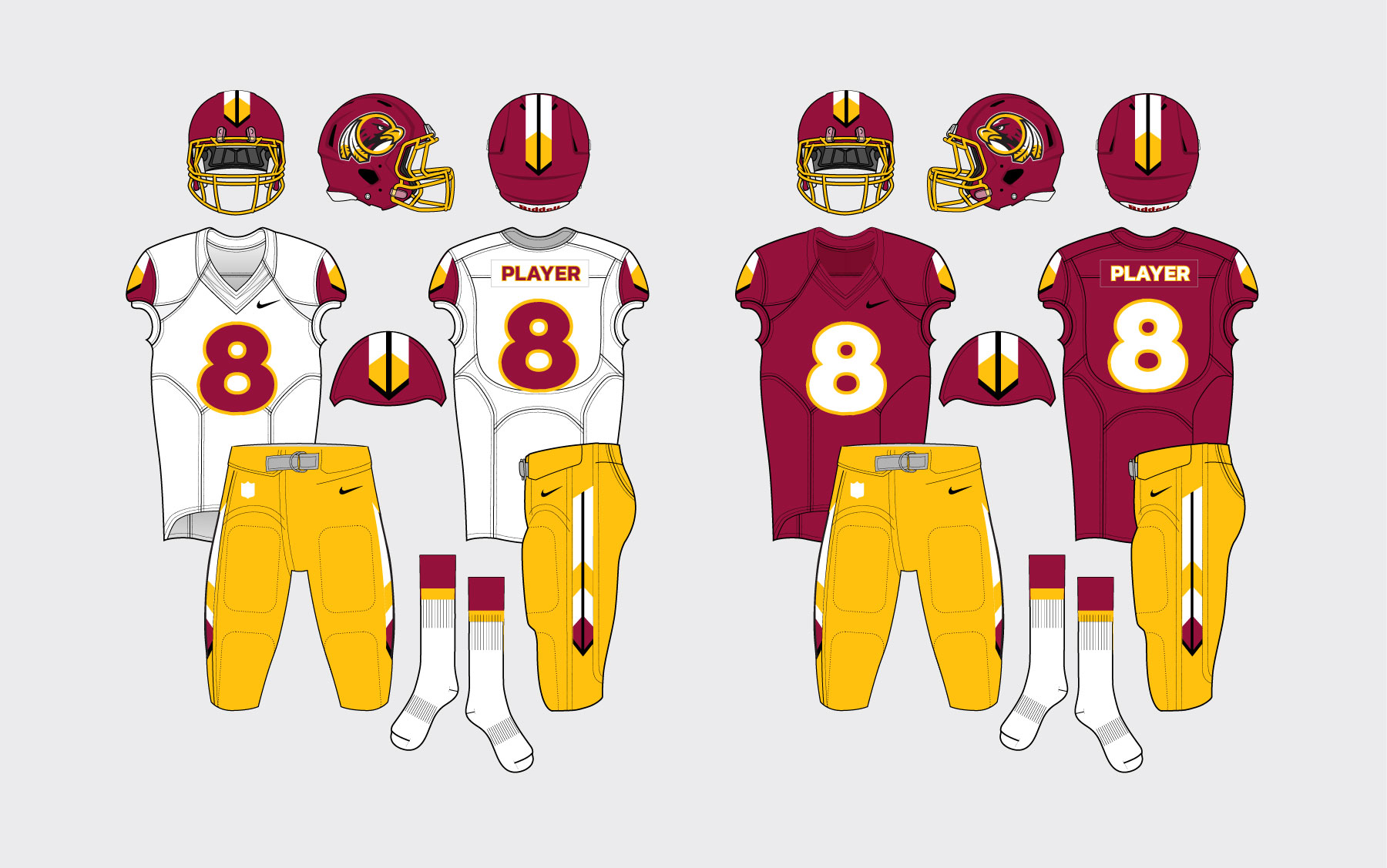
Bill Raddatz – @braddatz
Bill’s concept retains the color scheme and the hanging feathers while also using them to create unique sleeve and pants stripes. The menacing hawk inside the circle feels like a modern evolution of the brand, as well.
Patrick Martin
Patrick’s submission takes the franchise back to the early 1970s with a gold helmet and throwback sleeve stripes. A hawk is placed on both sides of the helmet, while the curvature of its neck fits seamlessly into the primary logo.
Garrett Nagorzanski
Garrett went in a different direction, meanwhile, swapping the patented gold for copper and silver. He also fit a hawk into the shape of Washington D.C. and incorporated the three-star, two-bar city flag into his design.
Vote below…
[socialpoll id=”2668516″]
Washington Redtails
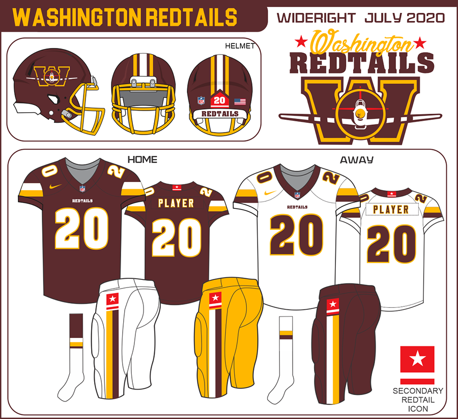
Allen Bertsche – @Allenin140
Though the uniforms themselves are very similar to what the franchise wore during the 1980s and early 1990s, Allen’s forward-facing plane logo and the subtle splash of red set his design apart.
Chad Fields – @CfieldsVFL
Several submissions for the Redtails category included wings, but Chad’s logo stood out from the rest thanks to his application of the stripes on the nose of the P-51 Mustang flown by the Tuskegee Airmen during WWII.


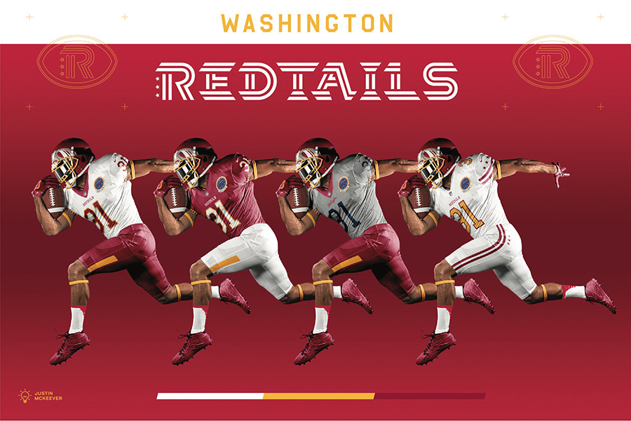
Justin McKeever – @jmckeev5
Rather than using the plane as his sole design inspiration, Justin’s concept creatively depicts the goggles of the Tuskegee Airmen on the helmet, as shown in the header photo above.
Vote below…
[socialpoll id=”2668518″]
Washington Redwolves
Rollin Garcia Jr. – @bigdub81
Rollin’s concept brings the franchise into the future with a howling wolf and crescent moon inside the familiar circle on the helmet while also creating the feeling of a throwback look by moving from athletic gold to old gold.
Daniel H. – @HurQlez
Daniel, meanwhile, leans all the way into the Redwolves motif by placing massive claw marks on the helmet and jersey. His all-black alternate uniform feels perfect for a foggy night game, too.


Diego Menocal – @Di3goM3nocal
Diego’s design is a bit more abstract, with gradient argyle on the shoulders and pants and a crest-style logo. The consistency throughout the uniform is key, with the three stars showing up once again on his logo, helmet and jersey.


Vote here…
[socialpoll id=”2668519″]
Washington Warriors
Cayle Christian – @damcayle
Instead of using Native American imagery often associated with the Warriors nickname such as feathers and spears, Cayle’s design is inspired by the aforementioned city flag and the United States Capitol Building.


Stephen Smith – @ssmith_48
Stephen went with a different D.C. landmark for his concept, prominently displaying the Washington Monument in the middle of the stylized “W” inside his shield-style logo.


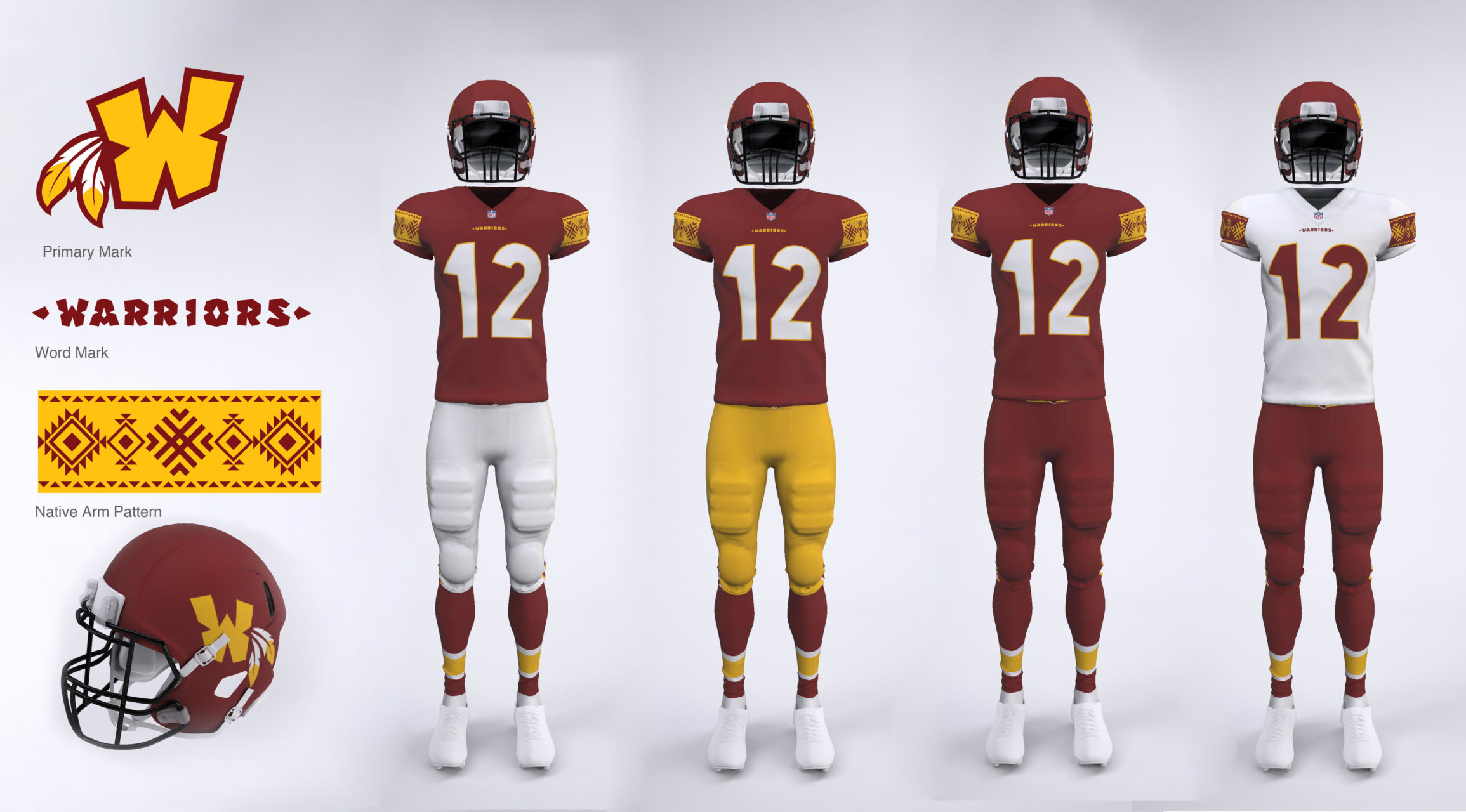
Ryan Taylor – @sanstaylor
Conversely, Ryan’s submission includes a Native American pattern on the sleeves, similar to Florida State’s Arrow, Man on Horse and Fire symbols. We’re hoping his idea was to partner with a local tribe like the Seminoles have.
Vote here…
[socialpoll id=”2668520″]
New Nicknames
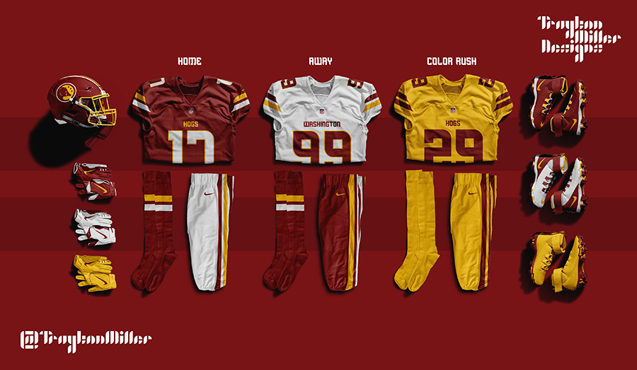
Trayton Miller – @TraytonMiller
Playing off the nickname given to Washington’s offensive line during the 1980s and early 1990s, Trayton refers to the team the Hogs. His home and road uniforms closely resemble what the franchise wore during those years, as well.
Mark Morgan – @mmorgan1960
Like the Redtails nickname, Mark’s design also honors the military. The uniforms for the Regiment include a stenciled number font and chevrons in the logo and on the sleeves and pants that indicate rank or length of service.
James Stanfield – @WashingtonFC_
James’ design is a continuation of the current branding, albeit with Club instead of Team in the full name. His football-shaped crest and the roundel feel like a logical step for the franchise if it wants to move forward without a nickname.
Vote here…
[socialpoll id=”2668523″]
Our Submission
Andrew Lind – @AndrewMLind
SportsLogos.net’s submission pulls inspiration from the Tuskegee Airmen, as well. The font is influenced by the identification numbers on the side of the plane, while the collar includes the stripes from the plane’s nose.


Thanks to all of those who sumbitted their entries, remember voting is only open until Wednesday, August 5, 2020 at 11:59pm ET.

