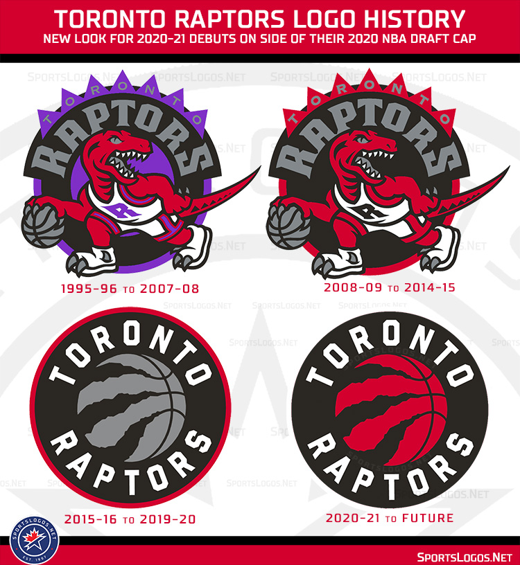
Earlier this year we reported that the Toronto Raptors will be getting a new look for the 2020-21 NBA season, which included a new set of chevron-focused uniforms as well as what called a minor tweak to their primary logo.
Well now you get to see what we mean by “minor tweak”.
Today the new line of New Era’s 2020 “On-Stage” NBA Draft Caps appeared the official NBA online shop as well as on Fanatics and with it, the new Toronto Raptors logo.
Here’s the cap, note the logo on the side:

Remember, we always said it was just going to be a minor tweak.
What’s the difference? The colour of the basketball on the logo is the biggest change, what once was silver is now red. Also gone is the red outline around the outside of the logo, we’re being told that this outline will now be white.
Here’s a side-by-side to show you what’s new:

Yes, the change is minor but it does better reflect the Raptors true colour scheme. It didn’t make much sense to have a logo that was heavy with silver when the team rarely makes use of that colour. The team is clearly primarily red and black.
Looking back now at how the new look will slide into the Toronto Raptors all-time logo history:

We’re not exactly sure when the Toronto Raptors are planning on announcing these changes both to their logo and uniforms, in a normal year we’d be a month removed from the draft and typically have seen all the big uniform changes by now. With the Raptors in the middle of a playoff series, we doubt they’ll make any sort of announcement regarding the new look anytime soon.
What are your thoughts? Personally, I like the change, it gives the previously stale logo a pop of colour that, as mentioned earlier, better reflects the actual look of the club. Share your opinions in the comments!
Buy the Raptors 2020 NBA Draft Cap here
Shop the entire 2020 NBA Draft Cap collection here


