Boy do I ever love social media, it sure makes my job of finding clues to new jerseys a little easier. Today the Atlanta Hawks were the latest to post a photo on one of their social media networks that gave a hint of what they will be wearing during the upcoming NBA season.
In the photo posted originally on their Facebook page and also shown below (with arrow added for your convenience) you can see the typical array of team jerseys hanging up in the closet – the regular “blah” set of navy blue and red the Hawks introduced a few seasons ago ending multiple decades of red and yellow as their primary colour scheme.
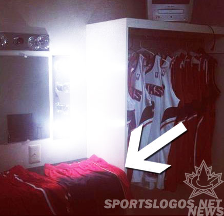
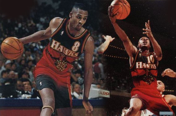
But look on the table there… that’s a black-to-red gradient pattern on those shorts! Which matches up exactly with that rumour we posted back in August about the return of several jerseys from the ’90s for 2013.
Likely this will just be a “Hardwood Classic” jersey, not an official alternate, but it’ll still sure be fun to see these back on the court.
The Hawks wore this uniform originally starting with the 1995-96 season, introduced along with a new logo replacing their “Pac-Man” look which had been used for the past 25 seasons. The Hawks kept the logo but ditched it from the front of the jerseys as well as the gradient after the lockout-shortened 1998/99 season.
—
Special thanks to Twitter user @RunOptionRight who sent this story into us, if you spot anything we’re missing just fire us a message on Twitter at @sportslogosnet or via email at ccreamer@sportslogos.net


