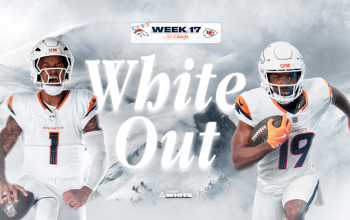
The Boise Broncos, known for their blue field, already pushing the boundaries of good taste and design and sports, has now announced that they will, for reasons we can only guess are somehow related to these tasteless esoteric “youth.”
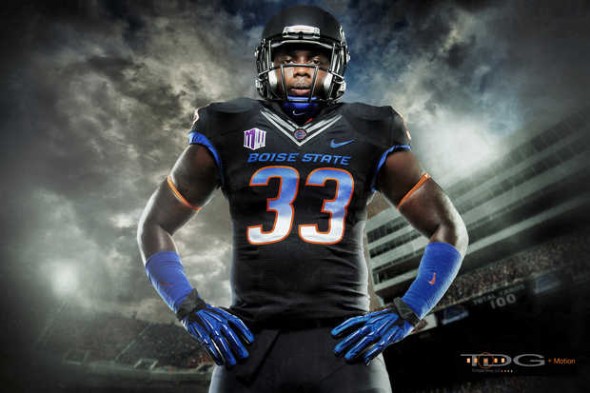
Gradient numbers fade from Broncos blue at the top to what at the bottom.
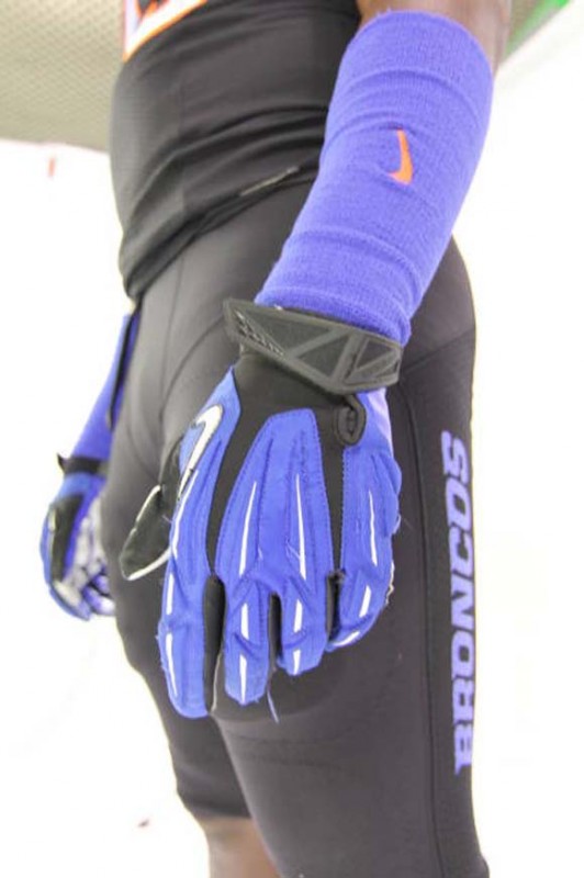
The models are shown with blue gloves and sweatbands. The pants are solid black all over, with a blue “Broncos” written down the side. The jerseys also feature the Nike-sperm collar that is goofing up several NFL uniforms this year.
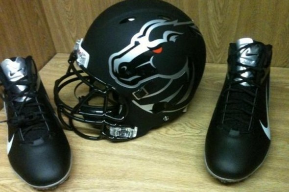
The helmets are painted a flat black, a notoriously un-favorite among our readers, with a HUGE broncos decal in silver. The shoes are a black and silver combo to match.
Something confusing is that different angles of the helmet seem to show different things. The above photo seems to show the decal being empty in the middle, allowing the matte black to shine through.
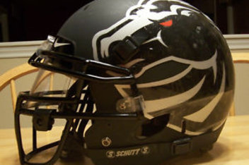
This photo appears to show a full decal, creating a shiny bronco head. Of course, flash and angles and so forth are to blame, as well as low quality photographs. But we can’t tell which will be true on the field. My guess is the full decal with shine, but tune in this Saturday to see.
Does matte, giant logo, gradient number, and black-for-no-GD-reason add up to be a universally panned uniform set? Or is this setup greater than the sum of its frequently-hated parts?

