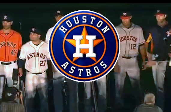
After months of teasers, speculation, and leaks the Houston Astros tonight unveiled their new logos, uniforms, colour scheme, league, and mascot at a “Launch Party” open to fans at Minute Maid Park in Houston, Tx.
The colour scheme has been switched back to navy blue and orange, which is what the franchise had used from their first season when they were originally known as the Colt .45s in 1962 and used right up through the 1993 season.
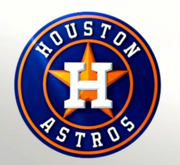
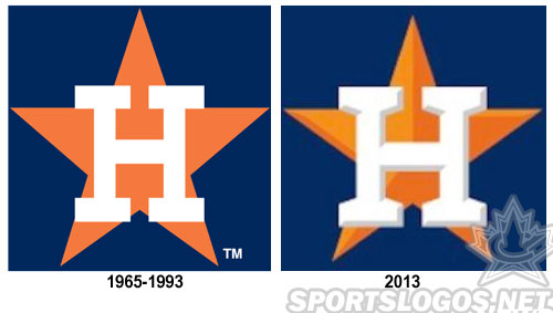
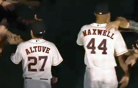
Also borrowing from the past is the new logo and uniform — based heavily on various elements of the Astros history, the new primary logo and cap logo is a modernized version of the cap logo the club used from 1965-1993, the primary adding a circle around the cap logo containing the team name, while the new uniforms are, for the most part, a simplified version of the 1965-69 set.

Astros owner Jim Crane made it quite clear that the club relied on fan feedback throughout the re-design process holding several focus groups and forums while also consulting the players and “the guys who wash the uniforms”.

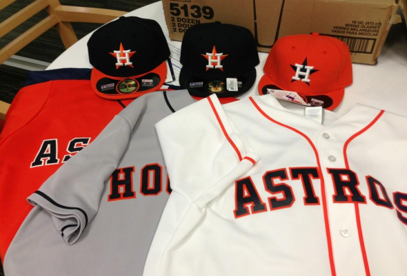
The home uniform is as we expected from the leak early last month, white with orange piping down the front, “ASTROS” arched across in blue trimmed in orange and the player number below. What we hadn’t known was there would be a patch on the sleeve of the new primary logo. All navy blue cap with new “H-star” logo on the front will be worn for all weekday home games; for Saturday home games the cap will be orange with a blue brim.
On the road is a grey uniform with blue piping, “HOUSTON” arched across the front in navy blue with orange trim – the player number below. The primary logo also on the sleeve. A blue cap with orange bill was shown with this uniform at the press conference.
An orange alternate with “ASTROS” across the front in blue was also unveiled, this paired with the standard all blue cap, this was referred to as the “Friday” jersey in a post-unveil video by MLB 2K13
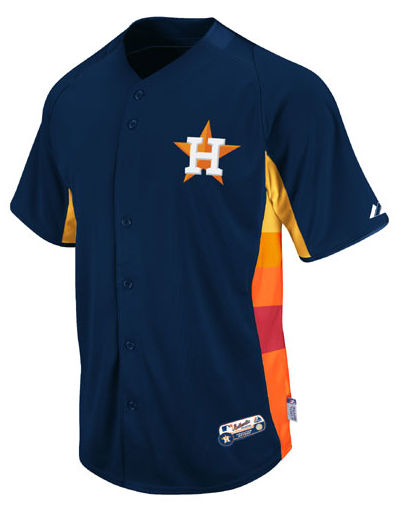
What might be the most interesting uniform in this set is the B.P. jersey (how often do you hear that?), an homage to the “rainbow guts” of the late 1970s is present on the BP uniform as the side stripes are red, orange, and yellow, a nice way to pay tribute to such an iconic (yet not eye-pleasing) set.

Adding to the B.P. jersey, it was also called the “Sunday” jersey in that MLB 2K13 video, if true this would be the first BP jersey to double as a regular in-game regular season jersey that I can think of since the BP jersey was introduced to MLB about 40 years ago.
The new mascot, by the way, is Orbit, who was the old mascot in the Astrodome days. Orbit has gotten a bit of a makeover and was introduced as an alien captured by secret NASA agents who insisted his home was Minute Maid Park.
We’re still awaiting on quality versions of the complete logo package, we’ll be sure to share them with you as soon as we get ’em.
New Houston Astros logo merchandise is already available for sale at MLB.com, you can see or buy anything by clicking here.


