After the unveiling of the overarching tournament logo on Wednesday, the host cities for the FIFA World Cup North America 2026 have started rolling out their city-specific branding over the past few days.
The city-specific brands take the 2026 World Cup logo and apply color palettes and patterns with local significance. A video tweeted out by FIFA on Thursday gives a quick look at all 16 host city brands:
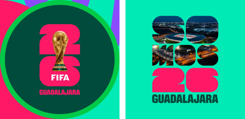
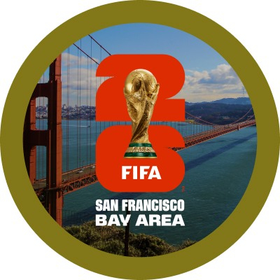
It appears that each host city has a specific colour that the “26” in the logo usually appears in as part of their branding. But that seems to be fluid, and the logo can appear on a wide variety of backgrounds and in a large number of configurations. Some cities have designs within the “26” numerals while others don’t. Overall, there doesn’t seem to be much uniformity among the cities in how the marks are used.
Here are some of the materials we were able to pull from host cities’ websites and social media accounts:
🇨🇦 TORONTO 🇨🇦

🇨🇦 VANCOUVER 🇨🇦

🇲🇽 GUADALAJARA 🇲🇽
🇲🇽 MEXICO CITY 🇲🇽

🇲🇽 MONTERREY 🇲🇽

🇺🇸 ATLANTA 🇺🇸

🇺🇸 BOSTON 🇺🇸

🇺🇸 DALLAS 🇺🇸

🇺🇸 HOUSTON 🇺🇸

🇺🇸 KANSAS CITY 🇺🇸

🇺🇸 LOS ANGELES 🇺🇸

🇺🇸 MIAMI 🇺🇸

🇺🇸 NEW YORK/NEW JERSEY 🇺🇸

🇺🇸 PHILADELPHIA 🇺🇸

🇺🇸 SAN FRANCISCO BAY AREA 🇺🇸
🇺🇸 SEATTLE 🇺🇸

Related stories:
 Canadian Men Debut New Away, Third Kits in Concacaf Nations League Finals
  ‘Is That It?’: Reaction to 2026 World Cup Logo Swift, Overwhelmingly Negative FIFA Unveils Logo For 2026 World Cup in North America
  Nike Launches New Home and Away Kits for 13 Nations in 2023 Women’s World Cup
  2022 FIFA World Cup Kit Tracker
  Alphonso Davies’ Agent Tells Canada Soccer to Stop Selling Jerseys with Player’s Name Here Are All the 2022 FIFA World Cup Kits Released So Far
  Nike Launches New Home and Away Kits for 11 National Teams in 2022 World Cup