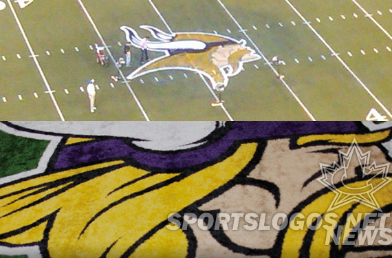
The Minnesota Vikings, in the first stages of a franchise refurbish that includes a new stadium and possibly new uniforms, announced to season-ticket-holders this morning that the team has a new, cleaned-up logo. With thicker, cleaner lines, the logo will begin to appear immediately on their web site, in March on merchandise, and “as we go” in the new stadium designs.
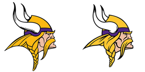
Not entirely new, rather a modernization of their current, the logo differs in 5 ways.
1. Horn Shape
The horns are obviously different, but by how much? We have traced them, then laid one on top of the other so we can compare.
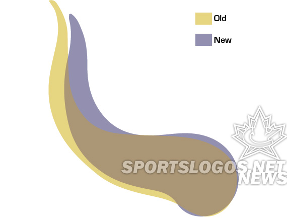
Taller, thinner, longer.. the old horn is different in many ways. The curves used to be almost “meandering” which now they are simpler and, as will be a theme throughout this design, cleaner.
2. Horn Design
The old horns had a dated hatching to provide depth and shadow. The new uses more solid, flowing black lines to create the same effect.
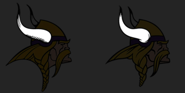
The changes bring the logo more in line with the Vikings helmet treatment, changed in 2006.
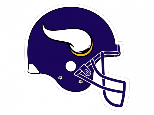
Will the helmet get a redesign if the team gets new uniforms? One would guess no, since this now almost exactly matches the logo.
3. Line Details
The lines in the old logo were very thin, in an old-school way, which is to be expected, as the logo was first used in 1966, itself a cleaned up version of the logo created in 1961. Now, the lines are thicker, bolder, easier to reproduce. Several lines have changed, such as the cheekbones, eyebrow, mustache, and hair. The eyebrow has added a slight “furrowed” quality that makes the new logo look perceptively meaner, even though the change is small.
4. Vikings Gold
A new Vikings gold is used on the logo, a small tweak meant to remove some of the “brassiness” and make the color more vivid. We are looking into the exact specifications. Check back here for info as we get it.
5. Overall Height
Vikings logos; the head and the V, have always been tall and thereby a little challenging to work with. The new logo has a “rebraided hair style” that combines with the new horns to reduce the overall height.
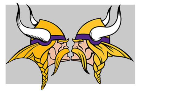
This brings the logo closer to square, so it will be more gracefully included in spaces where it would previously be scaled a little small in order to fit.
So, those are the changes for the Vikings. How many did you notice right away? Do you like the massage, or do you wish they would have left it alone? Or, redesigned it completely?

