The Huntsville Havoc are getting hungry like the wolf for the 2025-26 SPHL season after launching new logos and jerseys.
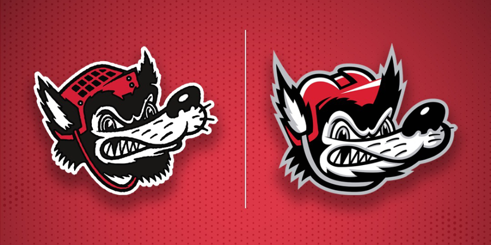
After introducing a retro cartoon wolf alternate logo a few years ago, the Havoc have pivoted and gone all-in on the look, unveiling a new suite of logos based on the cartoon and new home and away jerseys last week.
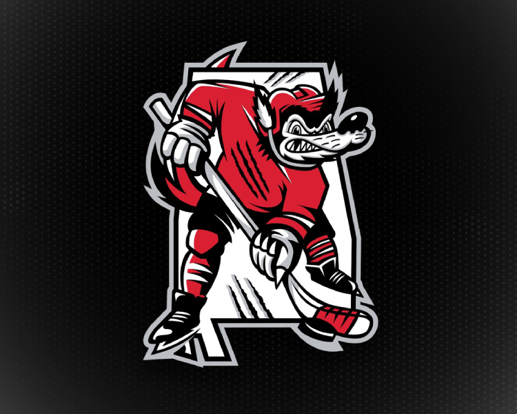
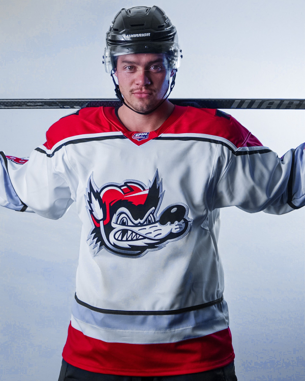
The Havoc’s new primary logo depicts the growling, stick-wielding wolf wearing a red jersey and helmet above a HAVOC wordmark and a red wolf’s tail below. However, despite not being designated the primary, the Havoc seem to be using their “crest” logo the most, which is just the wolf’s head.
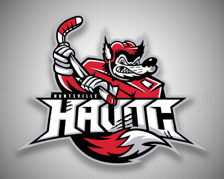
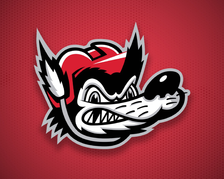
The new wolf’s head logo is what the Havoc are calling a “fierce evolution” of the old one, with a “bold expression and aggressive lines [bringing] a modern edge to a timeless look.” Notably, grey highlights have been added in the snout and ear, fur lines have been cleaned up, and the helmet has gone from a 1980s-style JOFA-type to a modern helmet.
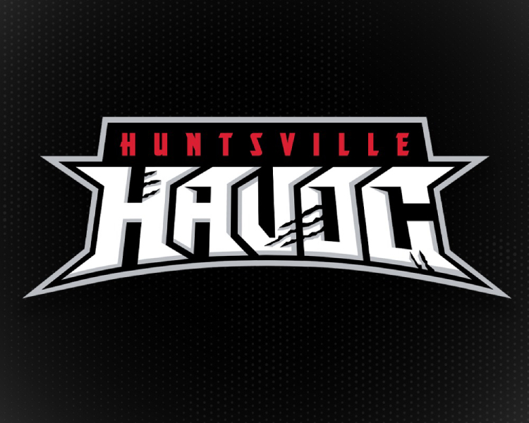
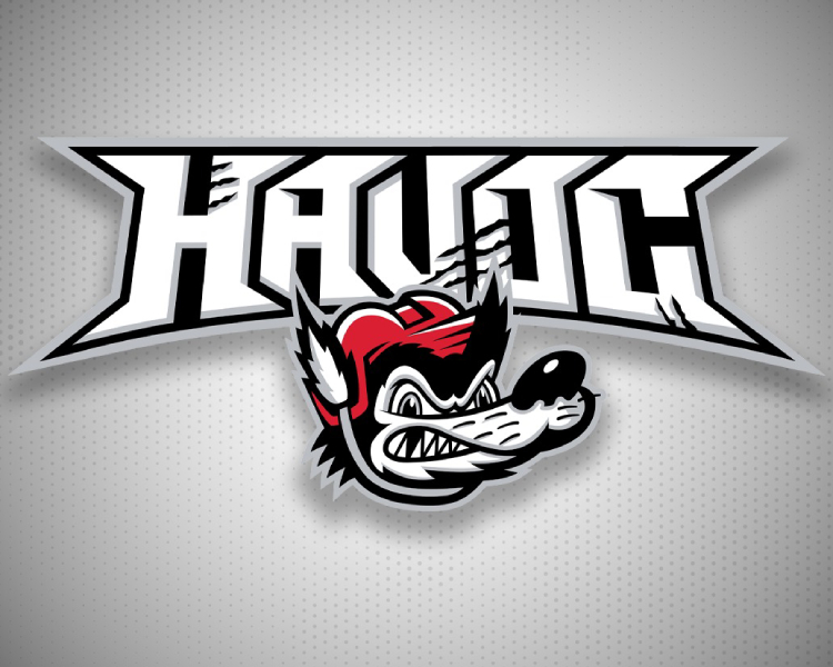
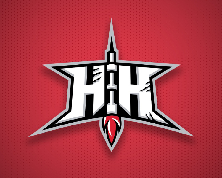
Other logos in the Havoc’s portfolio include a wordmark; a “wolfmark” with the wolf’s head below a HAVOC wordmark; a “State of Havoc” logo with a full body wolf in front of an outline of Alabama; and a “liftoff” logo with a rocket between two Hs that honours Huntsville’s history as the city where the rockets that powered missions to the moon were developed.
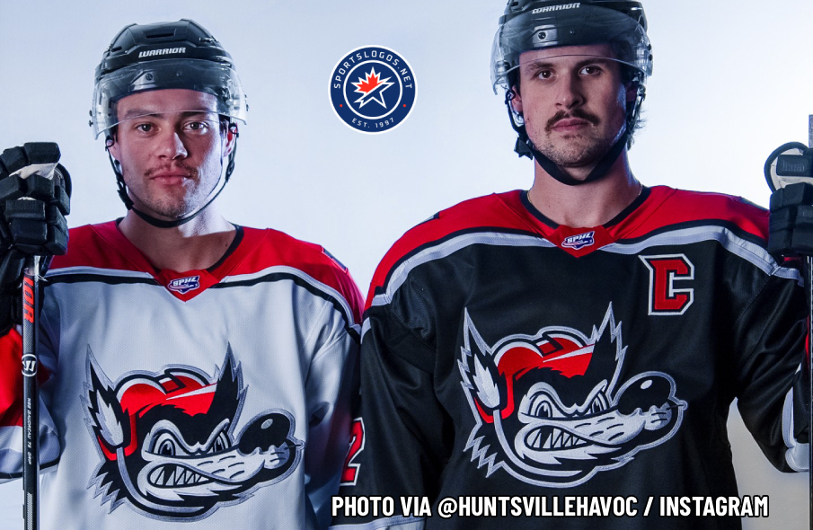
The Havoc’s new home jersey is black with the wolf’s head crest on the front. The shoulder yokes are red with black, white and silver outlines, and they taper to a point at the ends. The right shoulder has an “HH” logo while the left shoulder has a sponsor logo, and the liftoff logo sits on the back collar. The waist and sleeves have a broad red stripe below black and white stripes, with a narrow silver stripe on top.
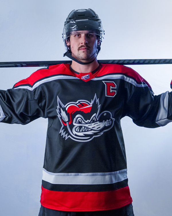
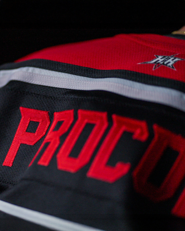
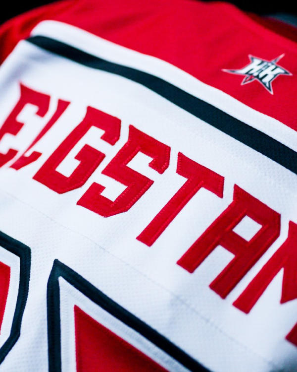
The collar is red with black trim and an SPHL logo at the front. Numbers on the sleeves and back — as well as the captain’s letters — are red with black and white outlines, while names on the back are one-colour red and set in the Havoc’s new custom typeface.
The away jerseys swap the black base for white but keep most of the same design elements. There appears to be one less outline on the shoulder yokes, and the black, white and silver stripes on the waist and sleeves are in a different order.
The Havoc kick off their 2025-26 SPHL regular season on Friday, October 17, with a visit to the Roanoke Rail Yard Dawgs. Their home opener comes a week later when they host the Pensacola Ice Pilots before going back on the road to face to the Macon Mayhem the next night.
Related stories:
 SPHL’s Macon Mayhem to Play as Ocmulgee River Monsters For One Night
  Macon Some Changes: SPHL’s Mayhem Unveil New Suite of Logos
  Pensacola Ice Flyers Soar High With Blue Angels-Themed Jerseys
  Ballclub Thinks Similar Emoji Hockey Jerseys are Frowny Face, Chocolate Swirl
  Sheldon Has Left the Building: The Story Behind the Mississippi RiverKings