Ahead of opening their inaugural seasons against one another later this month, the two newest Professional Women’s Hockey League teams now have names and logos for fans to cheer on.
The Seattle and Vancouver franchises launched their nicknames and visual identities on their websites and social media channels on Thursday, November 6. The Seattle club will be known as the Seattle Torrent, while the Vancouver team will be the Vancouver Goldeneyes.
For Seattle, the Torrent name is a nod to “the powerful waterways that shape and connect Washington’s unique landscape, symbolizing the team’s determination to carve its own path,” according to a PWHL press release. Their logo is an S formed by rushing water, “its flowing curves mirroring river channels,” with “TORRENT” written out diagonally overtop. Their wordmark features “TORRENT” spelled out in a font with slight serifs and inner notches, with “SEATTLE” in a smaller font above.
“A torrent of water, you don’t see it coming, it flows at you, forges its own path… all of those things translate really well to our league and our team, especially in this expansion process. We come quickly and there’s no hesitation. I think there’s a lot of opportunity to relate to the fast, physical hard to play style that we want to execute… we rush at you and put you on your heels as an opponent.”
— Meghan Turner, general manager, Seattle Torrent
With its name, Vancouver pays tribute to the “fiercely protective Common Goldeneye, a bird native to Vancouver’s waterways, coastlines, and mountain vistas,” reads the league’s press release. “Drawing inspiration from its speed, strength, and precision in flight, the Goldeneyes reflect Vancouver’s indomitable and unified spirit as they soar to new heights.”
The Goldeneyes’ logo features the bird’s eye with brown feathers in the background, with the team name spelled out in a blue roundel outside. The team is also using a version without the roundel in some applications, including website icons and social media profile pictures. They also unveiled a wordmark with the city and team name spelled out and the eye logo taking the place of the O in Vancouver.
“The name was born from a desire to create a team identity that felt truly unique to Vancouver; something that could only belong to this city and its natural surroundings. As the creative process unfolded, we explored local wildlife, looking for a symbol that was both visually compelling and rich in meaning. The name Goldeneyes draws inspiration from the Common Goldeneye, a striking bird native to British Columbia’s coastal waters and forested lakes. Known for its piercing yellow eyes and lightning-fast reflexes, the goldeneye is a creature of precision, agility, and resilience — qualities that mirror the game of hockey and the athletes who play it.”
— Ali Bologna, senior director of brand and marketing, PWHL
The Goldeneyes are the first PWHL team named after an animal, which has goalie Emerance Maschmeyer excited for the possibilities. “The eye is really intense for me and I love how sharp it is,” she said on the team’s website. “But also, the feathers above the eye, I’m going to do something really cool with that with my pads.”
Both teams unveiled jerseys with their city names running diagonally down the front in late October. The new nicknames and logos will be incorporated into the teams’ jerseys for the 2026-27 season.
The Torrent and the Goldeneyes will face each other in their first-ever PWHL game on Friday, November 21, at the Pacific Coliseum in Vancouver. They’ll meet for the first time in Seattle on Sunday, January 25.
Related stories:
 Back-to-Back PWHL Champs Minnesota Frost Launch Silver-Accented Championship Jersey
 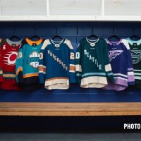 PWHL Vancouver, Seattle Teams Unveil Jerseys; Nicknames Still On the Way
  PWHL Expands to Seattle; Team Will Use Emerald Green as Primary Colour
  PWHL Announces Vancouver Franchise for 2025-26, Introduces Colour Palette
  PWHL Unveils Jerseys for All 6 Teams Ahead of 2024-25 Season Start
  PWHL Unveils Identities for Inaugural 6 Teams Ahead of Second Season