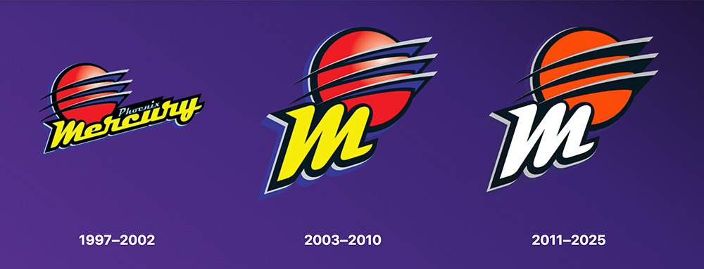
The Phoenix Mercury are already looking forward to their 30th season in 2026 as they unveiled new logos and uniforms earlier this week, marking the first significant overhaul to their branding since their inaugural season in 1997.
“The new branding represents the Mercury’s championship legacy, devoted fanbase and the new era that began (last year) with a record-breaking season and memorable Finals run,” chief executive officer Josh Bartelstein said in a statement.
“While our logos have been reimagined, the Mercury’s identity remains the same – our organization’s commitment to the community and the grit and joy of our team will continue to define Mercury basketball.”
The “M” from the Mercury’s original logo has been revised and is now the focal point of their new primary mark. The letter is positioned at a 19.97 degree angle, referencing their founding year, while the sharp right corner is a nod to the three geometric rings on their original logo.
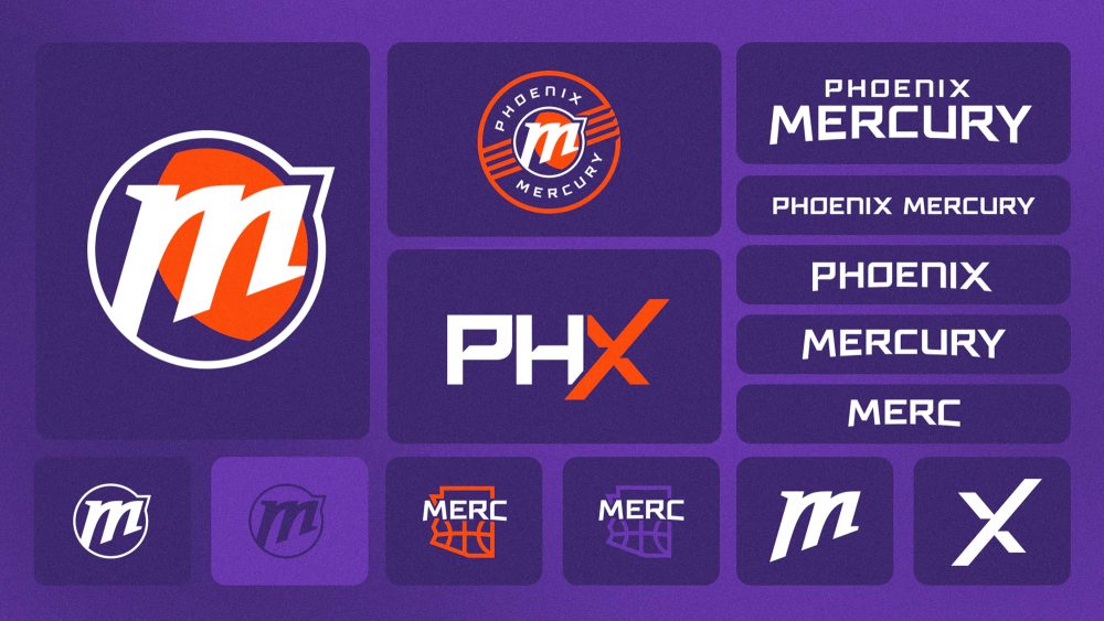
The letter is positioned on top of an orange circle with a purple crescent that, naturally, represents the shadowed side of the planet Mercury. It is then contained within a roundel that includes “Phoenix” and “Mercury” wordmarks for their global logo, which has four “planetary rings” on each side.
Never mind the fact that the planet Mercury doesn’t have any rings, this is another continuation of the franchise’s original logo. The primary logo then breaks the four “rings” into eight lines, symbolizing their status as one of the eight original WNBA franchises.
The “rings” are also positioned at a 19.97 degree angle, lining up directly with the “M” in the center. Additionally, Phoenix revealed the first secondary logo in team history, which features the Arizona state outline with basketball seams and a new “Merc” moniker.
The matching wordmarks are rendered in a new “Mighty Mercury” font, which can also be seen in their updated “PHX” alternate logo, which is an evolution of the logo that first appeared on their 2021 Rebel uniforms and includes an orange “X” as a nod to their fanbase.
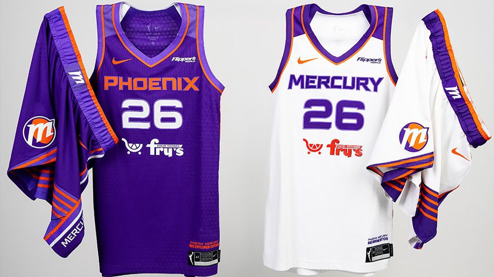
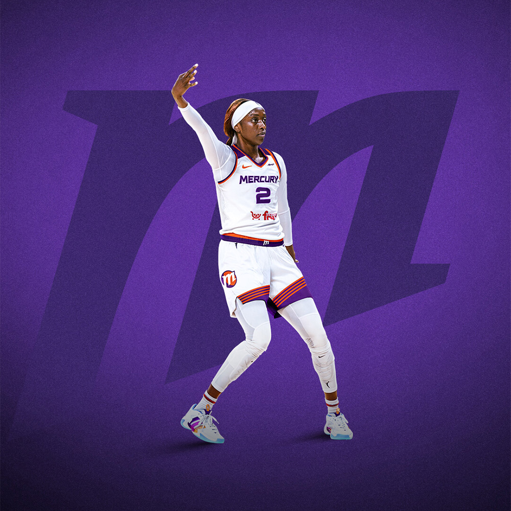
Speaking of uniforms, the slightly curved wordmarks – which symbolize the horizon on the planet Mercury – are prominently displayed across the chest of Phoenix’s new white Heroine and purple Explorer Edition designs.
The wordmarks and numbers are also outlined in a new, lighter shade of purple, which also appears on the waistband, trim and shoulder yoke of the Explorer Edition uniforms. The yoke – which is a darker shade on the Heroine set – mirrors the design of the Mercury’s inaugural uniforms.
The uniforms are complete with a silver tab on the back collar with the No. 3, representing the franchise’s three championships (2007, 2009 and 2014), the new “M” logo on the waistband and four “planetary rings” on each leg of the shorts, which are also at a 19.97 degree angle.
The design of the shorts are similar to the sunburst on the Phoenix Suns’ shorts, as the two franchises have shared a home venue (Mortgage Matchup Center) since 1997. There’s also advertisements for Flipper’s on the left shoulder and Fry’s Food Stores below the numbers.
The new logos and uniforms, which were all designed in-house, will debut when the Mercury’s 30th season tips off next May.

Photos courtesy of @PhoenixMercury on X/Twitter.

