While the “Cal” script isn’t going anywhere, the University of California unveiled a tweak to its athletic department identity that includes a fresh bear logo and a new third color: gray.
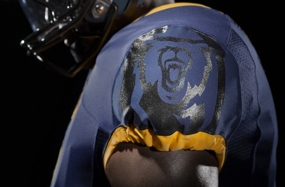
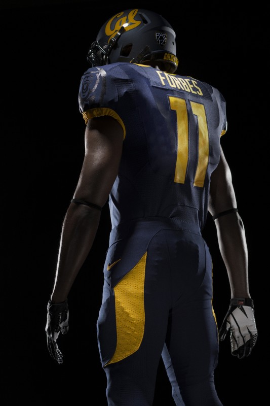
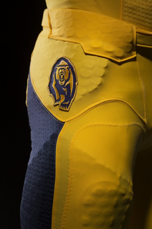
The new bear also gets some fun placement as a silhouette-styled graphic on the football jersey sleeve and as a full-color patch on the football pants.
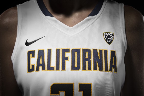
In an athletic department brand update, Cal will offer consistency in its blue and gold use across all teams and a custom-produced font for the “California” and “Golden Bears” wordmarks will span multiple sports. But the script Cal will continue to serve as the primary logo for everyone.
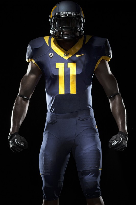
Based on the set of football uniforms released with the update, expect to see plenty of blue and gold from Cal. The gray, designed to help “accent Cal’s traditional shades,” doesn’t play a prominent role.
The two-year redesign process, in conjunction with Nike designers, led to the unified identity. “Our script logo is recognized around the world by alumni and fans, so we felt it was important to maintain the equity it has built,” says Cal Athletic Director Sandy Barbour in a statement. “We have worked to embrace the aspects of our visual brand that are firmly entrenched in our department’s culture, while coming up with new marks in areas where we haven’t been as consistent or developed a strong brand presence.”
The actual bear logo serves as a prime example. Over the years, new varieties of shapes and sizes emerged. The updating now includes a single bear, reflecting the look Cal adopted over 100 years ago.
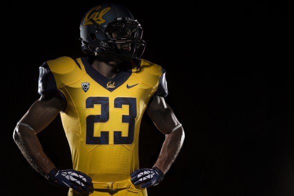
Both the blue and the yellow football jerseys shown feature blue sleeves, allowing an outline of the new bear logo to appear in black.
Photos also show a matte black helmet with the script lettering and pant options in blue, yellow and white. The healthy dose of piping used in past Cal looks may have gotten moved around in the update, but sticks pretty close to the theme the Golden Bears have adopted in the past.

