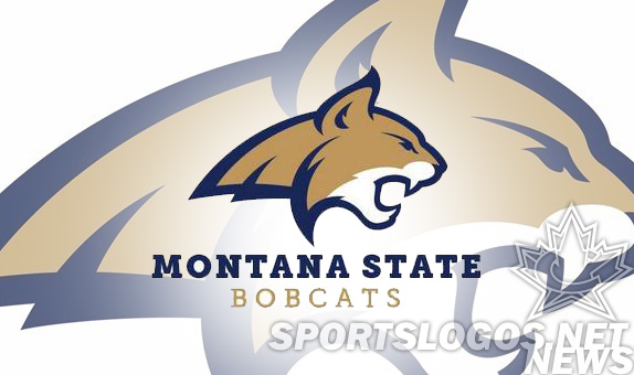
In Bozeman Montana, the Bobcats have received a makeover, presenting an enhanced identify package for Montana State.
Not exactly a full re-imaging, rather a fully designed cleaning up of their existing concept. Think Atlanta Falcons, Arizona Cardinals rather than UConn Huskys.
The new, massaged logo was handled by Torch Creative and is one of the rare logo changes that we can unequivocally say is a clear and substantial improvement. Their old logo was almost an amorphous blob in comparison.
In speaking with Torch about their work, they told SportsLogos.net; “In updating MSU’s existing bobcat logo, Torch aimed to provide a mark which was faithful to the classic MSU bobcat but had features which were more reflective of an actual bobcat. Not wanting to stray too far from the existing mark, the overall proportions were kept similar to the original logo, but shape of the head was adjusted, slightly, as were the jaw, muzzle and nose.

This version itself was simply an outlined version of their previous, which was almost progressive and modern in its simplicity.

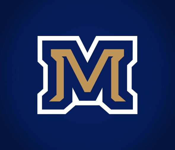
This gold and blue M will take the place of the M they had been using in the past, an outlined standard M that bore a striking resemblance to the Michigan logo.

Torch was very kind to speak to us about their process. Their goal was to set Montana State apart, “More important than the genesis of the concept, Torch feels that the resulting M is a truly distinctive letterform which, in addition to the new bobcat, will hopefully represent Montana State University for many years to come.”
As of press time, the Bobcats store (http://shop.msubobcats.com/) was not yet selling merchandise with the new logo, though one would imagine that transition will take place quite shortly.
How do you like it? DOes it bring a big school look to one you may possibly not before known much about? Is this gear you’d rock?

