![]()
Chief Wahoo is history.
The controversial logo which has been the primary brand of Cleveland’s Indians for the better part of the last seventy years made its final on-field appearance Monday afternoon; the team swept out of the ALDS at the hands of the Houston Astros. Sure, it’s possible the logo could return on a throwback uniform someday, but it’ll be completely absent from the Indians home, road, and alternate uniforms the next time they step onto a ball diamond when they open the season on March 28th, 2019.
In January, the team and Major League Baseball made the joint announcement confirming the logo would be removed following the season, appearing only on some merchandise sold to fans, no longer on any team uniform. The final season wasn’t without its issues, Jim Thome requested his Hall of Fame plaque not include the logo despite it being the logo he wore far more than any other, during an entire three-game series in Toronto the Indians voluntarily removed the logo from their uniform.
Although the club had taken on the “Indians” nickname back in 1915, there was no indication of this in any of the team’s uniforms or logos until 1928, when the head of a Native American, complete with feathered headdress, was added to the front of their home jersey. The logo was altered slightly and shifted to the sleeve a year later where it would remain until 1938. One could argue that the choice of the Native American graphic used by the club in this era would have been considered slightly more respectful, somewhat similar in style to the logos used by the Chicago Blackhawks and Washington Redskins today.
![]()
“Wahoo” would be adopted by the Indians in the mid-1940s, first used on team letterheads and official documents before being added to their uniforms in 1948 as a sleeve patch. Over the course of its life, the logo has been reversed, turned, given a crown, and on two different occasions had a body added to it and shown in an active hitter’s pose. It was put on the cap paired with a wishbone-C in 1954, then removed in ’58, returned in ’62, and removed a year later. Twenty-four years later it returned without the “C” in 1986 (reportedly at the recommendation of Indians players Joe Carter and Pat Tabler) where it stayed before finally being removed forever-ever for 2019.
Designer Todd Radom shares the story of the creation of Wahoo in a blog post from October 2016, an excerpt:
A J.F. Novak Company draftsman, 17-year-old Walter Goldbach, created the first iteration of Chief Wahoo. Introduced in 1947, his version appeared on a wide range of goods and team publications. Goldbach has been quoted as saying that he was tasked with “creating a mascot that ‘would convey a spirit of pure joy and unbridled enthusiasm.’” In a 1999 Associated Press interview, Goldbach stated: “the last thing on my mind was trying to offend anybody.”

In 2002, after numerous years of protests from various Native American groups, the club introduced a scripted “I” logo to be worn as an alternate cap — not to replace Wahoo but to be worn in addition to and giving their fans (perhaps those uncomfortable sporting the Wahoo logo) an alternative option while still showing support for the team. At the urging of eventual team president Mark Shapiro this alternate “I” cap was replaced with a block “C” in 2008, the “C” (as painfully plain as it is) somehow slowly got to be the successor to Wahoo taking over as the team’s road cap in 2009, the batting helmet logo in 2013, and finally replacing Wahoo as their official primary logo in 2014. We presume it’s the logo that’s replacing Wahoo on all jersey sleeves and the remaining caps next year.

A great debate has followed the existence of Wahoo of late, the emergence of social media allowing many more voices to be heard by many more people. The logo depicts a racially-insensitive cartoon caricature of a Native American head with bright red skin, a crooked nose, and a large feather sticking out of a white headband wrapped around its forehead, holding back navy blue hair parted neatly down the middle. Opponents of the logo say it paints a dated, negative, racist image of the American Indian used by non-Natives to turn a profit; supporters claim it’s an important part of team history, that too many people are offended by too many things these days, and that it actually honours Native Americans.
The name? Sure… maybe.
The logo? Eh. The team tinkered with the logo in the 1970s, removing the red skin and slimming down the nose, in an attempt to make it less offensive. They reverted right back to the red-skinned Wahoo logo just five years later.
As for the name, a common theory suggests the team named themselves the “Indians” to commemorate the memory of a former Native American player.
Let’s explore that.
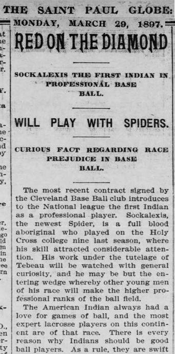
Louis Sockalexis, a standout ballplayer with Holy Cross at South Bend, Indiana, was signed by the Cleveland Spiders, a National League club with no official ties to the modern Indians franchise on March 10, 1897, becoming the first Native American to play baseball professionally. Despite being known as the Spiders, the team was almost immediately referred to as “Cleveland’s Indians” or simply “Cleveland Indians” (alongside the actual name “Spiders”) in reports about the team in newspapers throughout the United States. Was this done so in reverence or was it in mockery? It’s not always easy to read sarcasm in 19th-century newspapers.
Sockalexis, as you would have expected to happen at most any point in our history, was, of course, the target of racial taunts from fans. A news report following a game at Philadelphia in June 1897 tells the story of a brawl which nearly broke out between Philly fans and Spiders manager Patsy Tebeau when, as the team was leaving the field, they began “giving imitation ‘war whoops’ in honour of Sockalexis”, local police were finally called to escort the ballplayers to the team bus when the fans continued to “honour” Sockalexis with threats of physical violence.
Following an impressive start to his rookie season, Sockalexis struggled as he battled injuries and bouts with alcoholism, after just seven games with the 1899 Spiders (largely considered the worst sports team of all time) he was released.
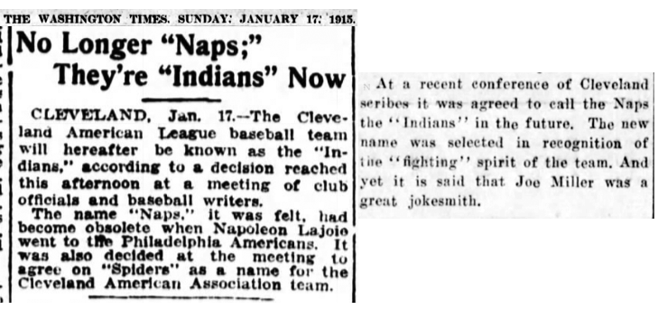
A new Cleveland team joined the American League in 1901 and, despite Sockalexis no longer being with the team, the “Indians” name continued to be attached to the team in articles as were the official Cleveland ballclub names such as Blues and Naps well into the 1910s. Sockalexis died in December of 1913, a year shy of the Naps adopting the “Indians” name officially, which they announced on January 16th, 1915, following a meeting between team officials and local sports reporters. The new name was said to be “in recognition of the fighting spirit of the team”, the change made because Napolean “Nap” Lajoie, the inspiration for the Naps name was sold to the Philadelphia Athletics earlier that month.
There was no mention of Sockalexis in any article regarding the name change at the time or in most of the accounts in the years to follow, it would seem the team was named just out of familiarity to newspaper writers and not at all directly to honour the memory of Sockalexis, though its origins can certainly be traced back to him signing with the club nearly 20 years earlier.
It’s borderline ironic that a city with a history of being relatively progressive with racial issues in baseball, signing Sockalexis as the first Native American player in professional baseball in 1897 and signing Larry Doby, the first African American ballplayer in the American League in 1947, would insist on using such a logo for so long, ultimately dropping it only when urged to do so by Major League Baseball.
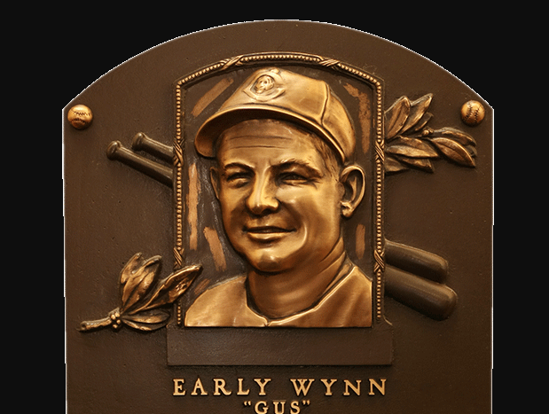
Chief Wahoo appeared on the sleeve of the Indians uniforms for five American League pennants and ten division titles, was worn by nineteen players now in the National Baseball Hall of Fame including on the cap of Early Wynn’s Hall of Fame plaque, and will of course be forever associated with the Major League movie franchise starring Charlie Sheen and Wesley Snipes in the late 1980s. A lot of great memories tied to that logo… but it was time for it to go.
The focus now turns to what should be a proper replacement for the logo, surely it can’t be just the “C” they’ve been using. I’ve seen many fans voice support for the crooked-C of the 1970s, I think that’d be alright. Or they could take a page out of the Spokane Indians playbook and actually meet with local Native American communities to work out something that can both honour team history and show respect.

I’m thinking for the 2019 season, we’ll see the block “C” completely in place of Wahoo as the club readies itself for a larger scale rebranding. It would certainly make a lot of sense to launch it as the league switches its on-field providers to Nike in the 2020 season.
Related stories:
 Cleveland, Angels Reveal 2021 Little League Classic Uniforms: Great Lakes vs West
  MLB, Indians Meet to Discuss Future of Chief Wahoo
  Bauer Chose Indians Blue Jerseys to Hide Blood
  Is Chief Wahoo Finally on the Way Out?
  Camo Caps to be worn by all MLB Teams, Full Gallery Here