
Let’s be honest, we knew this day would come. The San Diego Padres will be the first baseball team anywhere to allow a different cap design based on individual player preference, those who wear their caps straight and the few who wear them off to the side. An official announcement by both the
Author: Chris Creamer
Chris Creamer is the founder of SportsLogos.Net and has been maintaining it since June 1997. You can follow him on Twitter at @sportslogosnet or contact him via email at ccreamer@sportslogos.net

St Louis Blues Wearing Cardinals Baby Blue Tonight
Cardinals on Ice! The St Louis Blues will don these powder blue St Louis Cardinals jerseys, complete with front jersey number and even a Cards “STL” cap style insignia on each arm, prior to their game tonight against the Colorado Avalanche. The jerseys will be worn to mark the beginning of the
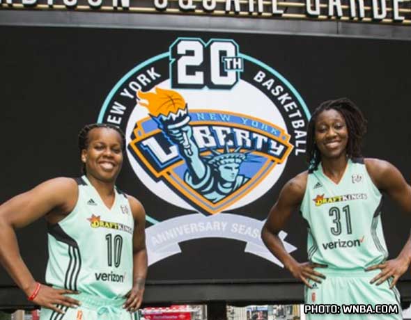
WNBA Uniforms Are Colourful for 20th Season
The Women’s National Basketball Association will have a colourful look throughout their 20th anniversary season this Summer. Yesterday, the league announced that every game will feature a colour vs colour uniform matchup. Each team will have two sets of uniforms, one in their primary colour and the other in their

AHL: Griffins Players Design Their Newest Uniform
The Grand Rapids Griffins have figured the best way to get players to wear a uniform they truly like. Just let them design it! A look at some of the designs Griffins’ players came up with early on in the process… Clean ’em up and stick ’em on a whiteboard… it’s time to vote
Saskatchewan Roughriders Announce Changes to Logo
The Saskatchewan Roughriders of the Canadian Football League have unveiled a new logo. I can sense a few Rider fans hearts skipping a beat just there. But no worries! Merely a slight cleaning up, in fact, that’s the new logo up at the top of this post. You didn’t even notice! Lines

Look Out for Chattanooga’s New Look in 2016
The Chattanooga Lookouts, Southern League Double-A affiliate of the Minnesota Twins, unveiled their new uniforms via an event earlier this morning. Despite the affiliation with the Twins, the uniforms appear to be more of a mix between the Cincinnati Reds and the old Negro League Kansas City Monarchs. This replaces

Ballclub Re-Brands As Cheesesteaks for One Night Only
The Lehigh Valley IronPigs have announced they will be known as the Cheesesteaks for one night only in 2016, a nod to their in-state Major League affiliate, the Philadelphia Phillies. This follows the popular “Taco Night” promotion held by the Fresno Grizzlies last season (and will again this Summer) in

Nike Unveils 2016 Olympic Basketball Uniforms
Nike held an event yesterday in New York where they (among other things) unveiled the basketball uniforms for the 2016 Summer Olympics to be held later this year in Rio de Janeiro, Brazil. We weren’t there nor were we privy to a media kit of the unveiling, so… enjoy your bare
Hamilton Bulldogs Adopt New Colour Scheme
Hamilton’s sports teams will all match nicely next season. Yesterday the Ontario Hockey League’s Hamilton Bulldogs announced they would be adopting a black and gold colour scheme for the 2016-17 season, copying the colours used by other teams in the city – the CFL’s Tiger-Cats and the long forgotten Tigers of

KIAC Rebrands as River States Conference, Unveils New Logo
To celebrate their 100th anniversary (and to really note that this is no longer a Kentucky-exclusive conference), the Kentucky Intercollegiate Athletic Conference has announced they will be known as the River States Conference for the next academic athletic calendar. The change takes effect on July 1st. With thirteen schools residing

2016 World Cup of Hockey Uniforms Unveiled
The National Hockey League today unveiled the new uniforms for the eight teams which will be competing in the 2016 World Cup of Hockey, to be held this September in Toronto. Six countries and two combination clubs make up the class of the next edition of the World Cup, the

First Look at 2016 World Cup of Hockey Logos
Thanks to a Tweet from the Canadian based Sportsnet television network, we’ve got an early look at the logos which will be used for each of the countries and teams in the upcoming 2016 World Cup of Hockey. It’s a combination of old school designs (Finland, Czech Republic), modern day designs (Russia,