The Boston Pride are a professional women’s hockey team playing in the Premier Hockey Federation (formerly National Women’s Hockey League, NWHL) since the 2015-16 season. They are affiliated with the NHL’s Boston Bruins. They play out of the Warrior Ice Arena in Boston and have won two Isobel Cup Championships (2015-16, 2020-21).
BOSTON PRIDE LOGOS and LOGO HISTORY

The Boston Pride have had two primary logos in their history. The first logo, introduced for their inaugural 2015/16 season, was a simple wordmark reading “PRIDE” in black with yellow drop shadowing, the letter “I” designed to resemble the tearing courtesy of a lion’s claw, the city name “BOSTON” was arched above in silver.

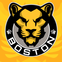
The Pride rebranded for the 2017/18 season by significantly upgrading their logo to a yellow lion’s head placed inside a black and silver circle. “BOSTON” was added below, arched in white, with two lion paw prints on either side.

BOSTON PRIDE ALTERNATE LOGOS
The Boston Pride alternate logos include a single yellow lion’s paw print with a series of white horizontal lines penetrating through it. This logo appears on the team’s primary mark on either side of the “BOSTON” wordmark and was introduced along with the club’s rebrand ahead of the 2017-18 season.

Before the 2020 season, the Pride introduced a second alternate logo showing just the lion’s head from the primary logo on its own, isolated from the rest of the design. There is one slight difference between this and the primary lion’s head in that this design includes an additional gold outline around the outside of the lion’s head.

BOSTON PRIDE UNIFORMS
For the 2021 season, the Boston Pride wore two uniforms – one gold and one black. The gold uniform featured the team’s primary logo of a lion head within a black and silver circle as the main crest, placed on a gold, white, and black horizontal stripe which covered the entirety of the jersey. Black lines were included at the end of each sleeve and around the waist and the collar; player numbers were white with black trim.

The Boston Pride black uniform simply read “BOSTON” across the chest in gold lettering; this was placed on a black jersey that incorporated a black-to-gold gradient toward’s the waist and the wrists down each sleeve. On the sleeve, two additional thin gold stripes were added and the lion head from their primary mark on each shoulder. The player’s name and numbers were single-coloured gold.

BOSTON PRIDE ADDITIONAL LOGOS

The Boston Pride won the NWHL’s Isobel Cup Championship for the 2020-21 season. Brendan Poe from the league created this logo for the team showing the Isobel Cup in gold on a black circle with the Pride’s primary mark placed at the bottom to celebrate their victory.
LINK: Boston Pride logos on SportsLogos.Net
LINK: Premier Hockey Federation logos on SportsLogos.Net


