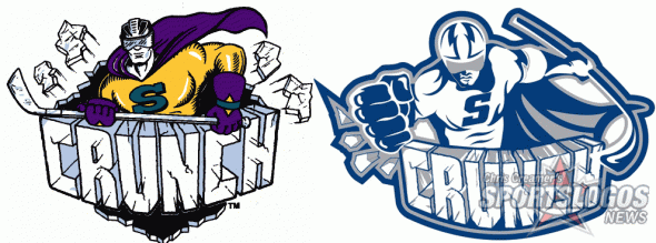
The Syracuse Crunch of the American Hockey League have returned to their roots with their new logo, unveiled earlier today.
“Crunchman”, the mascot featured in their original team logo, in use from 1994 through 1999, is back with a brand new colour scheme.

The logo and colour scheme change was made due to the Crunch’s new affiliation agreement with the Tampa Bay Lightning, they had previously been affiliated with the Anaheim Ducks.
Crunchman has been a beloved figure in the Syracuse community since the team’s inception in 1994… We believe with the change in our hockey partners to the Tampa Bay Lightning, the timing is perfect to go back to the future and welcome this iconic figure back into our brand.” – Syracuse Crunch owner Howard Dolgon
Now clad in blue, and white, matching the colour scheme of the Lightning, this new logo carries on the design style of the “CRUNCH” wordmark. This wordmark, which features the team name spelled out in chunks of cracked ice, has remained the same throughout all of the club’s logos.

Crunchman’s return marks the end of the “Ice Gorilla”, who had been featured in the team’s branding since the 1999/2000 season.
As for my opinion, I’m a fan of the team ending the era of the Ice Gorilla, put me in the camp as someone who never “got it”. Crunchman’s return, is a nice idea and his modernization turned out quite well… and with a name like “Crunch”, there’s not much you can do from a design point-of-view.
I look forward to seeing the uniforms, release date still to be announced.
Syracuse will take to the ice with the new look for the first time on October 13th.


