On the mid-Atlantic coast of the United States lies an amorphous geographic region designated as Tidewater. It comprises primarily southeastern Virginia, but also (depending on whom you ask and what sort of mood they’re in) parts of North Carolina and Maryland. The Tidewater region is flat and, because its water features—the Chesapeake Bay, rivers, sounds, etc.—are constantly surging and receding with the tide, soggy.
Smack dab in the middle of the Tidewater region (insomuch as you can find the middle of a region with such nonspecific boundaries) lies Hampton Roads, which is both the name of a body of water and a weird metropolitan area made up of nine independent cities. One of these cities is Norfolk, Virginia, which has been a haven for minor league baseball since the late 1800s, hosting teams with names like the Crows, Jewells, Phenoms, Skippers, and most prominently, off and on from 1906 to 1955, the Tars.
After the Tars’ tenure ended, Norfolk was without baseball for six seasons. When a new team finally opened its doors, a fan vote determined that the locals wanted a name that connected to their natural and cultural ties to the sea. But fan votes are almost always a sham, and it seems that was the case more than 50 years ago, too.
 “The Virginia Pilot, which is the local newspaper here, had a contest when baseball returned in 1961,” said Ian Locke, the team’s director of media relations. “The name that was selected was Mariners, but the editor of the paper liked sound and alliteration of Tidewater Tides, so they went with Tides instead.”
Given that the Tides play in a fluctuating geographic region (Tidewater) in a city (Norfolk) that’s kind of but not really part of another metropolitan area (Hampton Roads), it’s no surprise that they’re one of the few teams that’s changed its geographic designation more than their nickname. They’ve gone by the name Portsmouth-Norfolk Tides, Tidewater Tides, and Norfolk Tides.

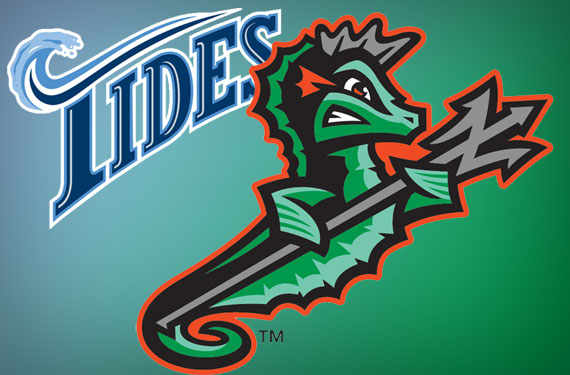
 The Tides debuted as a Single-A team, playing in two leagues and for four parent clubs over eight seasons. They finally settled down in 1969 when they became a Triple-A affiliate of the Mets, beginning a storied 38-year relationship. They played as the Tidewater Tides at a stadium in Norfolk called Met Park until 1992, then moved to their current home in Harbor Park in 1993. The 1993 move coincided with the team’s new designation as the Norfolk Tides and a new logo (above).
Even though the change from Tidewater to Norfolk eliminated the alliteration—that Virginia Pilot editor’s all-important reason for choosing the name Tides—the team never considered a change to the nickname, mostly because they had built a solid brand based on success on the field.
“The Tides won the league title five times in 1972, ’75, ’82, ’83, and ’85,” Locke said. “The fact that the Tides were well known, they wanted to keep the actual nickname, just change the city name.” (Had they wanted to change names, though, they could have hearkened back to one of the city’s previous teams, the Norfolk Clams, who played in the Virginia State League in 1895.)

Outside of changes to the geographic designation, the story of the Tides’ brand had been fairly uneventful until they went through a dramatic, seahorse-based rebrand before this season.
“It was just kind of a way to freshen up the look,” Locke said. “The fact that we hadn’t changed it for 23 years, it was just kind of a refreshing change to give it a new and modern look.”

Saying that the Tides were “freshening up” their look with their recent rebrand is something of an understatement (though perhaps the term is appropriate because their old logo did kind of remind me of toothpaste). The team’s previous look was one of the more conservative brands in baseball—”We had a T logo and the word Tides and those were our logos,” Locke said. “That was essentially it”—whereas the new look put together by Brandiose is one of the more visually shocking in the minors.
The visual change was met with predictable resistance, which has predictably declined as fans have gotten accustomed to the new look, and sales of the new merchandise are predictably higher than the team saw with its old look. This is partly because it’s new, but also because there are so many more options now.
“We used the ‘Tides’ name as freedom to explore the nautical world that celebrates the Hampton Roads,” said Brandiose partner Jason Klein when I talked to him about the new brand before the season. “This includes the Navy, shipbuilding, underwater sea creatures, and the connection with Poseidon.” (We covered the rebrand in detail back in December.)
The new look has set the Tides apart in the International League, which Locke mentioned gets a bit monotonous at times. “I think it’s 12 of the 14 teams in our league have the main colors of red or blue,” he said. “That was us for a long time. We had the blue and white forever.”

One of the other effects that the rebrand has had is that it’s reset a color palette that had become cluttered over the years. While the logo had not changed, and the team’s colors were officially blue and white, there was a certain amount of inconsistency in the uniforms, especially after the team changed parent clubs from New York to Baltimore in 2007.

“We had the white and the blue, the dark blue and light blue, which is what we were from 93 through 2015, but our home uniforms had red numbers on them. And then, with the Orioles coming in, we ended up going with orange jerseys and black hats. So we had red, white, blue, orange, black, and camouflage jerseys that we had as well because we do a lot of military stuff here,” Locke said. “This was a way to say, these are our colors, this is what we’re going to go with.”
Today, the Tides are a team with a split personality. Their nickname, which dates back more than half a century, is a conservative choice founded in tradition, but their visual identity is cresting the wave of newfangled, wacky minor league logos. This tenuous relationship seems to be working for the team so far, so as long as they don’t change their geographic designation (the Hampton Roads Tides is one they haven’t tried yet!), what we see is what we’ll get for the foreseeable future.
Related stories:
 More Cowbell: The Story Behind the Visalia Rawhide
  USA! USA! Baseball Team Wears Miracle on Ice Jerseys
  Norfolk Tides Wearing SpongeBob Jerseys August 7th
  This Team Bites: The Story Behind the Savannah Sand Gnats
  The Story Behind the Carolina Mudcats: It’s the Fish, Stupid
  Rancho Cucamonga Quakes are the Picture of Stability
  From Tobacconists to Lollygaggers: The Story Behind the Durham Bulls
  Chiefs Honour 100 Years With Multi-Logo Patch