The first day of Logovember, Minor League Baseball’s unofficial month-long celebration of new brands and rebrands, did not disappoint. The Class A Greensboro Grasshoppers today unveiled what they’re calling a “refreshed” suite of logos.
The brand update was implemented by Louisville-based Studio Simon, replacing the only mark the team has had since it became the Grasshoppers in 2005. While the existing brand was popular, it needed to be updated to meet the needs of a modern Minor League Baseball team.
“The industry then wasn’t what it is today,” said Dan Simon of Studio Simon. “Eighteen years ago when this logo was done, you didn’t have the fully fleshed out identity systems you see now with multiple secondary logos and word marks and other elements that the merchandise people have at their disposal. Greensboro didn’t have those assets. We had to give them more assets, and we had to give them assets that would translate better to today’s sports branding and merchandising needs.”

One major focus of the refresh was to humanize the grasshopper character—literally. The character from the original 2005 logo had actual grasshopper legs, complete with spines, articulated spurs, and calcars. The updated brand has human legs better suited for playing baseball.
“The original artwork was true in too many ways to what an actual grasshopper looks like,” Simon said. “Some details of insects are not that visually pleasing. Being entomologically correct was not ideal, so we chose to anthropomorphize the character to create a logo that was more pleasing to look at.”

The new look is intended to be simpler and cleaner than its predecessor, with thicker line weights and less detail.
“The existing artwork was a reflection of the times,” Simon said. “There were things that needed to be fixed. For instance, there were small details, thin line work that did not translate to things like embroidery.”
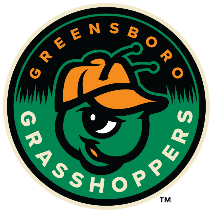
Another notable change with this refresh is a brighter color palette, which is mostly because the team wanted to create a cleaner contemporary look, but also because the thicker line weight of the black strokes in the new look didn’t work with the original color palette.
“Just from a design standpoint, the darker green did not provide contrast with the increased usage of black—the artwork got too dark,” Simon said. “So we brightened up the green, and in turn, we brightened up the orange a little bit to work with the brighter green.”

The new look strives to stay as true as possible to the original brand, which affected everything about the process, including the terminology the team used in discussions.
“We recognized that this was a beloved brand identity ensconced in the community—we knew we were not going to be reinventing the wheel,” Simon said. “A ‘brand update’ was more than we were looking to do here, and that’s why internally we kept using the word ‘refresh.’ That was intentional because we didn’t want to move this far away from what it already was. We weren’t looking to change, we were looking to improve.”

While the team has been called the Grasshoppers since 2005, the franchise dates back to 1902, adopting such names as the Farmers, Champs, Patriots (three times!), Red Sox, Yankees, Hornets, and Bats.
The new-look Grasshoppers will debut April 5, 2024.