Joe Borovich, the man who designed the Vancouver Canucks’ original “stick-in-rink” logo, has passed away at the age of 86.
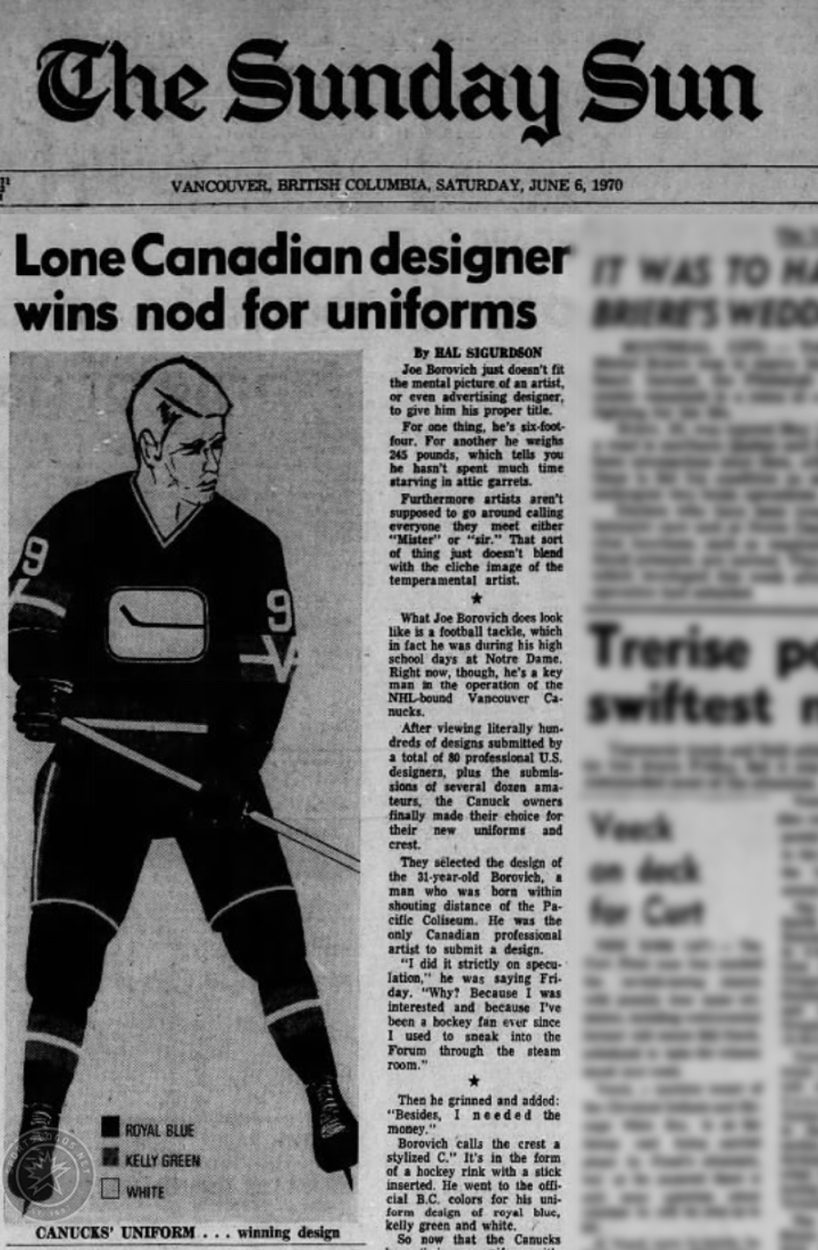
Borovich was a 31-year-old freelance graphic designer and lifelong hockey fan when he submitted the winning entry for the NHL expansion club, who were playing its home games “within shouting distance” of where he was born.
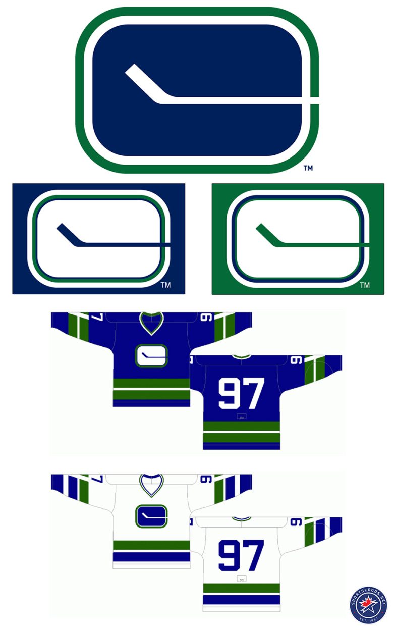
The logo featured a stylized “C” formed from a white hockey stick placed inside a blue, rounded rectangle representing a hockey rink. The colour palette of royal blue, white, and Kelly green was chosen as they were the official colours of British Columbia. They represent the blue of the Pacific Ocean, the white snow-capped mountains, and the green forests.
Borovich was the only Canadian to submit a design, beating out hundreds of entries from 80 professional designers and dozens of amateurs across the United States. He received $500 (approximately $4,000 in 2025 dollars) for the winning logo, which would go on to become one of the most recognizable designs in NHL history.
“I did it strictly on speculation,” Borovich told the Vancouver Sun upon the logo’s unveiling in June 1970. “Why? Because I was interested and because I’ve been a hockey fan ever since I used to sneak into the [Vancouver] Forum through the steam room… Besides, I needed the money,” he added with a grin.
He later reflected on the design process in a video produced by the team in 2014:
“When you do a logo, they sort of indicate that you should try and bring in the initial of the company and also what they do. I ended up with the ‘C’ for ‘Canucks,’ although a lot of people didn’t see it initially, made up of the overall shape of the hockey rink with a hockey stick going through, making a ‘C’ and, of course, the stick is a tool that they use in hockey, so I had three components there.”
The Vancouver Canucks acknowledged Borovich’s passing in a statement released by the club:
“The Vancouver Canucks are deeply saddened by the passing of Joe Borovich, the creator of the team’s original stick-in-rink logo, unveiled during the club’s inaugural NHL season in 1970.
Joe’s timeless design played a significant role in shaping the identity of the franchise and continues to hold a special place in Canucks history. We extend our heartfelt condolences to his family, friends, and all those touched by his creativity and passion for the game.”
The Canucks replaced Borovich’s logo in 1978, opting for the complete opposite look, moving away from a static stick with calming colours to a flying skate in red, black, and gold. The original logo has returned several times over the years, first as a shoulder patch in the early 2000s and then in a modernized form as both a shoulder patch and third jersey crest, along with a return to the blue and green colours in 2007.

“I think the stick-in-rink is the iconic logo of the Vancouver Canucks. If I owned the team, which I don’t, that would be the one for me,” former team captain Trevor Linden said in a Sportsnet radio interview back in 2023. “That logo is timeless; it’s simple. When I worked there, I was like, ‘Hey, this should never change. We should go back to where it started, and it should never change again.’ We can have fun with third jerseys and that sort of thing, but it should be the stick-in-rink.”
Borovich passed away peacefully on December 31, 2025. He was predeceased by his wife, Jean, with whom he shared 40 years of marriage.
Related stories:
 Report: New NHL City Connect-Style Uniform Program Coming Next Season
  Vancouver Canucks Unveil, Immediately Wear New “Flying Skate” Retro Third Uniform
  Sens, Canucks Will Honour 1915 Stanley Cup in Heritage Classic
  Canucks Honour Vancouver Hockey Roots with Patch
  The Toronto Star Jumps the Gun